
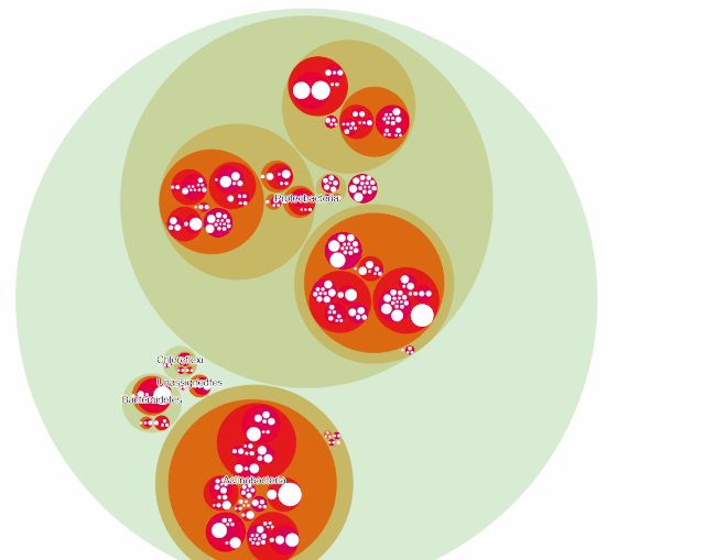
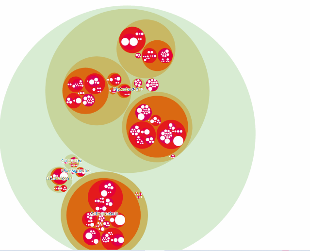
maptree以其优异的可视化展示方式,最近似乎博得很多人的眼球,如果我门让maptree动起来呢?
这种方式用来展示微生物群落的从属关系十分合适,下面让我们来试试:
很少的代码即可实现如此复杂的图片,比maptree简单多了。
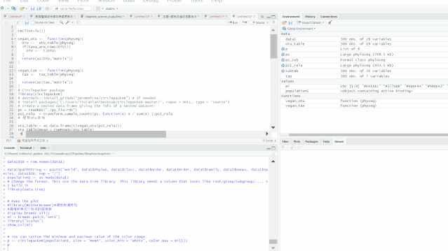
rm(list=ls())

vegan_otu function(physeq){
  OTU   if(taxa_are_rows(OTU)){
    OTU   }
  return(as(OTU,"matrix"))
}

vegan_tax function(physeq){
  tax
  return(as(tax,"matrix"))
}
# Circlepacker package
library(circlepackeR)
# devtools::install_github("jeromefroe/circlepackeR") # If needed
# install.packages("C:/Users/liulanlan/Desktop/circlepackeR-master/", repos = NULL, type = "source")
# create a nested data frame giving the info of a nested dataset:
ps = readRDS("./ps_liu.rds")
ps1_rela  = transform_sample_counts(ps, function(x) x / sum(x) );ps1_rela
# 提取otu表格

otu_table = as.data.frame(t(vegan_otu(ps1_rela)))
otu_table$mean = rowMeans(otu_table)
otu_table$ID = row.names(otu_table)
head(otu_table)
#按照从大到小排序

otu_tablesubtab = head(otu_table,300)
dim(subtab)
# row.names(subtab) = subtab$ID
#对phyloseq取子集
ps_sub %
  subset_taxa(

    row.names(tax_table(ps1_rela ))%in%subtab$ID
  )
ps_sub


#--------------------构造边和节点文件-----------------
#注意我们本次制作的是OTU水平的maptree

tax = as.data.frame(vegan_tax(ps_sub))
otu_table = as.data.frame(t(vegan_otu(ps_sub)))
head(otu_table)


#计算全部均值
otu_table$mean = rowMeans(otu_table)
#组合结果
data1 = merge(otu_table,tax,by = "row.names", all = TRUE)
head(data1)
row.names(data1) = data1$Row.names
data1$Row.names = NULL


data1$ID = row.names(data1)

data1$pathString "world", data1$Phylum, data1$Class, data1$Order, data1$Order, data1$Family, data1$Genus, data1$Species, data1$ID, sep = "/")
population1 as.Node(data1)
# Change the format. This use the data.tree library. This library needs a column that looks like root/group/subgroup/..., so I build it
library(data.tree)


# Make the plot
#library(RColorBrewer)#调色板调用包
#调用所有这个包中的调色板
display.brewer.all()
mi = brewer.pal(9,"Set1")
library("scales")
show_col(mi)


# You can custom the minimum and maximum value of the color range.
p "mean", color_min = "white", color_max = mi[1])
p
如需联系EasyCharts团队
请加微信:
EasyCharts

增强版配套源代码下载地址
Github
https://github.com/EasyChart/Beautiful-Visualization-with-R


