关于INNER/因而教育
INNER/因而教育,是一家由国内外建筑及艺术类专家成立的技术教育交流机构。INNER/因而教育力邀欧美建筑及艺术教育专家线上讲学交流,推动中外建筑及艺术产业的学术,逐渐成为国际建筑及艺术教育交流的主要平台。
INNER/因而教育涉及建筑设计、艺术设计、VI/平面设计和景观规划设计等领域,INNER/因而教育采用与国际接轨的当代建筑与艺术教育模式,引进美国、英国、法国、德国、意大利等国家建筑及艺术院校的国际专业课程,由国际知名建筑及艺术大师和全海归专业教师团队,采用导师制小班制、一对一等教学形式,培养出符合欧美名牌建筑及艺术院校的专业人才,助国内学生通向国际建筑及艺术殿堂。

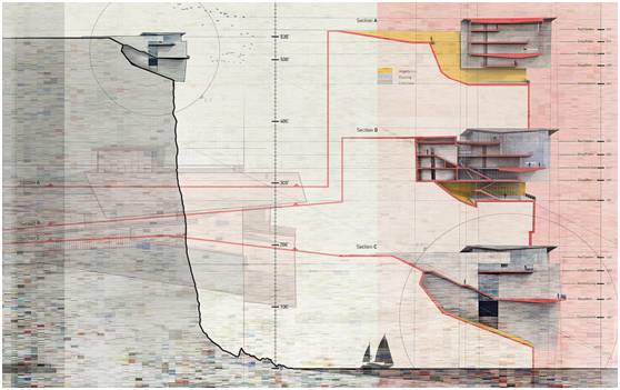
For
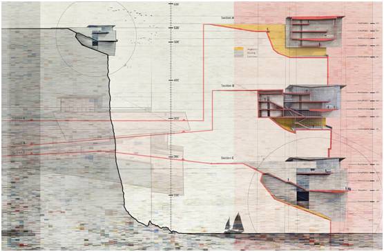
the past few weeks, I have been producing section illustrations of my
cliff retreat design. As is often the case, the final result took a
complete detour from what I originally set out to produce. I began the
spreads rendering out two large detail perspectives with the intention
of placing one on each side of the spread. However, as the
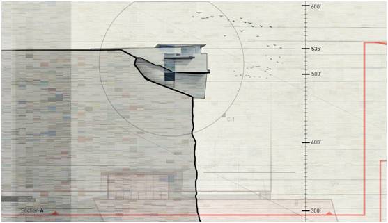
work progressed, I realized more emphasis needed to be placed on the
scale of the cliff. Once I started going in this direction, the building
sections themselves scaled down and more real estate was given to the
site cliff section. The aesthetics of the spreads also shifted from
clean and detailed image to a loose and sketchy style. At a certain
point, I just started experimenting and iterating like crazy to arrive
at the final design. Below is a very quick breakdown of the image.
之前A神的重点一直在制作悬崖公寓的效果图上面,通常的结果是成品与初始概念方向不同,所以A神尝试由两个大透视角度开始往外延展。然后随着进度条的读取,A神意识到重点应当放在悬崖公寓的规模上面。在朝这个方向前进的过程中,建筑本身在环境中所处的重要性就减弱了,更多的重心放在了悬崖本身的考量上面。在美学的表达上面也从清晰细致的形象转变为宽松粗略的风格。
1. Base Renderings
基本渲染
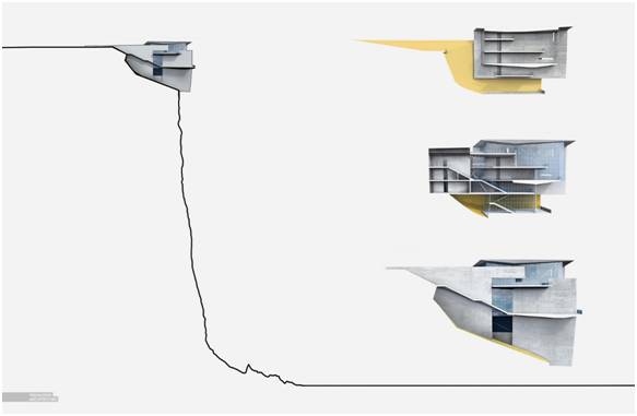
I
started out by cutting sections in my Sketchup model and then rendering
in V-Ray. The V-Ray renderings required quite a bit of cleanup in
Photoshop to hide mistakes in the model. I also added some concrete
textures and colors to designate materiality.
首先SU中剖切,然后在V-Ray中渲染,选然后在PS中进行一些处理将SU中原有的剖切后产生的小错误消除掉。然后添加一些具体的纹理和颜色来指定重要性。
2. Poche and Site Plans
剖切和平面
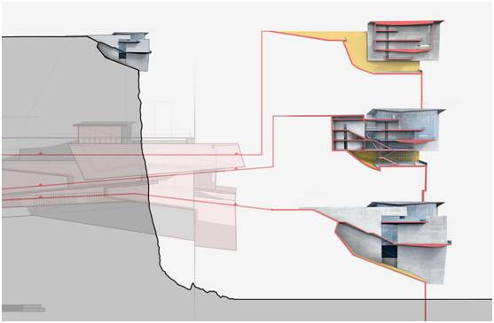
One
thing I like to do with my sections is poche the cut with a bold color
to help clarify the reading. The red also becomes a graphical move that
encourages eye movement around the page and make connections to more
information. In this case, I added a site plan of the design to inform
where the cuts are taking place. All of this is kept somewhat abstract
to help fade into the background and not draw attention away from the
main site section.
A神倾向于用一些明快的颜色来让图面更加容易识别。红色可以引导眼睛向周围的移动,获取更多信息。这个前提下,A神添加了一个平面图来展示剖切的位置。所有这些做法都是在抽象前提下进行的,而非让人重点注意剖切部分。
3. Textures
材质

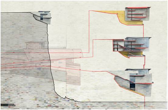
At
a certain point, I quite methodically planning every move, relaxed a
little, and let my right brain take over. I started exploring with
texture and color to give this image some grit.While the step-by-step
breakdown of this image is very linear, in actuality, Iiterated and
tested out a lot of different layout designs, colors, and textures before arriving to the final image style.
A神在某些特定的点上运用感性思维,比如在图像的材质和色彩上进行雕琢。虽然在图像上是按线性分布展示的,但是在达到最终效果之前,有着大量关于布局、色彩、材质的测试。
4. Background Color
背景颜色
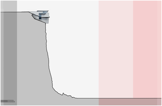
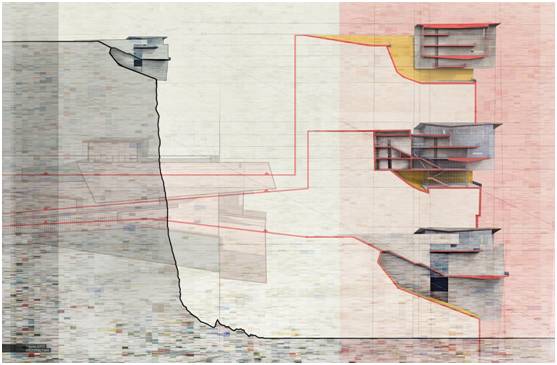
I
added background tones to clarify the hierarchy of the spread and
help organize the information. The red on the right was used to better
define the sky from the cliff as well as visually separate the building
sections from the site section on the left.
A神添加背景色调来标明分散的层级结构,同时还可以帮助将信息规整化。右边的红色更好的在这个场景下定义天空,并且将建筑物的部分视同从左侧的悬崖部分分开。
5. Annotation
注释
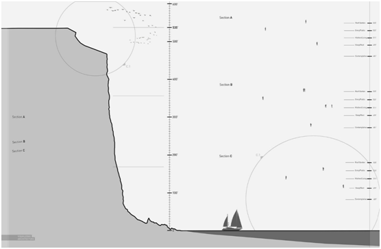
Finally,
annotations and scale figures were added. I always try to put just as
much time into the design of the text and annotations as with any other
graphical information. Often, I see this stuff added at the very end in a
way that disrupts the flow of the spread and distracts from the
illustrations. However, I typically work this stuff in as Iam developing
the spread which can add another layer of texture to the composition
and be used to strengthen the hierarchy of the spread.With that said,
it is a fine balance between maintaining readability and not stealing
too much attention.
最终添加的是注释和尺寸。A神经过多次试验,尝试将文本注释与其他图面信息融为一体。通常此类信息是最后添加,所以会破坏图面的整体感和流畅性。A神目前正在尝试将注释添加到别的图层,并加强图面分布的层级结构。这样可以更好地将注释信息的可读性和图面信息结合平衡。
原文地址:https://visualizingarchitecture.com/cliff-retreat-section-spread/
联系INNER
地址:北京市建外SOHO西区#14-2802室;山东省济南市市中区经四路万达写字间C座512-515室 。
联系方式:+86 17866600727;+86 18906445650
网站:http://www.inner.today/
INNER因而设计客服 咨询

微信号:Inner_Design_
长按二维码关注INNER教育
点击阅读原文查看INNER/因而教育往期活动


