
一个圆形布局包含扇形(sector)和轨道(track)两个部分.扇形和轨道交叉的地方称之为cell.
circlize
使用的是R的base图层写的,因此和R自带的画图系统一样,包含high-level函数和低级绘图函数.高级绘图函数可以直接绘图,而低级绘图则只能在创建track之后,才能在上面绘图.
circlize中的low level function包括以下几种,每一个其实都在R中存在对应的函数,因此,只要熟悉R基础绘图函数, 对下面这些都不会陌生,只是将在笛卡尔坐标转换为极坐标:
-
circos.points()
: 添加点.
-
circos.lines()
: 添加直线.
-
circos.segments()
: 添加segment.
-
circos.rect()
: 在cell中添加矩形,比如热图,其实就是用该函数来绘制的.
-
circos.polygon()
: 添加多边形.
-
circos.text()
: 添加文字.
-
circos.axis()
and
circos.yaxis()
:对x和y坐标轴进行设置.
circlize中与layout相关的函数如下:
-
circos.initialize()
: 用来启动一个初始的circos layout,其实就是用来创建sector,只有创建sector之后,才能添加track,进而在cell中绘图.
-
circos.track()
: 在sector中创建track.
-
circos.update()
: 对某一个已经创建并绘图的cell进行更行.
-
circos.par()
: 与
par
相当,对一些整体参数进行设置,比如绘制扇形时的起始角度和顺序等.
-
circos.info()
: prints general parameters of current circular plot.
-
circos.clear()
: 关闭现在的circos图形,从而不会影响下一个图形的绘制.
下面用一个简单的例子,来一步步说明如何使用
circlize
绘制circos图形.
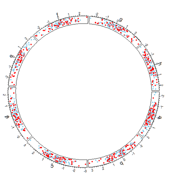
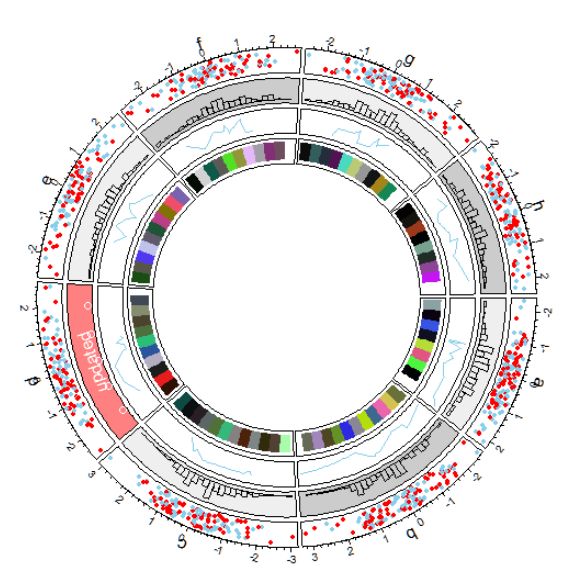
构建数据并启动一个circos layout.
我们一共构建8个种类的数据,在circos的表现就是8个sector.
set.seed(999)
n = 1000
df = data.frame(factors = sample(letters[1:8],
n, replace = TRUE),
x = rnorm(n), y = runif(n))
library(circlize)
circos.par("track.height" = 0.1)
circos.initialize(factors = df$factors,
x = df$x)
track.height
用来设置所有轨道的默认高度.整个circos的直径默认为为1,所以将其设置为0.1意味着每个轨道的高度是整个圆圈直径的10%.当然,在后面绘制单个track的时候,也可以通过函数中的
track.height
参数来对单个track进行设置.
circos.initialize()
函数中必须要设置的两个参数,
factors
和
x
或者
xlim
.它会根据factors的level(如果不是factor则使用unique(factors))来确定创建几个sector.x则会根据factor自动进行分组,然后根据每组的range自动设置每个sector的宽度(宽度代表的是x轴).
使用上述代码初始化一个circos plot之后,下面要做的就是按照一层层轨道往上添加东西了.
添加轨道之前,首先需要使用
circos.track()
函数来创建轨道,然后才可以使用low-level的函数往里面添加各种元素.
创建第一个track并添加点和文字
circos.track(factors = df$factors, y = df$y,
             panel.fun = function(x, y) {
               circos.text(x = get.cell.meta.data("xcenter"),
                           y = get.cell.meta.data("cell.ylim")[2] + uy(5, "mm"),
                           labels = get.cell.meta.data("sector.index"))
               circos.axis(labels.cex = 0.6)
             })

col
  rep(c("skyblue", "red"), 4)
circos.trackPoints(factors = df$factors,
                   x = df$x, y = df$y,
                   col = col, pch = 16, cex = 0.5)
circos.text(x = -1, y = 0.5, labels = "text",
            sector.index = "a", track.index = 1)
circos.track()
函数中的panel.fun函数用来在创建cell的时候,自定义执行一定的功能.比如可以和低级绘图函数结合,来自动对每一个cell中自动添加点等等信息.
get.cell.meta.data()
函数可以提供当前的cell的meta信息.有很多信息可以从`中提取,后面再详细讲解.
circos.trackPoints()
函数与
circos.points()
函数不同的点就是,他可以接受
factors
参数,从而可以自动将x和y按照factor分组,自动在每个cell分别绘制点.因此,他的效果,相当于使用
circos.track()
函数,然后结合
panel.fun()
函数,在其中使用
circos.points()
函数.因此,上面的函数也可以写成下面的函数,效果相同.
circos.track(factors = df$factors, x = df$x, y = df$y,
             panel.fun = function(x, y) {
               circos.text(x = get.cell.meta.data("xcenter"),
                           y = get.cell.meta.data("cell.ylim")[2] + uy(5, "mm"),
                           labels = get.cell.meta.data("sector.index"))
               circos.axis(labels.cex = 0.6)
               circos.points(x = x, y = y, col = col,
                             pch = 16, cex = 0.5)
             })
添加第二个track并添加柱状图
使用
circos.trackHist()
函数.这是一个high-level的函数.high-level函数意味着它自己可以直接创建新的track,然后直接绘图.
bgcol
  rep(c("#EFEFEF", "#CCCCCC"), 4)
circos.trackHist(df$factors, df$x, bin.size = 0.2, bg.col = bgcol, col = NA)
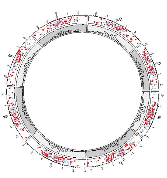
可以看到,默认的话,track是一层一层从外往里进行添加.
添加第三个track.
注意在
circos.track()
函数中,x坐标(x)和y坐标(y)是自动被factor所分类的,也就是说传递到内部函数
panel.fun
中的x和y都是当前cell(也就是分类)的x和y.
下面,在第三个track中,我们在每个cell中随机选取10个点,然后按照x排序,连接成线.
circos.track(factors = df$factors, x = df$x, y = df$y,
    panel.fun = function(x, y) {
        ind = sample(length(x), 10)
        x2 = x[ind]
        y2 = y[ind]
        od = order(x2)
        circos.lines(x = x2[od], y = y2[od])
})
如果需要对某个cell中用的内容进行重新绘制,可以使用
circos.update()
函数进行更新.注意一定需要指明所需要更新的sector和track的index.
注意,更新某个cell之后,当前(current)的cell就是你更新的cell,所以如果你想要对整个cell进行修改,比如添加新的点等,可以不需要指明cell.
circos.update(sector.index = "d", track.index = 2,
              bg.col = "#FF8080", bg.border = "black")
circos.points(x = -2:2, y = rep(0.5, 5), col = "white")
circos.text(x = get.cell.meta.data("xcenter"),
            y = get.cell.meta.data("ycenter"),
            labels = "updated", col = "white")
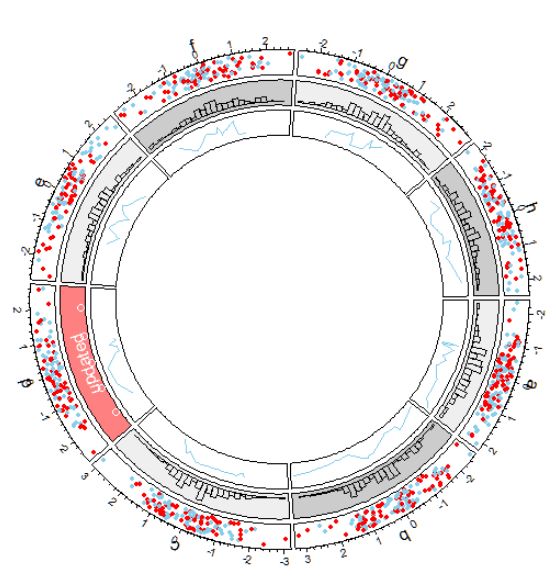
但是,如果接着添加track,仍然是在最里层的track的基础上,往里面接着添加.
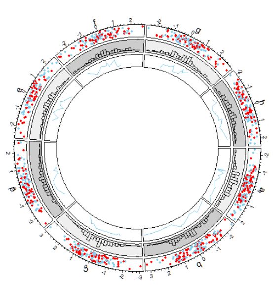
添加第四个track.
我们接着添加track,这次我们添加一个热图,使用的是
circos.rect()
函数.因为该函数并不是high-level函数,因此我们需要使用
circos.track()
先创建track,然后在其内部的
panel.fun()
函数中在使用
circos.rect()
函数为每个cell创建热图.
circos.track(ylim = c(0, 1),
             panel.fun = function(x, y) {
  xlim = get.cell.meta.data("xlim")
  ylim = get.cell.meta.data("ylim")
  breaks = seq(xlim[1], xlim[2], by = 0.5)
  n_breaks = length(breaks)
  circos.rect(xleft = breaks[-n_breaks],
              ybottom = rep(ylim[1], n_breaks - 1),
              xright = breaks[-1],
              ytop = rep(ylim[2], n_breaks - 1),
              col = rand_color(n_breaks), border = NA)
})
可以看到,
circos.rect()
函数内部的四个参数:
xleft
,
ybottom
,
xright
和
ytop
可以是vector.
在内部添加连线(links)
我们添加连线或者缎带.也就是所谓的和弦图.连接可以是点对点,也可以点对区域,或者区域对区域.使用的是低级函数
circos.link()
函数.
circos.link(sector.index1 = "a",
            point1 = 0,
            sector.index2 = "b",
            point2 = 0, h = 0.4)
circos.link(sector.index1 = "c", point1 = c(-0.5, 0.5),
            sector.index2 = "d", point2 = c(-0.5,0.5),
            col = "skyblue",
            border = "skyblue", h = 0.2)
circos.link(sector.index1 = "e", point1 = 0,
            sector.index2 = "g", point2 = c(-1,1),
            col = "green",
            border = "black",
            lwd = 2,
            lty = 2)
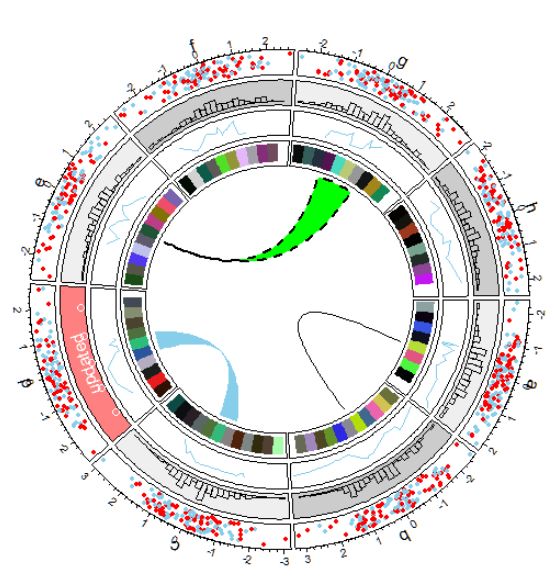
最后,所有track都做完之后,需要重置你的graphic的参数等等,从而使你画下一个figure的时候,才不会搞混到一起.
circos.clear()
layout(布局)
使用
circlize
进行画图的过程其实很简单:
初始化启动layout(创建了sector)->创建track->画图形->常见track->画图形-…-clear.
其中,对于画图来说,只要创建了该cell,就可以通过指定cell在任意时间进行画图.
-
初始化layout(
circos.initialize()
函数).
-
创建track并画图.有三种方法可以创建track并画图.
-
使用
circos.track()
创建track之后,使用low-level函数(如
circols.points()
,
circols.lines()
)画图.这时候,一般需要使用使用for循环,并且需要你手动提出每个cell对应的分类的数据(指定sector.index和track.index参数).
-
可以直接使用
circos.trackPoints()
,
circos.trackLines()
等函数直接创建track并添加图形.也就是每个低级参数都有其对应的
circos.tracl...()
函数.
-
在
circos.track()
函数中使用
panel.fun()
函数.panel函数需要x和y参数,这个参数是在当前cell的x和y.这是作者推荐使用的方法.
sector和track
sector是一列(从外到里),而track是一行(一圈).sector在使用
circos.initialize()
函数进行初始化的时候,就已经分配好了,一个sector代表着一类,因此,数据至少需要一组.
每个sector的宽度,与该组内的数据x的的range成正比.当然这是默认的,也可以通过手动设置
xlim
参数(
circos.initialize()
)来指定每个sector的宽度.
xlim
参数需要是一个两列的matrix,每一行对应着每一个sector的宽度的两个界限.因此,该matix的行数应该和sector的个数一致.
当然,你也可以设置xlim为两个元素的vector,这样,所有的sector的宽度就是一致的.
当初始化的时候,sector的顺序也已经被决定了.sector的顺序和你的数据中的分类的factor的因此水平时一致的,所以如果需要更改sector的顺序,请到原始数据中更改.
另外需要注意的时,在同一个sector中的不同track的cell,他们共享一个x轴.因此,当新建一个track的时候,我们没有必要设置xlim,只需要设置ylim就行了.
而对于一个track中的所有cell来说.他们共享一个ylim,因此像
circos.track()
中的
ylim
参数,直接设置为两位的vector即可.
circos.track(factors, y = y)
circos.track(factors, ylim = c(0, 1))
circos.track(factors, x = x, y = y)
当创建新的track的时候,如果不想创建所有sector的track,可以在
circos.track()
的factor参数只提供想要设置track的名字即可.
创建sector的时候,默认角度为0(水平).方向为顺时针,如果希望修改,可以通过设置:
circos.par("clock.wise" = TRUE,
start.degree = 90)
总体参数
总体参数可以通过
circos.par()
参数进行设置.
创建绘图区域
只有创建了绘图区域之后,才能够使用low-level函数进行绘图.一般,使用
circos.track()
函数来进行绘制track.
panel.fun()
函数
该函数都是和
circos.track()
函数配合使用.
在
panel.fun()
中使用low-level绘图函数,不需要指明
sector.index
和
track.index
.
在
panel.fun()
内部,可以使用
get.cell.meta.data()
函数来获得当前cell的信息.
可以使用其获得的cell信息包括:
-
sector.index: The name for the sector.
-
sector.numeric.index: Numeric index for the sector.
-
track.index: Numeric index for the track.
-
xlim: Minimal and maximal values on the x-axis.
-
ylim: Minimal and maximal values on the y-axis.
-
xcenter: mean of xlim.
-
ycenter: mean of ylim.
-
xrange: defined as xlim[2] - xlim[1].
-
yrange: defined as ylim[2] - ylim[1].
-
cell.xlim: Minimal and maximal values on the x-axis extended by cell paddings.
-
cell.ylim: Minimal and maximal values on the y-axis extended by cell paddings.
-
xplot: Degree of right and left borders in the plotting region. The first element corresponds to the start point of values on x-axis and the second element corresponds to the end point of values on x-axis Since x-axis in data coordinate in cells are always clockwise, xplot[1] is larger than xplot[2].
-
yplot: Radius of bottom and top radius in the plotting region.
-
cell.start.degree: Same as xplot[1].
-
cell.end.degree: Same as xplot[2].
-
cell.bottom.radius: Same as yplot[1].
-
cell.top.radius: Same as yplot[2].
-
track.margin: Margins of the cell.
-
cell.padding: Paddings of the cell.
比如,可以使用下面的代码,在每个cell的中间,加上该cell的index.
circos.track(ylim = ylim,
panel.fun = function(x, y) {
    sector.index = get.cell.meta.data("sector.index")
    xcenter = get.cell.meta.data("xcenter")
    ycenter = get.cell.meta.data("ycenter")
    circos.text(xcenter, ycenter, sector.index)
})
CELL_META
和
get.cell.meta.data()
是等价的,比如,
CELL_META$sector.index
就等于
get.cell.meta.data("sector.index")
.
但是该函数只能在
panel.fun()
内部使用,用来获得当前cell的信息,而
get.cell.meta.data()
则可以在指明sector和track index的前提下,在
panel.fun()
外部使用.
使用
circlize
包画一个弯曲的热图.例子来源于
Zuguang Gu
博士的
circlize
包的官网.感兴趣的可以直接点击阅读原文查看.
library('circlize')
## ========================================
## circlize version 0.4.6
## CRAN page: https://cran.r-project.org/package=circlize
## Github page: https://github.com/jokergoo/circlize
## Documentation: http://jokergoo.github.io/circlize_book/book/
##
## If you use it in published research, please cite:
## Gu, Z. circlize implements and enhances circular visualization
##   in R. Bioinformatics 2014.
## ========================================
set.seed(999)
mat matrix(rnorm(100*10), nrow = 10, ncol = 100)
col_fun = colorRamp2(breaks = c(-2, 0, 2),
colors = c("skyblue", "white", "red"))
factors = "a"
dend as.dendrogram(hclust(dist(t(mat))))
circos.par(cell.padding = c(0, 0, 0, 0),
start.degree = 90)
circos.initialize(factors, xlim = c(0, 100))
circos.track(ylim = c(0, 10),
bg.border = NA,
track.height = 0.6,
panel.fun = function(x, y) {
mat2 = mat[, order.dendrogram(dend)]
col_mat = col_fun(mat2)
nr = nrow(mat2)
nc = ncol(mat2)
for(i in 1:nr) {
circos.rect(xleft = 1:nc - 1, ybottom = rep(nr - i, nc),
xright = 1:nc, ytop = rep(nr - i + 1, nc),
border = "white",
col = col_mat[i, ])
}
for(i in 1:nc){
circos.text(x = c(1:100) - 0.5,
y = 10,
labels = c(1:100),
facing = "clockwise", niceFacing = TRUE,
cex = 1,
adj = c(0, 0.5)
)
}
})
max_height max(attr(dend, "height"))
circos.track(ylim = c(0, max_height),
bg.border = NA,
track.height = 0.3,
panel.fun = function(x, y) {
circos.dendrogram(dend = dend,
max_height = max_height)
})
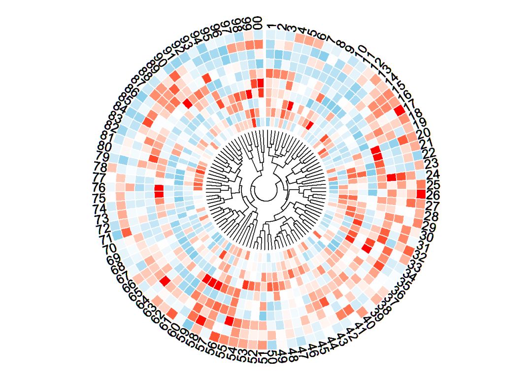
circos.clear()
如果想要让其不是一个闭合的热图,可以考虑创建两个数据,其中一个数据为空数据,不在cell里面画图即可.
代码如下:
library('circlize')
set.seed(999)
mat matrix(rnorm(50 * 10), nrow = 10, ncol = 50)
col_fun colorRamp2(breaks = c(-2, 0, 2),
colors = c("skyblue", "white", "red"))
factors factor(c(rep("a", 10), rep("b", 50)), levels = c("a", "b"))
dend as.dendrogram(hclust(dist(t(mat))))
library(tidyverse)
## Warning: package 'tidyverse' was built under R version 3.6.1
## -- Attaching packages --------------------------------------------------- tidyverse 1.2.1 --
## v ggplot2 3.2.0     v purrr   0.3.2
## v tibble  2.1.3     v dplyr   0.8.3
## v tidyr   0.8.3     v stringr 1.4.0
## v readr   1.3.1     v forcats 0.4.0
## Warning: package 'tibble' was built under R version 3.6.1
## Warning: package 'dplyr' was built under R version 3.6.1
## -- Conflicts ------------------------------------------------------ tidyverse_conflicts() --
## x dplyr::filter() masks stats::filter()
## x dplyr::lag()    masks stats::lag()
library


