相关阅读:
吊炸天!74款APP完整源码!
[干货]2017已来,最全面试总结——这些Android面试题你一定需要
2017年,身为Android开发的你必须要掌握的热门开源框架
Material Design中的动画将为用户提供操作反馈并在用户与您的应用进行互动时提供视觉连续性。 Material Design将为按钮与操作行为转换提供一些默认动画,而 Android 5.0(API Level 21)及更高版本可让您定制这些动画,同时也可创建新动画:
一、触摸反馈动画
效果图:
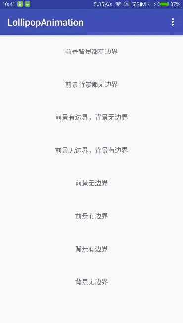
Material Design的触摸反馈可在用户与 UI 元素互动时,在接触点上提供即时视觉确认。 适用于按钮的默认触摸动画使用全新 RippleDrawable类别,以波纹效果实现不同状态间的转换。
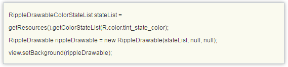
在大多数情况下,应以下列方式指定视图背景,在您的视图 XML 中应用此功能:
任何view处于可点击状态,都可以使用RippleDrawable来达到水波纹特效,而且必须处于可点击状态,才会出现波纹动画效果。
在代码中可以这样设置:
注意:selectableItemBackgroundBorderless是 API Level 21 中推出的新属性。
此外,您可利用 ripple元素将
RippleDrawable
定义为一个 XML 资源。
您可以为
RippleDrawable
对象指定一种颜色。如果要改变默认触摸反馈颜色,请使用主题的 android:colorControlHighlight属性。
如果要了解更多信息,请参阅
RippleDrawable
类别的 API 参考文档。
我们来看看系统自带的触摸反馈动画是怎么实现的,为什么只需要在view的background或者foreground属性设置成?android:attr/selectableItemBackground或者?android:attr/selectableItemBackgroundBorderless就可以实现波纹动画的效果?这两个属性点进去,可以看到在路径sdk/platforms/android-xx/data/res/values/attrs.xml文件中有定义这么两个属性:
我们想到,这两个属性既然是整个app中有效的,那可能会是在Theme中的属性吧,那就去AndroidManifest文件中跟这个Theme一步步看下去,最后在Base.V21.Theme.AppCompat.Light这个style中看到确实是有这两个item属性:
-
?android:attr/selectableItemBackground
-
?android:attr/selectableItemBackgroundBorderless
但是这里还是调用的系统的定义的属性,继续往下追,在android:Theme.Material和android:Theme.Material.Light中,可以看到:
-
@drawable/item_background_material
-
@drawable/item_background_borderless_material
然后sdk路径下platforms\\android-xx\\data\\res\\drawable可以找到这些资源文件如下图:
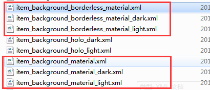
item_background_material的内容是:
android:color="?attr/colorControlHighlight">
-
item_background_borderless_material的内容是:
android:color="?attr/colorControlHighlight" />
系统的做法是用ripple元素将 RippleDrawable定义为一个 XML 资源,而通过看View的源码中在构造方法中是这样获取background属性的:
public View(Context context, @Nullable AttributeSet attrs, int defStyleAttr, int defStyleRes) {
this(context);
final TypedArray a = context.obtainStyledAttributes(
attrs, com.android.internal.R.styleable.View, defStyleAttr, defStyleRes);
if (mDebugViewAttributes) {
saveAttributeData(attrs, a);
}
Drawable background = null;
switch (attr) {
case com.android.internal.R.styleable.View_background:
background = a.getDrawable(attr);
break;
.
.
.
}
也就是说,这个background实际上就是RippleDrawable类。那我们就来看看这个RippleDrawable内部到底是怎么做的吧。
首先官方文档对RippleDrawable解释是
Drawable that shows a ripple effect in response to state changes. The anchoring position of the ripple for a given state may be specified by calling setHotspot(float, float)with the corresponding state attribute identifier.
通过显示出波纹效果来响应状态的改变,对于给定状态的波纹的锚定位置可以通过调用具有对应的状态属性标识符的setHotspot(float,float)来指定。
RippleDrawable继承自LayerDrawable,而LayerDrawable是继承Drawable,RippleDrawable又是为了响应View的statechange,那就看看Drawable类中对点击时的状态处理吧。
public boolean setState(@NonNull final int[] stateSet) {
if (!Arrays.equals(mStateSet, stateSet)) {
mStateSet = stateSet;
return onStateChange(stateSet);
}
return false;
}
给Drawable设置状态属性时,会把状态的数组传给onStateChange方法,在RippleDrawable中重写了onStateChange。
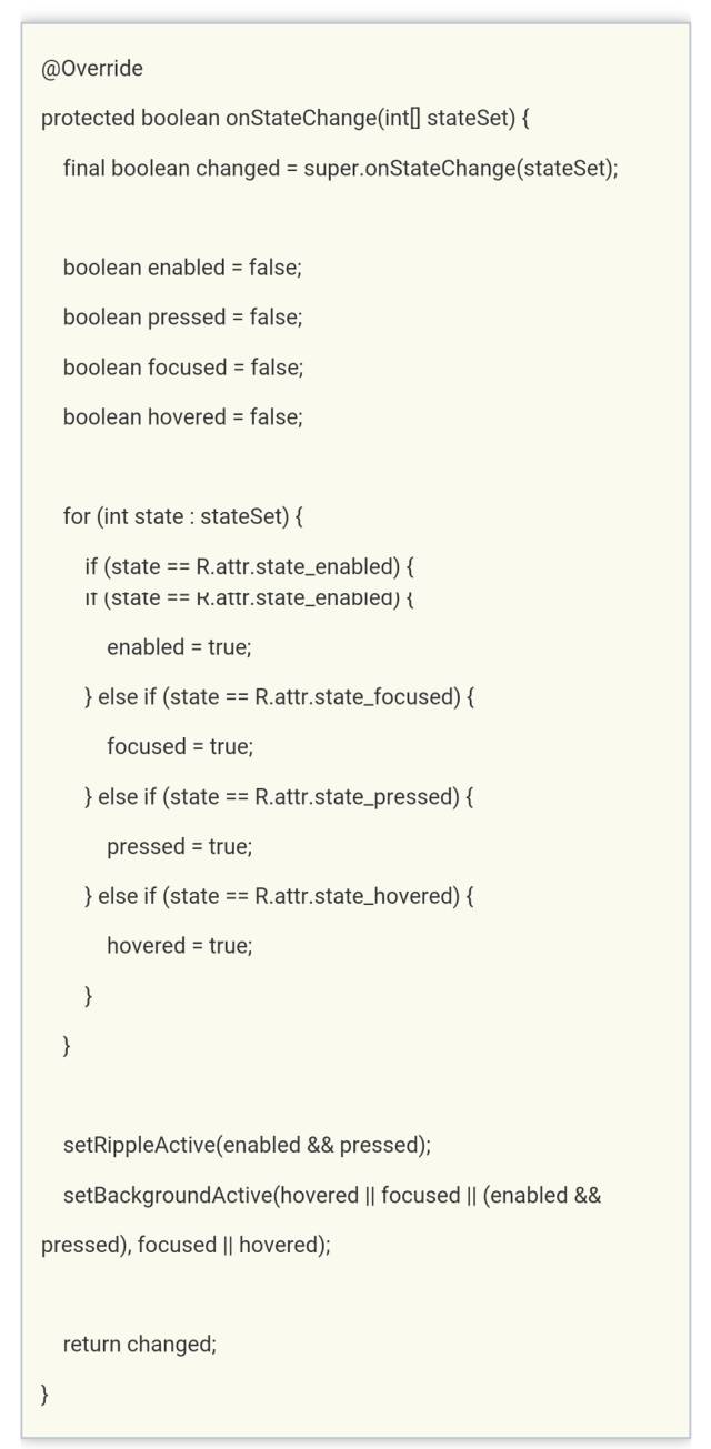
看到setRippleActive和setBackgroundActive这两个方法应该可以猜到是什么意思了,接着看。
private void setRippleActive(boolean active) {
if (mRippleActive != active) {
mRippleActive = active;
if (active) {
tryRippleEnter();
} else {
tryRippleExit();
}
}
}
如果Drawable是enable=true且pressd=true时,会调用tryRippleEnter方法
看到这里,我们可以知道要开始做波纹动画的效果了。mRipple 是RippleForeground类的实例,然而我没有在RippleForeground类中找到setup和enter方法,但是RippleForeground继承自RippleComponent类,于是,我在这个类中发现了这两个方法。
public final void setup(float maxRadius, int densityDpi) {
if (maxRadius >= 0) {
mHasMaxRadius = true;
mTargetRadius = maxRadius;
} else {
mTargetRadius = getTargetRadius(mBounds);
}
mDensityScale = densityDpi * DisplayMetrics.DENSITY_DEFAULT_SCALE;
onTargetRadiusChanged(mTargetRadius);
}
/**
* Starts a ripple enter animation.
*
* @param fast whether the ripple should enter quickly
*/public final void enter(boolean fast) {
cancel();
mSoftwareAnimator = createSoftwareEnter(fast); if (mSoftwareAnimator != null) {
mSoftwareAnimator.start();
}
}
setup是初始化一系列参数,enter创建一个动画并开始动画。
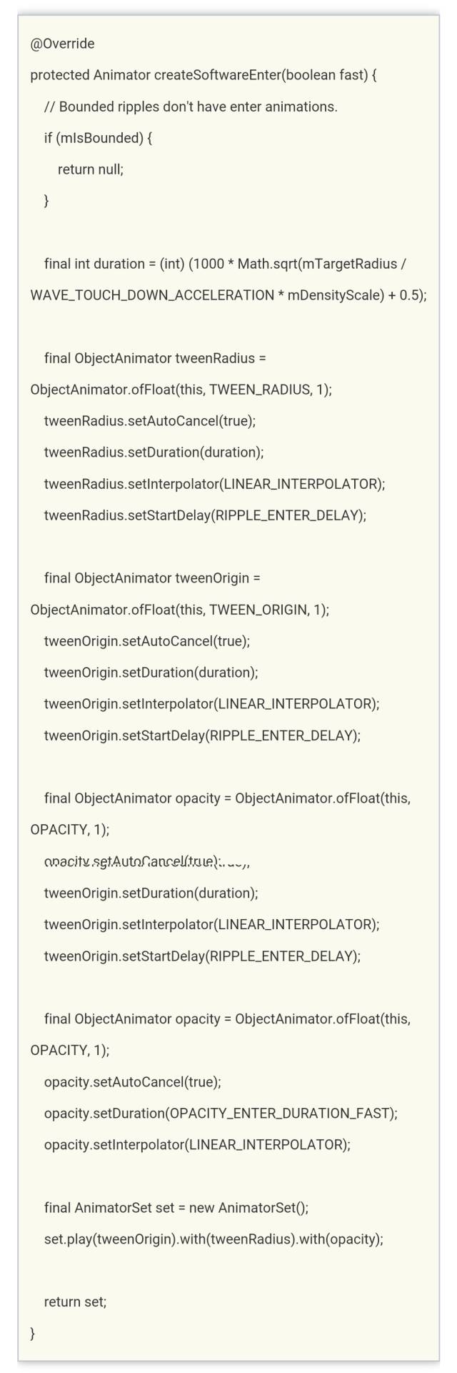
从上面创建动画的代码可以看到,实际上是一个组合的属性动画,然后自定义了三个属性波纹半径TWEEN_RADIUS、波纹中心点TWEEN_ORIGIN和波纹的不透明度OPACITY。通过这三个属性的过渡变化得到一个复合的动画。以上就是前景波纹动画效果的实现过程。
private void setBackgroundActive(boolean active, boolean focused) {
if (mBackgroundActive != active) {
mBackgroundActive = active;
if (active) {
tryBackgroundEnter(focused);
} else {
tryBackgroundExit();
}
}
}
mBackground是RippleBackground类的实例,与RippleForeground不同的是,背景动画只是改变了不透明度。
@Override
protected Animator createSoftwareEnter(boolean fast) {
// Linear enter based on current opacity.
final int maxDuration = fast ? OPACITY_ENTER_DURATION_FAST : OPACITY_ENTER_DURATION;
final int duration = (int) ((1 - mOpacity) * maxDuration);
final ObjectAnimator opacity = ObjectAnimator.ofFloat(this, OPACITY, 1);
opacity.setAutoCancel(true);
opacity.setDuration(duration);
opacity.setInterpolator(LINEAR_INTERPOLATOR);
return opacity;
}
以上分析的都是手指触摸view时产生的enter波纹动画,当手指抬起时state也会改变,会产生一个exit动画,这里就不详细分析了。
二、使用揭露效果
效果图:
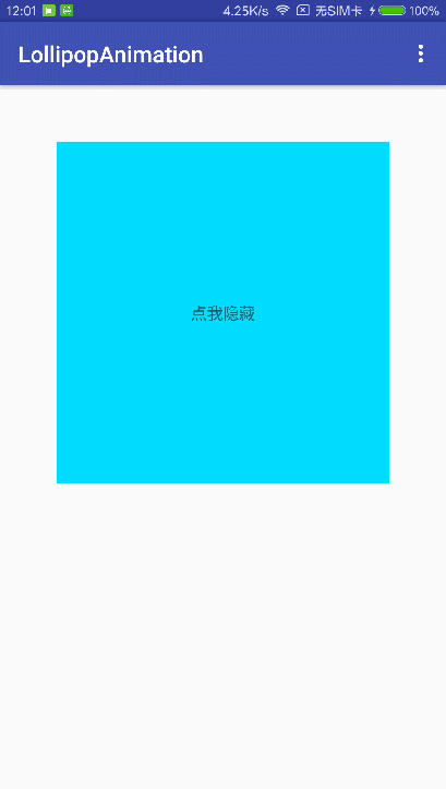
当需要显示或隐藏一组UI元素时,揭露动画可为用户提供视觉连续性。
ViewAnimationUtils.createCircularReveal()方法能够为裁剪区域添加动画以揭露或隐藏视图。
/* @param view The View will be clipped to the animating circle.要隐藏或显示的view
* @param centerX The x coordinate of the center of the animating circle, relative to
view
.动画开始的中心点X
* @param centerY The y coordinate of the center of the animating circle, relative to
view
.动画开始的中心点Y
* @param startRadius The starting radius of the animating circle.动画开始半径
* @param endRadius The ending radius of the animating circle.动画结束半径
*/
public static Animator createCircularReveal(View view,
int centerX, int centerY, float startRadius, float endRadius) {
return new RevealAnimator(view, centerX, centerY, startRadius, endRadius);
}
RevealAnimator和之前的动画使用没什么区别,同样可以设置监听器和加速器来实现各种各样的特效,该动画主要用在隐藏或者显示一个view,改变view的大小等过渡效果。
显示view:
final TextView tv9 = (TextView) findViewById(R.id.tv9);
findViewById(R.id.content_main).setOnClickListener(new View.OnClickListener() {
@Override public void onClick(View v) {
// get the center for the clipping circle
int cx = (tv9.getRight() - tv9.getLeft()) / 2;
int cy = (tv9.getBottom() - tv9.getTop()) / 2;
// get the final radius for the clipping circle
int finalRadius = Math.max(tv9.getWidth(), tv9.getHeight());
// create the animator for this view (the start radius is zero)
final Animator anim = ViewAnimationUtils.createCircularReveal(tv9, cx, cy, 0, finalRadius);
tv9.setVisibility(View.VISIBLE);
anim.start();
}
});
隐藏view:
final TextView tv9 = (TextView) findViewById(R.id.tv9);
tv9.setOnClickListener(new View.OnClickListener() {
@Override public void onClick(View v) {
// get the center for the clipping circle
int cx = (tv9.getRight() - tv9.getLeft()) / 2;
int cy = (tv9.getBottom() - tv9.getTop()) / 2;
// get the final radius for the clipping circle
int initRadius = Math.max(tv9.getWidth(), tv9.getHeight());
// create the animator for this view (the start radius is zero)
final Animator anim = ViewAnimationUtils.createCircularReveal(tv9, cx, cy, initRadius, 0);
anim.addListener(new AnimatorListenerAdapter() {
@Override public void onAnimationEnd(Animator animation) {
super.onAnimationEnd(animation);
// make the view visible and start the animation
tv9.setVisibility(View.INVISIBLE);
}
});
anim.start();
}
});