图形是一个有效传递分析结果的呈现方式。R是一个非常优秀的图形构建平台,它可以在生成基本图形后,调整包括标题、坐标轴、标签、颜色、线条、符号和文本标注等在内的所有图形特征。本章将带大家领略一下R在图形构建中的强大之处,也为后续更为高阶图形构建铺垫基础。
目 录
1 认识常见的图形函数hist和plot
1.1 认识hist
1.2 认识plot
2 图形参数
3 文本标注、自定义坐标轴和图例
3.1 标题
3.2 点标注
3.3 参考线
3.4 图例
4 图形布局与组合
正 文
1 认识常见的图形函数hist和plot
1.1 认识hist
hist(柱形图)是呈现一维数据的一种常用图形。
#hist函数表达式hist(x, breaks = "Sturges", freq = NULL, probability = !freq, include.lowest = TRUE, right = TRUE, density = NULL, angle = 45, col = NULL, border = NULL, main = paste("Histogram of" , xname), xlim = range(breaks), ylim = NULL, xlab = xname, ylab, axes = TRUE, plot = TRUE, labels = FALSE, nclass = NULL, warn.unused = TRUE, ...)
主要参数解释:
x:定义数据向量breaks:定义柱形图分组。可以是一个常数,定义分组个数,例如:breaks = 12; 可以是一个有序数据集,定义分组的边界,其中两端边界即为x的最大最小值,例如:breaks = c(4*0:5, 10*3:5, 70, 100, 140freq:定义频数/频率计算,默认freq=TRUE,频数;freq=FALSE,频率。main:定义图标题xlim/ylim:定义x/y横纵坐标范围xlab/ylab:定义x/y横纵坐标名称
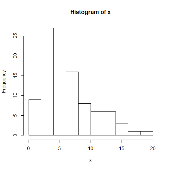
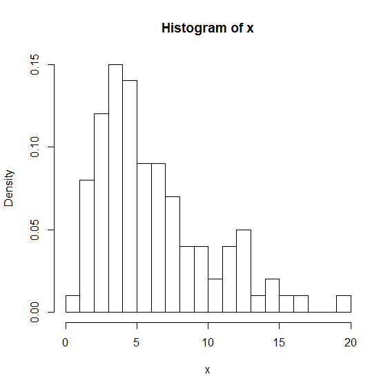
hist示例
set.seed(4)x q(100, df = 6)hist(x)
hist(x,breaks = 20,freq = FALSE)
1.2 认识plot
plot(散点图)是最常见的展现双变量的图形。
#plot函数表达式plot(x, y, ...) #常规形式定义数据plot(y~x, ...) #函数形式定义数据
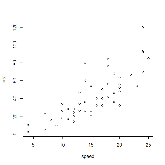
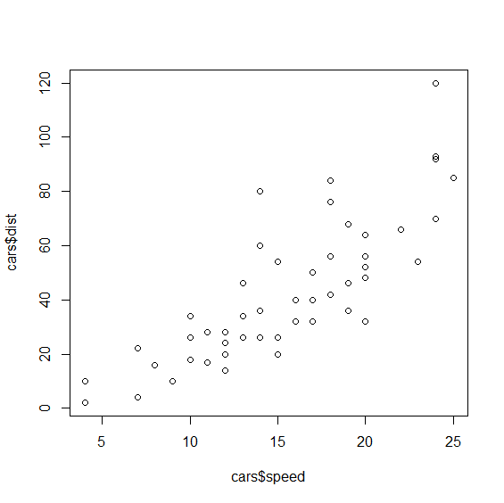
plot示例
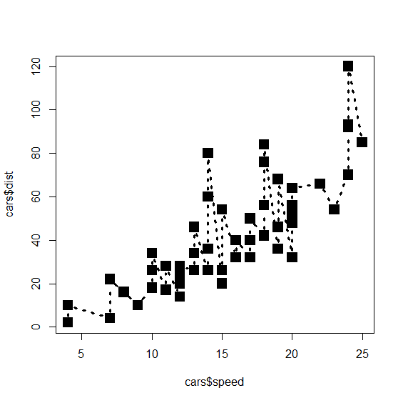
> require(stats)> head(cars,3) speed dist1 4 22 4 103 7 4> plot(cars)
> require(stats)> head(cars,3) speed dist1 4 22 4 103 7 4> plot(cars)> plot(cars$dist~cars$speed)
2 图形参数
主要包括以下图形参数
> require(stats)> plot(cars$speed,cars$dist,type='b',lty=3,lwd=3,pch=15,cex=2)

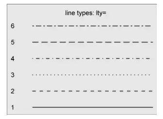
type:呈现形式
"p" for points,
"l" for lines,
"b" for both,
"c" for the lines part alone of "b",
"o" for both ‘overplotted’,
"h" for ‘histogram’ like (or ‘high-density’) vertical lines,
"s" for stair steps,
"S" for other steps, see ‘Details’ below,
"n" for no plotting.


3 文本标注、自定义坐标轴和图例
3.1标题
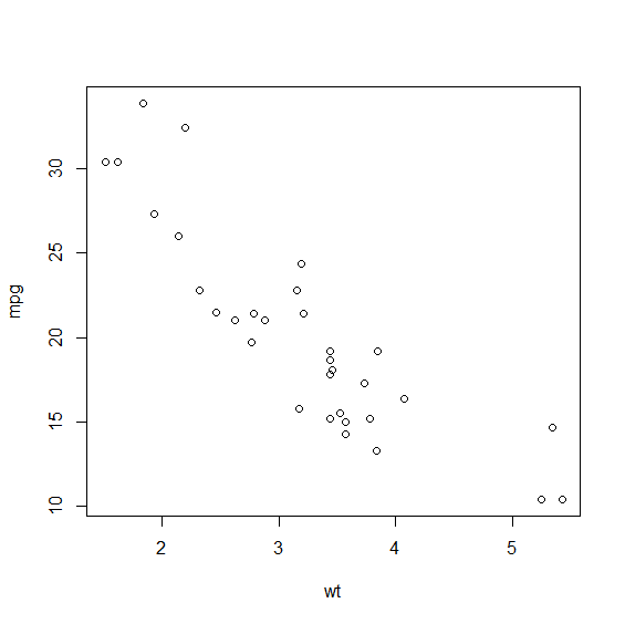
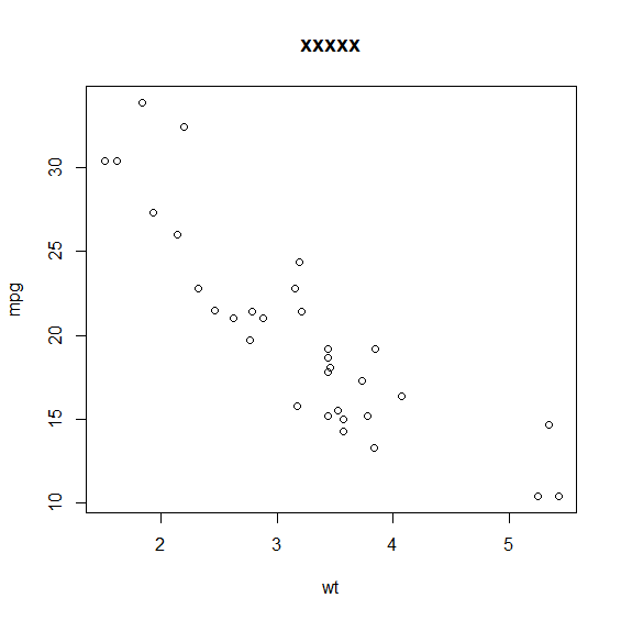
plot(wt,mpg) #输出下左图title(main="xxxxx") #在plot(wt,mpg)图上添加标题
3.2 点标注
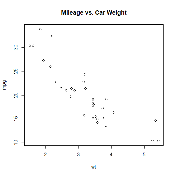
attach(mtcars)plot(wt,mpg,main = 'Mileage vs. Car Weight') #输出下图1text(wt,mpg,row.names(mtcars),cex = 0.6,pos=4,col='red') #输出下图2detach(mtcars)

attach(mtcars)plot(wt,mpg,main = 'Mileage vs. Car Weight')text(wt,mpg,mpg,cex = 0.6,pos=4,col='red') #输出下图3detach(mtcars)
(图1)
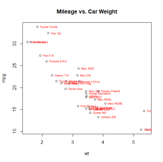
(图2)
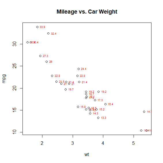
(图3)
3.3 参考线
函数abline()可以用来添加参考线,格式如下
:
abline(h=yvalues,v=xvalues)
示例
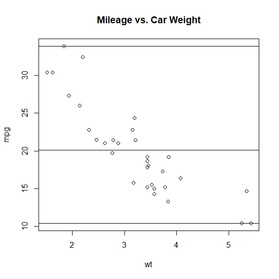
attach(mtcars)plot(wt,mpg,main = 'Mileage vs. Car Weight')abline(h=c(min(mpg),mean(mpg),max(mpg)))detach(mtcars)
attach(mtcars)plot(wt,mpg,main = 'Mileage vs. Car Weight abline(lm(mpg~wt))')abline(lm(mpg~wt))detach(mtcars)

3.4 图例
图例格式如下:
legend(location,title,legend……)#location位置#title图例标题#legend图例标签组成(可以使字符串向量)
图例示例
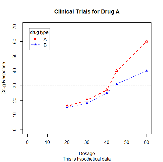
#2-4行原始数据dose 20,30,40,45,60)drugA 16,20,27,40,60)drugB 15,18,25,31,40)
#7-11行作图plot(dose,drugA,type='b',col='red',lty=2,pch=2,lwd=2,     main = 'Clinical Trials for Drug A',     sub = 'This is hypothetical data',     xlab = 'Dosage',ylab = 'Drug Response',     xlim = c(0,60),ylim = c(0,70))     #14行添加线条lines(dose,drugB,type='b',pch=17,lty=2,col='blue')
#17行添加辅助线abline(h=c(30),lwd=1.5,lty=2,col='grey')
#20行添加图例legend('topleft',inset = .05,title = 'drug type',c('A','B'),lty = c(1,2),pch = c(15,17),col=c('red','blue'))
4 图形布局与组合
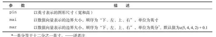
在R中使用函数par()或layout()可以容易地组合多幅图形为一幅总括图形。par()函数中使用图形参数mfrow=c(nrows, ncols)来创建按行填充的、行数为nrows、列数为ncols的图形矩阵。另外,可以使用nfcol=c(nrows, ncols)按列填充矩阵。
布局与组合示例1:
attach(mtcars)opar <- par(no.readonly = TRUE)par(mfrow = c(2, 2))plot(wt, mpg, main = "Scatterplot of wt vs. mpg")plot(wt, disp, main = "Scatterplot of wt vs disp")hist(wt, main = "Histogram of wt")boxplot(wt, main = "Boxplot of wt")par(opar)detach(mtcars)

布局与组合示例2:
opar TRUE)par(fig = c(0, 0.8, 0, 0.8))plot(mtcars$wt, mtcars$mpg, xlab = "Miles Per Gallon", ylab = "Car Weight")par(fig = c(0, 0.8, 0.55, 1), new = TRUE)boxplot(mtcars$wt, horizontal = TRUE, axes = FALSE)par(fig = c(0.65, 1, 0, 0.8), new = TRUE)boxplot(mtcars$mpg, axes = FALSE)mtext("Enhanced Scatterplot", side = 3, outer = TRUE, line = -3


