(点击
上方蓝字
,快速关注我们)
来源:鱼心DrFish
www.jianshu.com/p/ce0e0773c6ec
如有好文章投稿,请点击 → 这里了解详情
本文将使用Python来可视化股票数据,比如绘制K线图,并且探究各项指标的含义和关系,最后使用移动平均线方法初探投资策略。
数据导入
这里将股票数据存储在stockData.txt文本文件中,我们使用pandas.read_table()函数将文件数据读入成DataFrame格式。
其中参数usecols=range(15)限制只读取前15列数据,parse_dates=[0]表示将第一列数据解析成时间格式,index_col=0则将第一列数据指定为索引。
import pandas
as
pd
import numpy
as
np
import
matplotlib
.
pyplot
as
plt
%
matplotlib
inline
%
config
InlineBackend
.
figure_format
=
'retina'
%
pylab
inline
pylab
.
rcParams
[
'figure.figsize'
]
=
(
10
,
6
)
#设置绘图尺寸
#读取数据
stock
=
pd
.
read_table
(
'stockData.txt'
,
usecols
=
range
(
15
),
parse_dates
=
[
0
],
index_col
=
0
)
stock
=
stock
[
::-
1
]
#逆序排列
stock
.
head
()
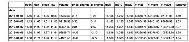
以上显示了前5行数据,要得到数据的更多信息,可以使用.info()方法。它告诉我们该数据一共有20行,索引是时间格式,日期从2015年1月5日到2015年1月30日。总共有14列,并列出了每一列的名称和数据格式,并且没有缺失值。
stock.info()
<
class
'pandas.core.frame.DataFrame'
>
DatetimeIndex
:
20
entries
,
2015
-
01
-
05
to
2015
-
01
-
30
Data columns
(
total
14
columns
)
:
open
20
non
-
null float64
high
20
non
-
null float64
close
20
non
-
null float64
low
20
non
-
null float64
volume
20
non
-
null float64
price
_
change
20
non
-
null float64
p
_
change
20
non
-
null float64
ma5
20
non
-
null float64
ma10
20
non
-
null float64
ma20
20
non
-
null float64
v
_
ma5
20
non
-
null float64
v
_
ma10
20
non
-
null float64
v
_
ma20
20
non
-
null float64
turnover
20
non
-
null float64
dtypes
:
float64
(
14
)
memory
usage
:
2.3
KB
在观察每一列的名称时,我们发现’open’的列名前面似乎与其它列名不太一样,为了更清楚地查看,使用.columns得到该数据所有的列名如下:
stock.columns
Index
([
' open'
,
'high'
,
'close'
,
'low'
,
'volume'
,
'price_change'
,
'p_change'
,
'ma5'
,
'ma10'
,
'ma20'
,
'v_ma5'
,
'v_ma10'
,
'v_ma20'
,
'turnover'
],
dtype
=
'object'
)
于是发现’open’列名前存在多余的空格,我们使用如下方法修正列名。
stock.rename(columns={' open':'open'}, inplace=True)
至此,我们完成了股票数据的导入和清洗工作,接下来将使用可视化的方法来观察这些数据。
数据观察
首先,我们观察数据的列名,其含义对应如下:
这些指标总体可分为两类:
-
价格相关指标
-
当日价格:开盘、收盘价,最高、最低价
-
价格变化:价格变动和涨跌幅
-
均价:5、10、20日均价
-
成交量相关指标
-
成交量
-
换手率:成交量/发行总股数×100%
-
成交量均量:5、10、20日均量
由于这些指标都是随时间变化的,所以让我们先来观察它们的时间序列图。
时间序列图
以时间为横坐标,每日的收盘价为纵坐标,做折线图,可以观察股价随时间的波动情况。这里直接使用DataFrame数据格式自带的做图工具,其优点是能够快速做图,并自动优化图形输出形式。
stock['close'].plot(grid=True)
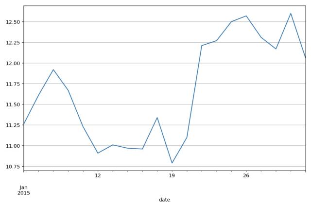
如果我们将每日的开盘、收盘价和最高、最低价以折线的形式绘制在一起,难免显得凌乱,也不便于分析。那么有什么好的方法能够在一张图中显示出这四个指标?答案下面揭晓。
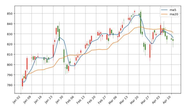
K线图
相传K线图起源于日本德川幕府时代,当时的商人用此图来记录米市的行情和价格波动,后来K线图被引入到股票市场。每天的四项指标数据用如下蜡烛形状的图形来记录,不同的颜色代表涨跌情况。
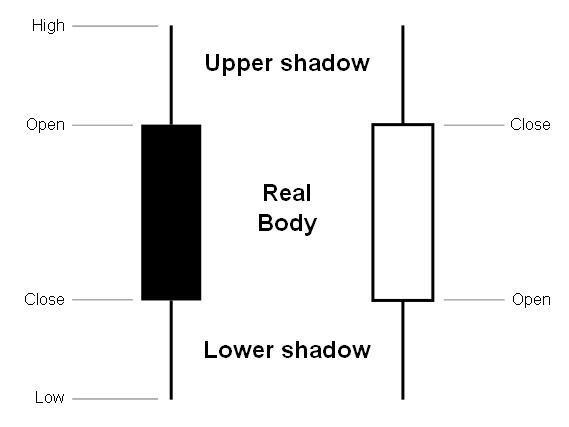
图片来源:http://wiki.mbalib.com/wiki/K线理论
Matplotlib.finance模块提供了绘制K线图的函数candlestick_ohlc(),但如果要绘制比较美观的K线图还是要下点功夫的。下面定义了pandas_candlestick_ohlc()函数来绘制适用于本文数据的K线图,其中大部分代码都是在设置坐标轴的格式。
from
matplotlib
.
finance
import
candlestick_ohlc
from
matplotlib
.
dates
import
DateFormatter
,
WeekdayLocator
,
DayLocator
,
MONDAY
def
pandas_candlestick_ohlc
(
stock_data
,
otherseries
=
None
)
:
# 设置绘图参数,主要是坐标轴
mondays
=
WeekdayLocator
(
MONDAY
)
alldays
=
DayLocator
()
dayFormatter
=
DateFormatter
(
'%d'
)
fig
,
ax
=
plt
.
subplots
()
fig
.
subplots_adjust
(
bottom
=
0.2
)
if
stock_data
.
index
[
-
1
]
-
stock_data
.
index
[
0
]
pd
.
Timedelta
(
'730 days'
)
:
weekFormatter
=
DateFormatter
(
'%b %d'
)
ax
.
xaxis
.
set_major_locator
(
mondays
)
ax
.
xaxis
.
set_minor_locator
(
alldays
)
else
:
weekFormatter
=
DateFormatter
(
'%b %d, %Y'
)
ax
.
xaxis
.
set_major_formatter
(
weekFormatter
)
ax
.
grid
(
True
)
# 创建K线图
stock_array
=
np
.
array
(
stock_data
.
reset_index
()[[
'date'
,
'open'
,
'high'
,
'low'
,
'close'
]])
stock_array
[
:
,
0
]
=
date2num
(
stock_array
[
:
,
0
])
candlestick_ohlc
(
ax
,
stock_array
,
colorup
=
"red"
,
colordown
=
"green"
,
width
=
0.4
)
# 可同时绘制其他折线图
if
otherseries
is
not
None
:
for
each
in
otherseries
:
plt
.
plot
(
stock_data
[
each
],
label
=
each
)
plt
.
legend
()
ax
.
xaxis_date
()
ax
.
autoscale_view
()
plt
.
setp
(
plt
.
gca
().
get_xticklabels
(),
rotation
=
45
,
horizontalalignment
=
'right'
)
plt
.
show
()
pandas_candlestick_ohlc(stock)
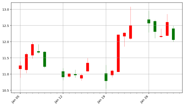
这里红色代表上涨,绿色代表下跌。
相对变化量
股票中关注的不是价格的绝对值,而是相对变化量。有多种方式可以衡量股价的相对值,最简单的方法就是将股价除以初始时的价格。

stock