
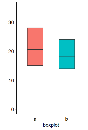
上次提到箱线图等这些类型的图可以展示更多的数据特点,很多人并不推荐使用柱状图。
为了在科研论文中普及箱线图(boxplot)的使用,nature method还专门发文力推。
Visualization samples with box plots
文中详细讲解了箱线图的原理和优点,并与传统柱状图做了对比。柱状图边上标红的
Not recommended
格外显眼!
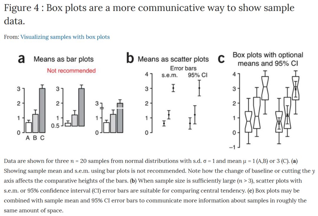
Box plots are a more communicative way to show sample data
另外,不久前刚获得“统计界诺奖”考普斯会长奖(COPSS Presidents' Award)的Hadley Wickham 还曾在2011年专门写过一篇文章
“40 years of boxplots”
总结了boxplot的发展变化。该文中对boxplot的构成介绍如下图:
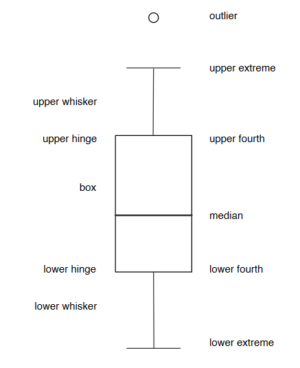
Construction of a boxplot
经过很多年的发展,目前有各种各样画风的箱线图:
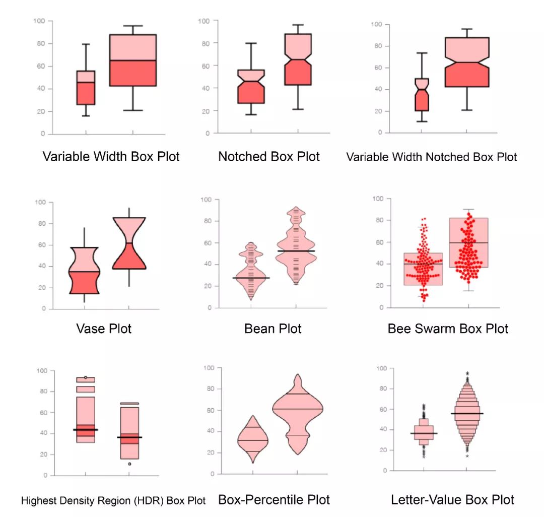
Box Plot Variations(http://datavizcatalogue.com/blog/box-plot-variations/)
其实在22排小提琴那篇帖子里,小提琴图的内部是有个箱线图的,如果你没注意,可以再去回顾一下。
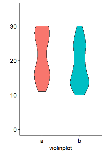
除了箱线图,提琴图、杰特图和蜂窝图这些也是很好的选择。
如下,我简单画出了这几种统计图,供您作图时参考。
首先给出模拟数据:
1
2library(tidyverse)
3library(cowplot)
4set.seed(1234)
5data "a","b"),100),
6 value = sample(10:30,100, replace = TRUE))
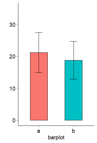
先上柱状图:
 1bar %
 2  group_by(items) %>%
 3  summarise(mean = mean(value),
 4            sd = sd(value),
 5            se = sd/sqrt(length(value))) %>%
 6  ggplot(aes(items, mean, fill = items))+
 7  geom_col(width = 0.5, color = "black")+
 8  ggpubr::theme_pubr(14)+
 9  theme(legend.position = "")+
10  geom_errorbar(aes(ymin=mean - sd, ymax=mean + sd), width=0.2, size = 0.5)+
11  labs(x = "barplot", y = "")+
12  ylim(0,35)
13bar
箱线图:
1box 2  geom_boxplot(width = 0.5)+
3  ggpubr::theme_pubr(14)+
4  theme(legend.position = "")+
5  labs(x = "boxplot", y = "")+
6  ylim(0,35)
7box
提琴图:
1vio 2  geom_violin(width = 0.5)+
3  ggpubr::theme_pubr(14)+
4  theme(legend.position = "")+
5  labs(x = "violinplot", y = "")+
6  ylim(0,35)
7vio
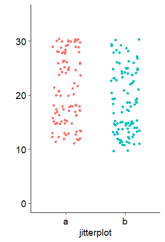
杰特图:
1jit 2  geom_jitter(width = 0.25)+
3  ggpubr::theme_pubr(14)+
4  theme(legend.position = "")+
5  labs(x = "jitterplot", y = "")+
6  ylim(0,35)
7jit
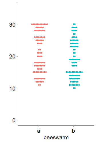
蜂窝图:
1bwm 2  ggbeeswarm::geom_beeswarm(cex = 2)+
3  ggpubr::theme_pubr(14)+
4  theme(legend.position = "")+
5  labs(x = "beeswarm", y = "")+
6  ylim(0,35)
7bwm
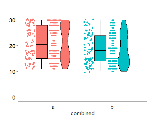
最后,我把除柱状图外的四种图画在一个坐标系上,可对比观察几种图的特点:
 1com  2  geom_boxplot(width = 0.2,position = position_nudge(-0.2), color = "black")+
 3  geom_jitter(aes(as.numeric(items) - 0.4,value, color = items), width = 0.08)+
 4  geom_violin(width = 0.2,position = position_nudge(0.2), color = "black")+
 5  ggbeeswarm::geom_beeswarm(cex = 1)+
 6  ggpubr::theme_pubr(14)+
 7  theme(legend.position = "")+
 8  labs(x = "combined", y = "")+
 9  ylim(0,35)
10com
最后的最后,我们用cowplot来拼个图吧~ 做了share legends的复杂拼图。
1
2legend 3 bar +
4 guides(fill = guide_legend(ncol = 1))+
5 theme(legend.position = "right",
6 legend.box.margin = margin(0, 0, 50, -50))
7)
8
9
10plot_grid(
11 plot_grid(bar, box, jit, bwm, labels = c("a", "b", "c","d"), nrow = 2),
12 plot_grid(
13


