背景介绍
气候变化在美国一直属于争议话题,现任总统特朗普曾指其为“中国制造的骗局”(牵制美国制造业)。我们提供的这个数据集,来自记录地表温度最权威的三家机构—英国的HadCrut、美国的NASA(航空航天局)和NOAA(海洋和大气管理局)。气候变化到底是伪科学,还是客观存在,在探索数据的过程中,你一定会得出自己的结论。
import numpy as np
import pandas as pd
import matplotlib.pyplot as plt
%matplotlib inline
import plotly.offline as py
py.init_notebook_mode(connected=True)
import plotly.graph_objs as go
import plotly.tools as tls
import seaborn as sns
import time
import warnings
warnings.filterwarnings('ignore')
global_temp_country = pd.read_csv('../input/GlobalLandTemperatures/GlobalLandTemperaturesByCountry.csv')
1) 绘制各国平均温度图
In [2]:
#移除重复的国家(殖民地不作为国家)和无温度信息的国家
global_temp_country_clear = global_temp_country[~global_temp_country['Country'].isin(
['Denmark', 'Antarctica', 'France', 'Europe', 'Netherlands',
'United Kingdom', 'Africa', 'South America'])]
global_temp_country_clear = global_temp_country_clear.replace(
['Denmark (Europe)', 'France (Europe)', 'Netherlands (Europe)', 'United Kingdom (Europe)'],
['Denmark', 'France', 'Netherlands', 'United Kingdom'])
#取各国家温度平均值
countries = np.unique(global_temp_country_clear['Country'])
mean_temp = []
for country in countries:
mean_temp.append(global_temp_country_clear[global_temp_country_clear['Country'] ==
country]['AverageTemperature'].mean())
data = [ dict(
type = 'choropleth',
locations = countries,
z = mean_temp,
locationmode = 'country names',
text = countries,
marker = dict(
line = dict(color = 'rgb(0,0,0)', width = 1)),
colorbar = dict(autotick = True, tickprefix = '',
title = '# Average\nTemperature,\n°C')
)
]layout = dict(
title =
'Average land temperature in countries',
geo = dict(
showframe = False,
showocean = True,
oceancolor = 'rgb(0,255,255)',
projection = dict(
type = 'orthographic',
rotation = dict(
lon = 60,
lat = 10),
),
lonaxis = dict(
showgrid = True,
gridcolor = 'rgb(102, 102, 102)'
),
lataxis = dict(
showgrid = True,
gridcolor = 'rgb(102, 102, 102)'
)
),
)fig = dict(data=data, layout=layout)
py.iplot(fig, validate=False, filename='worldmap')
俄罗斯和加拿大都有平均温度较低的值;最低温度出现在格陵兰(在地图上很明显);最热的国家自然在非洲,赤道区域。
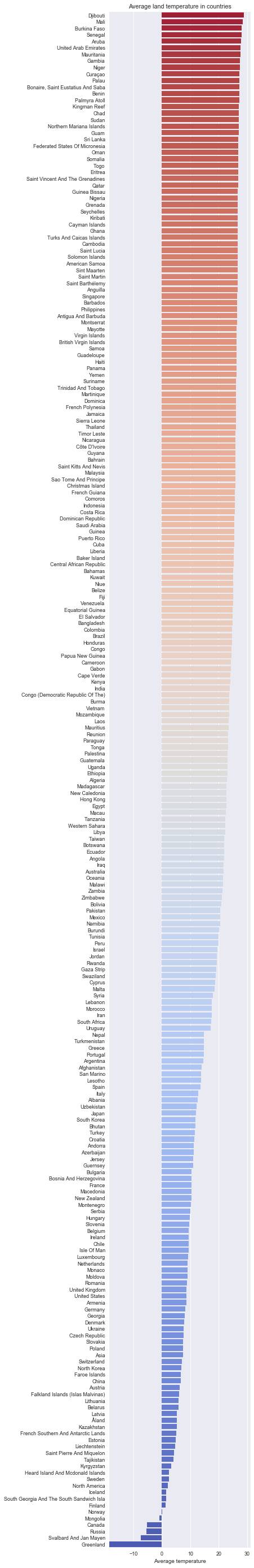
2)按平均温度给国家分类,并绘制水平主图。
In [3]:
mean_temp_bar, countries_bar = (list(x)
for x in zip(*sorted(zip(mean_temp, countries),
                                                             reverse = True)))
sns.set(font_scale=0.9) f, ax = plt.subplots(figsize=(4.5, 50))
colors_cw = sns.color_palette('coolwarm', len(countries))
sns.barplot(mean_temp_bar, countries_bar, palette = colors_cw[::-1])
Text = ax.set(xlabel='Average temperature', title='Average land temperature in countries')
3) 是否存在全球变暖?
我们先读入"GlobalTemperatures.csv"中信息(包含地球每月温度),并在图中展示。
In [5]:
global_temp = pd.read_csv("../input/GlobalLandTemperatures/GlobalTemperatures.csv")#从日期中抽取年years = np.unique(global_temp['dt'].apply(lambda x: x[:4]))mean_temp_world = []mean_temp_world_uncertainty = []for year in years:
    mean_temp_world.append(global_temp[global_temp['dt'].apply(
        lambda x: x[:4]) == year]['LandAverageTemperature'].mean())
    mean_temp_world_uncertainty.append(global_temp[global_temp['dt'].apply(
                lambda x: x[:4]) == year]['LandAverageTemperatureUncertainty'].mean())trace0 = go.Scatter(
    x = years,
    y = np.array(mean_temp_world) + np.array(mean_temp_world_uncertainty),
    fill= None,
    mode='lines',
    name='Uncertainty top',
    line=dict(
        color='rgb(0, 255, 255)',
    ))trace1 = go.Scatter(
    x = years,
    y = np.array(mean_temp_world) - np.array(mean_temp_world_uncertainty),
    fill='tonexty',
    mode='lines',
    name='Uncertainty bot',
    line=dict(
        color='rgb(0, 255, 255)',
    )