数据可视化在数据分析和探索中扮演着不可或缺的角色。它不仅仅是将数据以图形形式呈现,而是通过视觉手段揭示隐藏在数据背后的故事和洞察。无论是发现模式、趋势,还是理解变量之间的关系,优秀的数据可视化都能帮助我们更直观地理解复杂的信息。
Plotly 是一个广受欢迎且功能强大的 Python 库,因其丰富的交互式和动态图表功能而备受推崇。无论是基本的线图和柱状图,还是更复杂的地理空间可视化和三维图表,Plotly 都能轻松应对。其灵活性和可定制性使得数据科学家、分析师和开发者能够创建既美观又实用的可视化。
接下来将分享一些 Plotly 代码示例,帮助理解Plotly 的使用方式和特点。
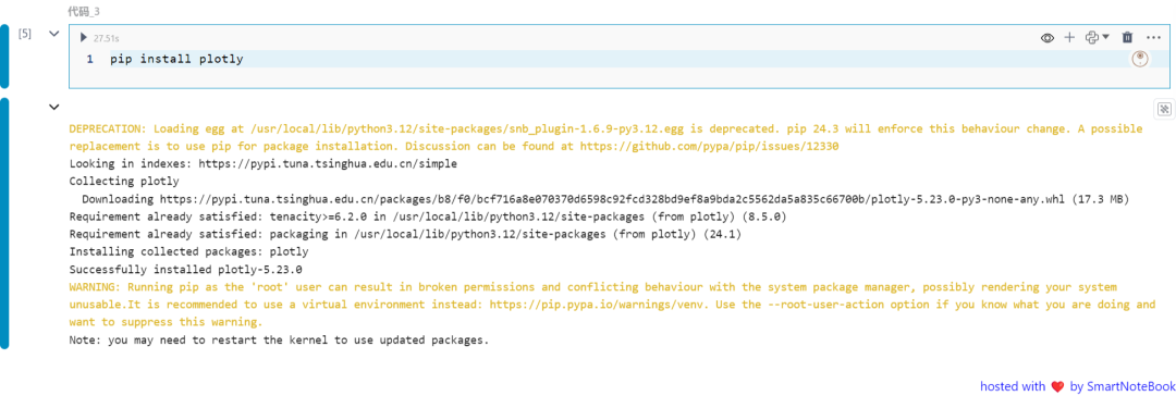
安装Plotly
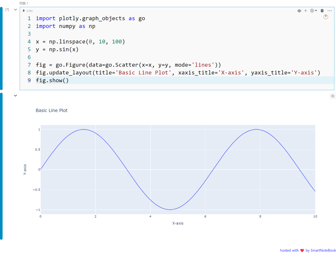
一:基本折线图
这个示例使用 Plotly 创建一个简单的折线图。我们使用 NumPy 生成样本数据,并使用 Plotly 的 go.Scatter 来创建图表。
import plotly.graph_objects as goimport numpy as np
x = np.linspace(0, 10, 100)y = np.sin(x)
fig = go.Figure(data=go.Scatter(x=x, y=y, mode='lines'))fig.update_layout(title='Basic Line Plot', xaxis_title='X-axis', yaxis_title='Y-axis')fig.show()
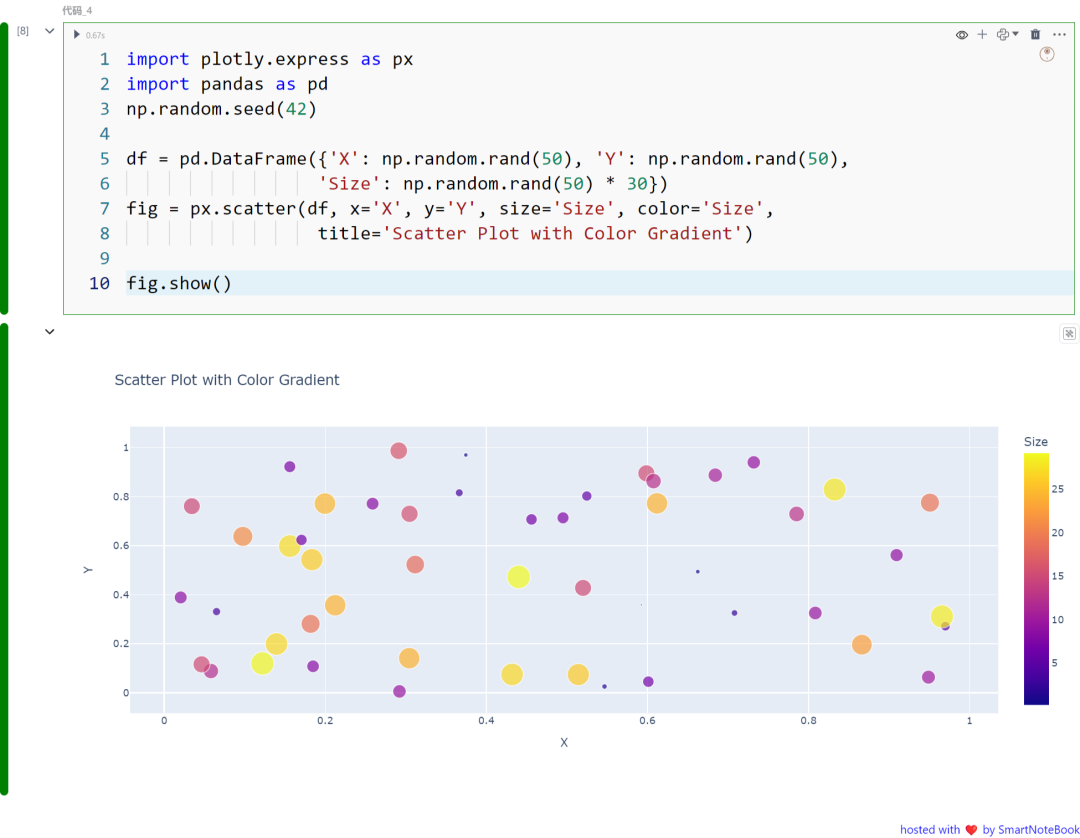
二:彩色散点图
在这个示例中,我们使用 Plotly Express 创建了一个带有颜色渐变的散点图。通过大小和颜色参数展示了第三维度的信息:
import plotly.express as pximport pandas as pdnp.random.seed(42)
df = pd.DataFrame({'X': np.random.rand(50), 'Y': np.random.rand(50),                   'Size': np.random.rand(50) * 30})fig = px.scatter(df, x='X', y='Y', size='Size', color='Size',                   title='Scatter Plot with Color Gradient')
fig.show()
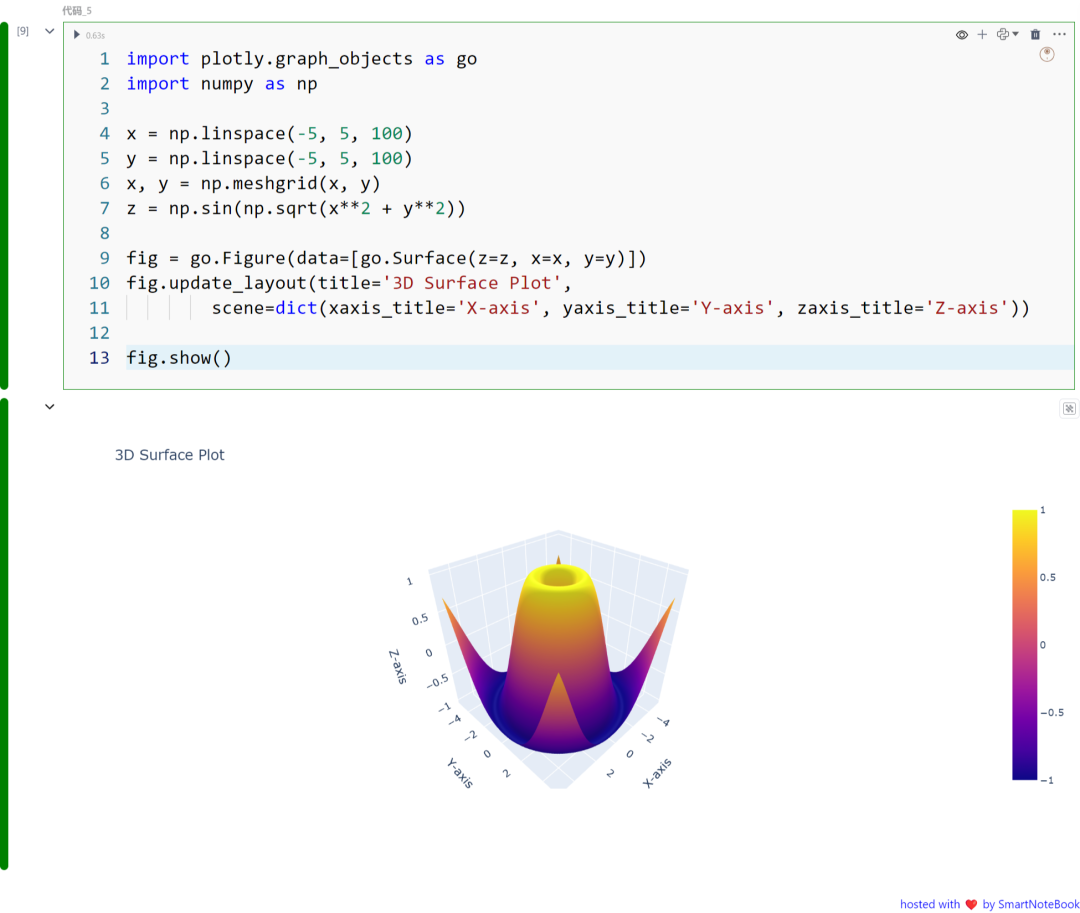
三:3D 表面图
3D 表面图显示了三个变量在三维空间中的关系。数据点被映射到三维坐标系统中的一个表面上,通过表面的形状、高度或颜色展示特征和趋势。
import plotly.graph_objects as goimport numpy as np
x = np.linspace(-5, 5, 100)y = np.linspace(-5, 5, 100)x, y = np.meshgrid(x, y)z = np.sin(np.sqrt(x**2 + y**2))
fig = go.Figure(data=[go.Surface(z=z, x=x, y=y)])fig.update_layout(title='3D Surface Plot',         scene=dict(xaxis_title='X-axis', yaxis_title='Y-axis', zaxis_title='Z-axis'))
fig.show()
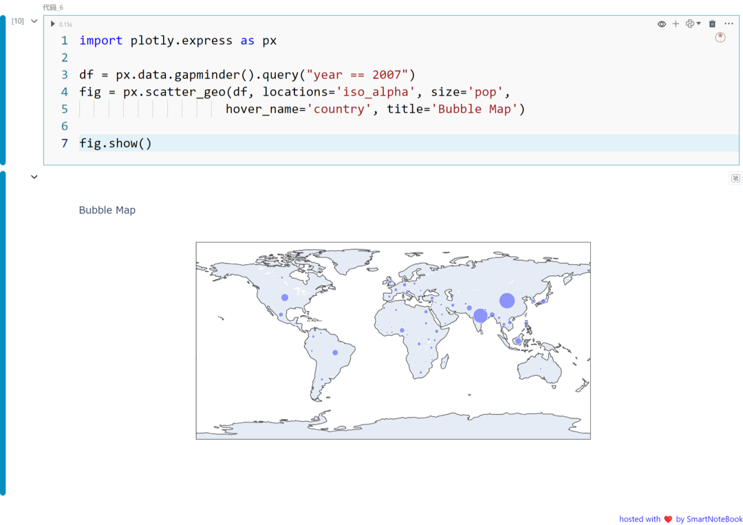
四:气泡图
气泡图是散点图的一种变体,其中每个点的大小反映了数据的第三维度。创建气泡图的示例代码:
import plotly.express as px
df = px.data.gapminder().query("year == 2007")fig = px.scatter_geo(df, locations='iso_alpha', size='pop',                     hover_name='country', title='Bubble Map')
fig.show()
五:小提琴图
小提琴图是一种绘制数值数据的方法。它类似于箱线图,但每侧都有一个旋转的核密度图。创建小提琴图的示例代码:
import plotly.express as px import seaborn as sns
tips = sns.load_dataset( 'tips' ) fig = px.violin(tips, y= 'total_bill' , x= 'day' , box= True ,                 points= "all"


