
截至2月2日24时,累计报告确诊病例17205例,现有重症病例2296例,累计死亡病例361例,累计治愈出院475例。现有疑似病例21558例。
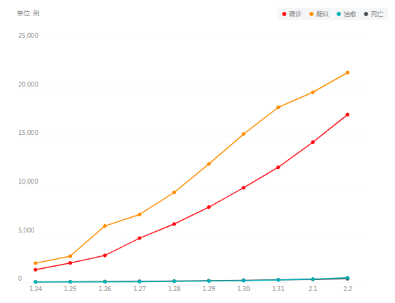
图表来自百度疫情实时大数据报告
在家闲来无事,就用python绘制了全国各省新型冠状病毒疫情状况动态图表,其地图数据来源于
腾讯的疫情实时追踪
展示地图:https://github.com/dongli/china-shapefiles
全国各省的
疫情实时
数据来源于丁香园:
https://github.com/BlankerL/DXY-2019-nCoV-Data/blame/master/DXYArea.csv#
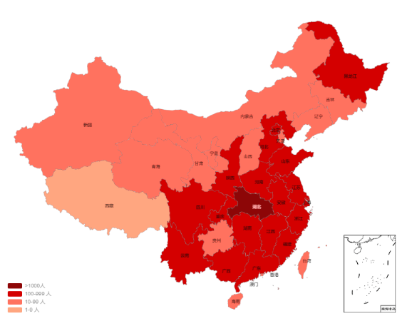
我们使用下载的china.shp和china_nine_dotted_line.shp两个文件,可以绘制如下所示的带南海地区单独展示的中国地图

import pandas as pdimport numpy as npimport seaborn as snsimport matplotlib.pyplot as pltfrom matplotlib.font_manager import FontPropertiesfrom matplotlib.backends.backend_agg import FigureCanvasAggfrom matplotlib.patches import Polygonfrom matplotlib.collections import PatchCollectionfrom mpl_toolkits.basemap import Basemapimport matplotlib.dates as mdatesimport matplotlib as mplplt.rcParams['font.sans-serif']=['SimHei'] plt.rcParams['axes.unicode_minus']=False
%matplotlib inline
fig = plt.figure(figsize=(12,12))ax = fig.gca()
basemap = Basemap(llcrnrlon= 80,llcrnrlat=10,urcrnrlon=150,urcrnrlat=50,projection='poly',lon_0 = 116.65,lat_0 = 40.02,ax = ax)basemap.readshapefile(shapefile = 'china',name = "province", drawbounds=True)basemap.readshapefile('china_nine_dotted_line',name ='section', drawbounds=True)ax.spines['right'].set_color('none')ax.spines['top'].set_color('none')ax.spines['left'].set_color('none')ax.spines['bottom'].set_color('none')
df_mapData = pd.DataFrame(basemap.province_info)df_mapData['OWNER'] = [x.strip('\x00') for x in df_mapData['OWNER']] df_mapData['FCNAME'] =[x.strip('\x00') for x in df_mapData['FCNAME']]
province=np.unique(df_mapData['OWNER'])color = sns.husl_palette(len(province),h=15/360, l=.65, s=1).as_hex()colors = dict(zip(province.tolist(),color))
for info, shape in zip(basemap.province_info, basemap.province): pname = info['OWNER'].strip('\x00') fcname = info['FCNAME'].strip('\x00') if pname != fcname: continue color = colors[pname] poly = Polygon(shape, facecolor=color, edgecolor='k') ax.add_patch(poly)
ax2= fig.add_axes([0.7, 0.25, 0.15, 0.15])basemap2 = Basemap(llcrnrlon= 106.55,llcrnrlat=4.61,urcrnrlon=123.58,urcrnrlat=25.45,projection='poly',lon_0 = 116.65,lat_0 = 40.02
,ax = ax2)basemap2.readshapefile(shapefile = 'china',name = "province", drawbounds=True)basemap2.readshapefile('china_nine_dotted_line',name ='section', drawbounds=True)
for info, shape in zip(basemap2.province_info, basemap2.province): pname = info['OWNER'].strip('\x00') fcname = info['FCNAME'].strip('\x00') if pname != fcname: continue color = colors[pname] poly = Polygon(shape, facecolor=color, edgecolor='k') ax2.add_patch(poly)
from datetime import datetimefrom matplotlib import cm,colors
df_data=pd.read_csv('DXYArea.csv')df_data['updateTime']=[datetime.strptime(d, '%Y-%m-%d %H:%M:%S.%f').date() for d in df_data['updateTime']]
df_data['month']=[d.month for d in df_data['updateTime']]df_data['day']=[d.strftime('%d') for d in df_data['updateTime']]df_data['date']=[d.strftime('%m-%d') for d in df_data['updateTime']]df_data=df_data.drop_duplicates(subset = ['month','day','provinceName']).reset_index()
labels = [ '1-9', '10-99', '100-999', '1000-10000','>10000']n_colors=len(labels)color=[colors.rgb2hex(x) for x in cm.get_cmap( 'YlOrRd',n_colors)(np.linspace(0, 1, n_colors))]color_array=[x for x in cm.get_cmap( 'YlOrRd',n_colors)(np.linspace(0, 1, n_colors))]
df_data['lablels']=pd.cut(df_data['province_confirmedCount'], [0,10,100,1000,10000,100000], labels=labels)df_data['color']=[color[i] for i in df_data['lablels'].values.codes]df_data=df_data.set_index('provinceName',drop=False)
days=[ '24', '25', '26', '27', '28', '29', '30', '31','01', '02', '03']
df_day=df_data[df_data['day']==days[7]][['provinceName','province_confirmedCount','day','month','color','date']]
def draw_ChinaMap(Num_day): ax.clear() df_day=df_data[df_data['day']==days[Num_day]][['provinceName','province_confirmedCount','day','month','color','date']] basemap = Basemap(llcrnrlon= 80,llcrnrlat=10,urcrnrlon=150,urcrnrlat=50,projection='poly',lon_0 = 116.65,lat_0 = 40.02,ax = ax) basemap.readshapefile(shapefile = 'C:/Users/Peter_Zhang/Desktop/Hex_Map/china_shapefiles_master/china', name = "province", drawbounds=True) basemap.readshapefile('C:/Users/Peter_Zhang/Desktop/Hex_Map/china_shapefiles_master/china_nine_dotted_line', name ='section', drawbounds=True) ax.spines['right'].set_color('none') ax.spines['top'].set_color('none') ax.spines['left'].set_color('none') ax.spines['bottom'].set_color('none')
for info, shape in zip(basemap.province_info, basemap.province): pname = info['OWNER'].strip('\x00') fcname = info['FCNAME'].strip('\x00') if pname != fcname: continue color='white' if sum(df_day['provinceName']==pname)>0: color = df_day.loc[pname,'color'] poly = Polygon(shape, facecolor=color, edgecolor='k') ax.add_patch(poly)
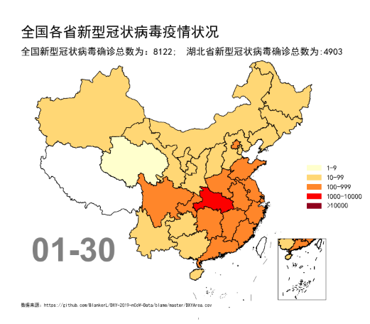
patches = [ mpatches.Patch(color=color_array[i], label=labels[i]) for i in range(n_colors) ] legend=ax.legend(handles=patches, borderaxespad=0,loc="center right",markerscale=1.3, edgecolor='none',facecolor='none',fontsize=15,title='') ax.text(0.02,1.07, s='全国各省新型冠状病毒疫情状况', transform=ax.transAxes, size=30, weight='bold',color='k') ax.text(0.02,1.0, s='全国新型冠状病毒确诊总数为:'+str(df_day['province_confirmedCount'].sum())+'; 湖北省新型冠状病毒确诊总数为:'+ str(df_day.loc['湖北省','province_confirmedCount']), transform=ax.transAxes, size=20,weight='light', color='k') ax.text(0.05,0.22, s=df_day['date'][0], transform=ax.transAxes, size=70, color='gray',weight='bold',family='Arial') ax.text(0.02,0.05, s='数据来源:https://github.com/BlankerL/DXY-2019-nCoV-Data/blame/master/DXYArea.csv', transform=ax.transAxes, size=10, color='k') basemap2 = Basemap(llcrnrlon= 106.55,llcrnrlat=4.61,urcrnrlon=123.58,urcrnrlat=25.45,projection='poly',lon_0 = 116.65,lat_0 = 40.02,ax = ax2) basemap2.readshapefile(shapefile = 'china',name = "province", drawbounds=True) basemap2.readshapefile('china_nine_dotted_line',name ='section', drawbounds=True)
for info, shape in zip(basemap2.province_info, basemap2.province): pname = info['OWNER'].strip('\x00') fcname = info['FCNAME'].strip('\x00') if pname != fcname: continue color='white' if sum(df_day['provinceName']==pname)>0: color = df_day.loc[pname,'color'] poly = Polygon(shape, facecolor=color, edgecolor='k') ax2.add_patch(poly) fig = plt.figure(figsize=(12,12))ax = fig.gca()ax2= fig.add_axes([0.75, 0.2, 0.15, 0.15])plt.subplots_adjust(left=0.12, right=0.98, top=0.85, bottom=0.1) draw_ChinaMap(2)
matplotlib
包和
plotnine
包都可以实现动态数据的可视化演示。其中,在
matplotlib
包中,函数
FuncAnimation(fig,func,frames,init_func,interval,blit)
是绘制动图的主要函数,其参数如下:
(1) fig
为绘制动图的画布名称;
(2) func
为自定义动画函数
update()
,比如
11-4-1
的
draw_barchart(year)
和
11-4-2
的
draw_areachart(Num_Date)
;
(3) frames
为动画长度,一次循环包含的帧数,在函数运行时,其值会传递给函数
update(n)
的形参
“n”
;
(4) init_func
为自定义开始帧,即初始化函数,可省略;
(5) interval
为更新频率,以
ms
计算;
(5) blit
为选择更新所有点,还是仅更新产生变化的点。应选择
True
,但
mac
用户请选择
False
,否则无法显示。
plotnine
包的
PlotnineAnimation()
函数也可以绘制动态图表,但是对于不断更新的数据绘制动态图表时,动态图表生成速度很慢。
import matplotlib.animation as animationfrom IPython.display import HTMLfig = plt.figure(figsize=(12,12))ax = fig.gca()ax2= fig.add_axes([0.75, 0.2, 0.15, 0.15])plt.subplots_adjust(left=0.12, right=0.98, top=0.85, bottom=0.1) animator = animation.FuncAnimation(fig, draw_ChinaMap, frames=np.arange(0,len(days),1),interval=1000)HTML(animator.to_jshtml())
ps:源代码与数据的Github下载地址:
https://github.com/EasyChart/Beautiful-Visualization-with-python/tree/master


