之前介绍了《
joyplot:一种波涛汹涌,哦不对,是山峰叠峦的可视化方式
》,最近有人问怎么和ggtree搞基,像这样的问题,大家应该不陌生,因为我在《
align genomic features with phylogenetic tree
》一文中已经直播了和ggbio的搞基过程。

我在《
how to bug author
》一文中,就强调了在社区里问问题的重要性,想要ggjoy和ggtree搞基的问题,就没有直接问我,而是在同性交友网站stackoverflow上问,在我回答之前,就已经有非常好的解答贴出来了,这就是社区的好处!公开交流比私下邮件好多了。
问题
Is it possible to add a joyplot as a panel to a plot that includes a ggtree, as shown in these examples? Examples of joyplots are here.
I realize that I could manually put the species labels for the joyplot in the same order as the tree tip labels, but I am looking for an automatic solution. I would like to associate the joyplot rows with the tips of the trees automatically, akin to how the boxplot data are associated with the tip labels.
I think that Guangchuang Yu’s examples at the above link provide suitable data:
require(ggtree)
require(ggstance)# generate tree
tr 30)# create simple ggtree object with tip labels
p 0.02)
# Generate categorical data for each "species"
d1 "GZ", "HK", "CZ"), 30, replace=TRUE))
#Plot the categorical data as colored points on the tree tips
p1 # Generate distribution of points for each species
d4 = data.frame(id=rep(tr$tip.label, each=20),
val=as.vector(sapply(1:30, function(i)
rnorm(20, mean=i)))
)
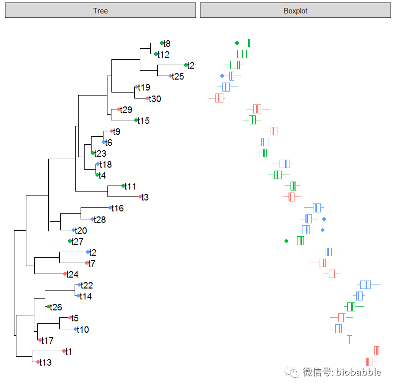
# Create panel with boxplot of the d4 data
p4 "Boxplot", data=d4, geom_boxploth,
mapping = aes(x=val, group=label, color=location))
plot(p4)
This produces the plot below:
Is it possible to create a joyplot in place of the boxplot?
Here is code for a quick joyplot of the demo dataset d4 above:
require(ggjoy)

ggplot(d4, aes(x = val, y = id)) +
geom_joy(scale = 2


