我一般不转贴,除非是像这种使用我的软件做出了吸引我眼球的东西,那么还是要分享一下的。
Note that for ggimage you’ll have to include BioC repo for dependencies, and, if using devtools, setRepositories(ind=1:2).
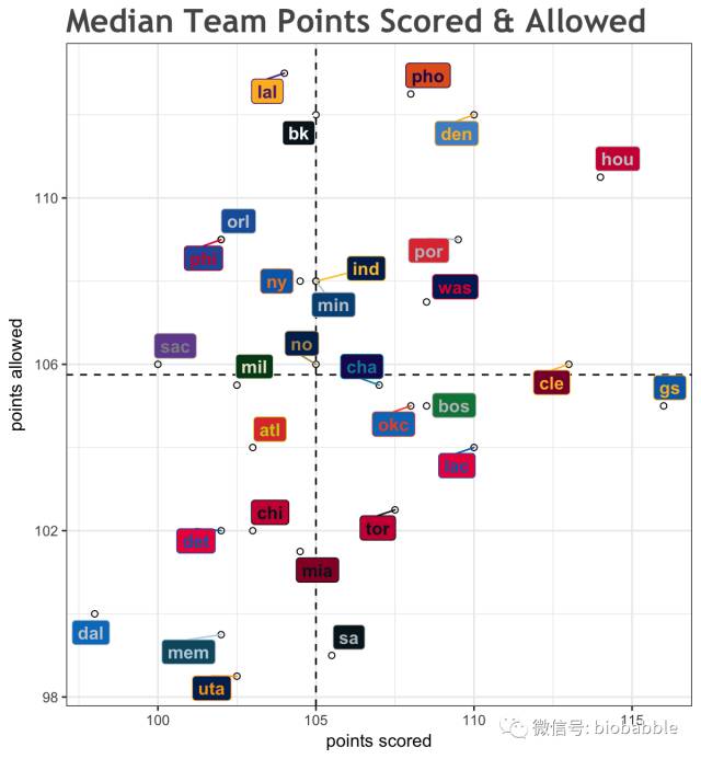
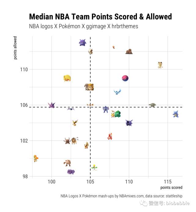
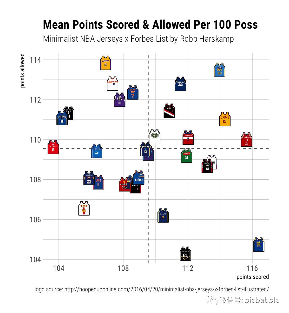
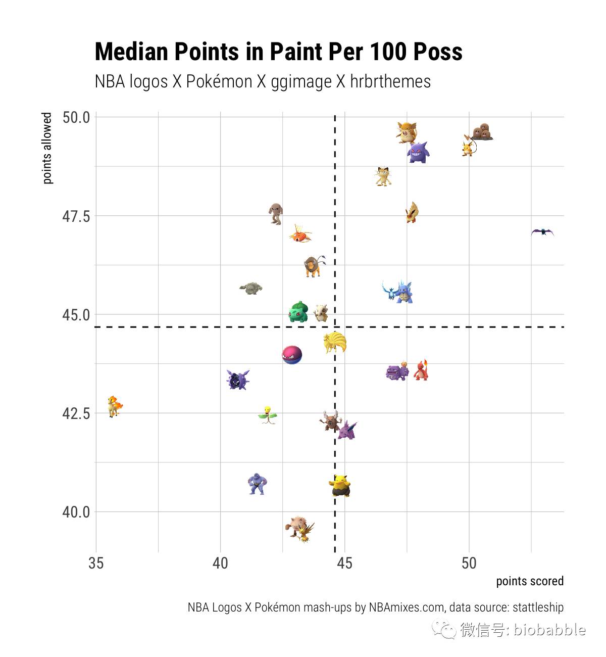
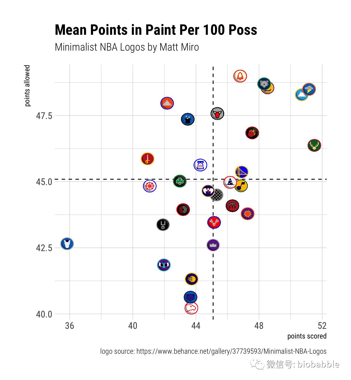
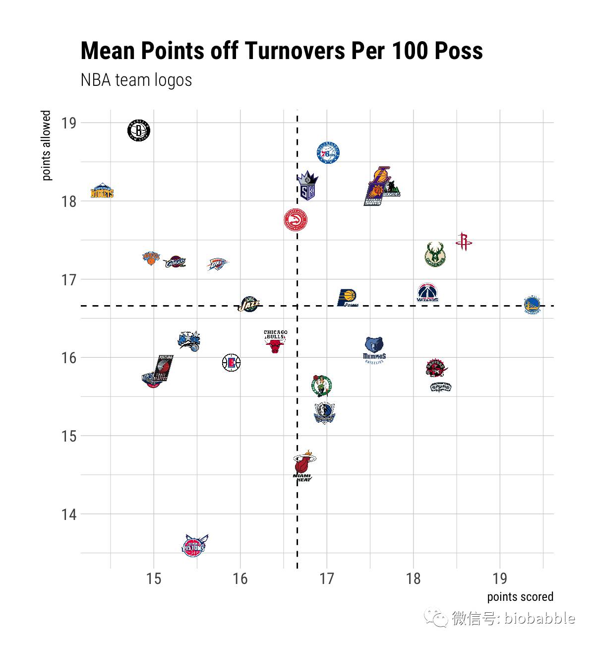
The summary statistics are for each of the NBA teams during the 2016-17 regular season, through 2017-04-12 acquired through stattleshipR, the R wrapper for the Stattleship API.
Team vs Opponent Avg Points by Type
Use ggrepel for better formatting of text labels.
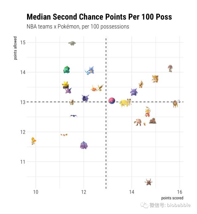
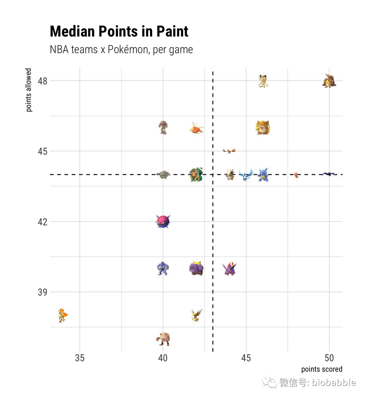
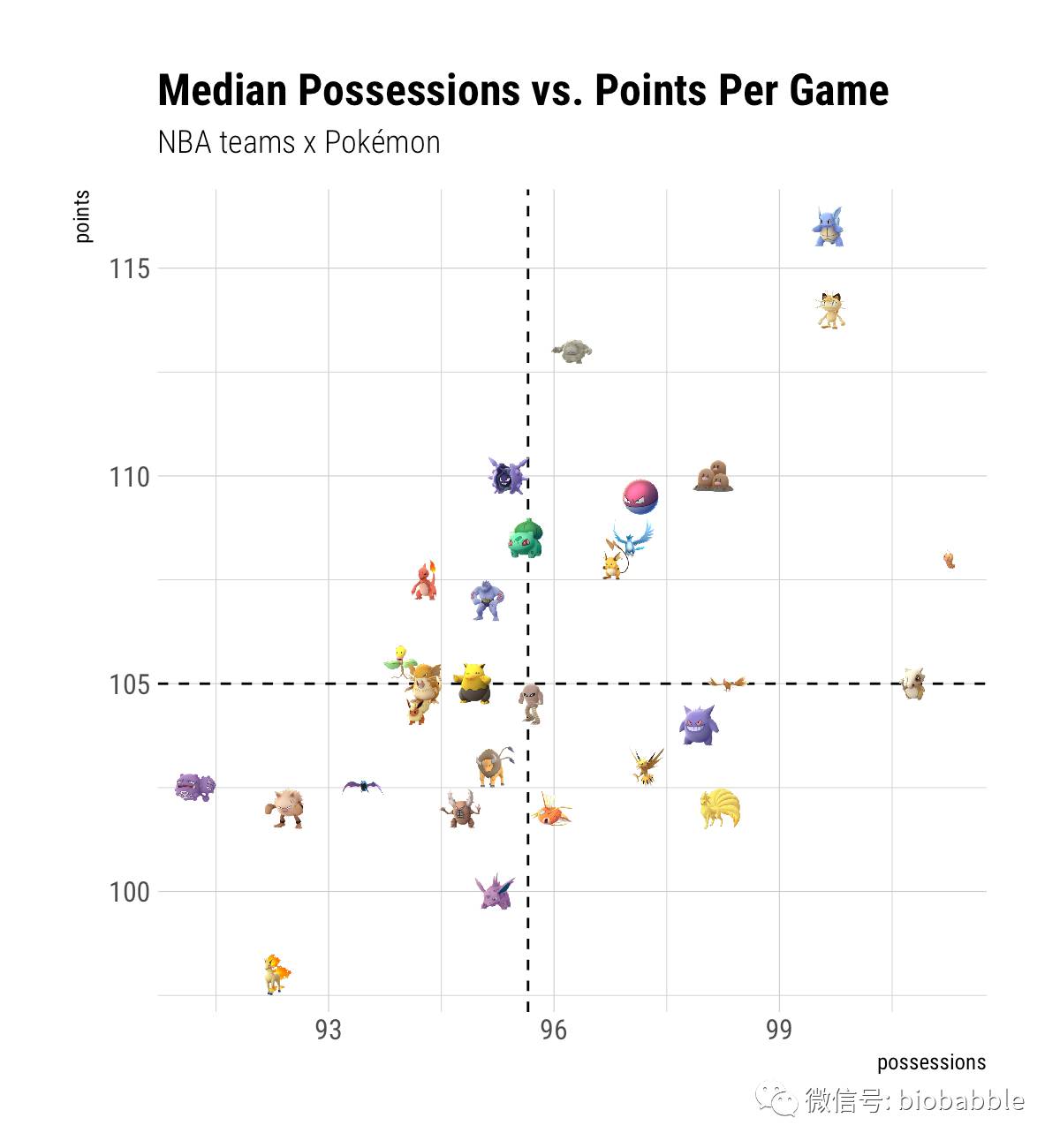
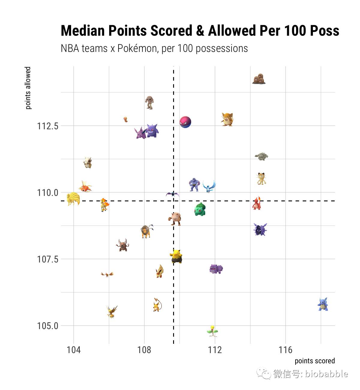
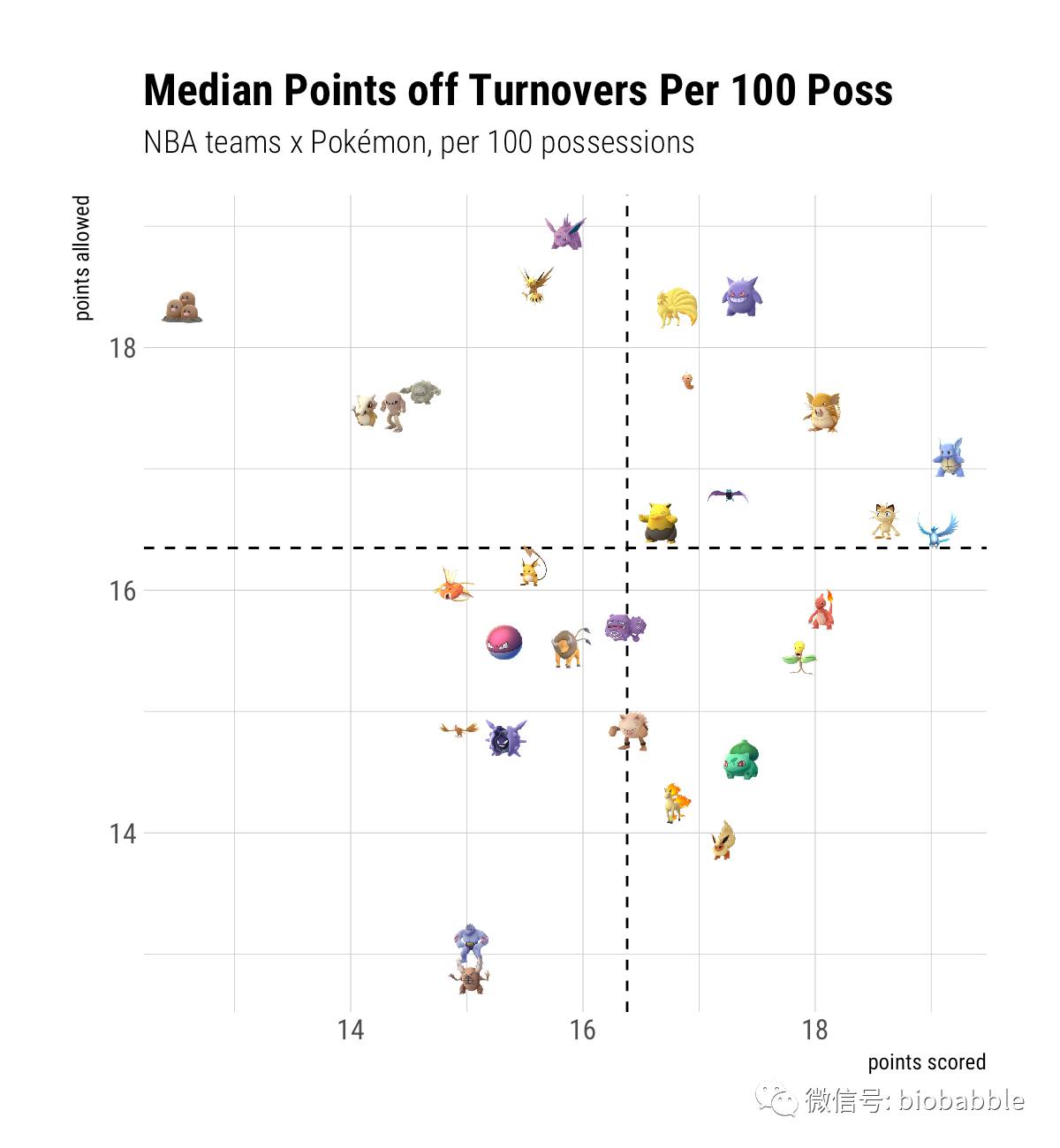
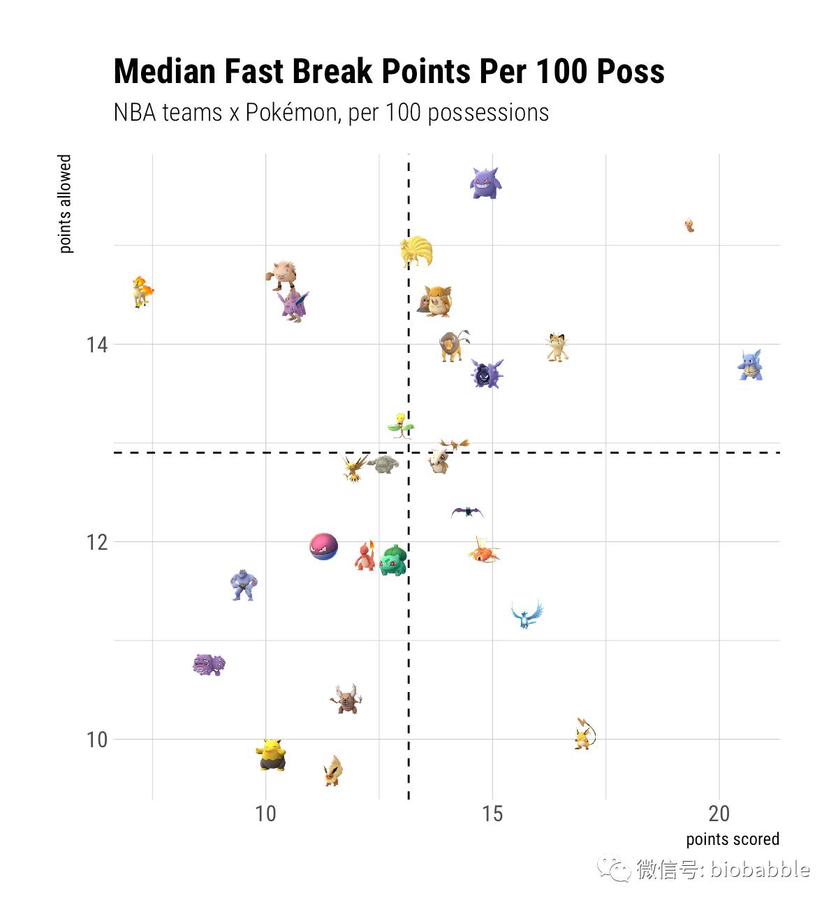
Now with Pokémon
In ggimage, a fun little package by Guangchuang YU, you can map and use images in the gggplot2 graphic system. It comes with a few already-defined geometries, including geom_pokemon(), which inspired this whole endeavor.
Because I don’t actually know the Pokemon (sorry), I’ve matched each team to its NBAmixes.com NBA Logos X Pokémon mashups counterpart as re-imagined by artist Micah Coles to the best of my ability. Sometimes the pokelogos weren’t of an actual Pokémon creature thing (sorry, I’m trying) or were of a Pokémon that didn’t have an image counterpart in the package, in which case, I just kind of guessed. You can see the team logos in their full-sized glory in Micah’s Pokémon NBA imgur gallery (plus, a couple “throwback” extras– e.g. Onix Sonics).
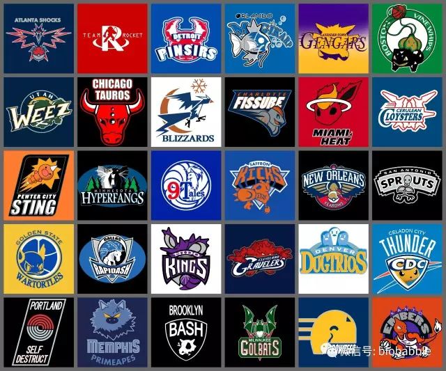
NBA Teams using 1st generation Pokemon by Micah Coles
To make things a bit more visually palatable, I’m also going to use one of Bob Rudis’ “opinionated, typographic-centric ggplot2 themes” from the hrbrthemes package.
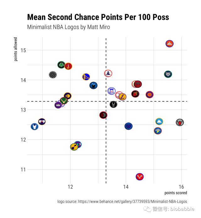
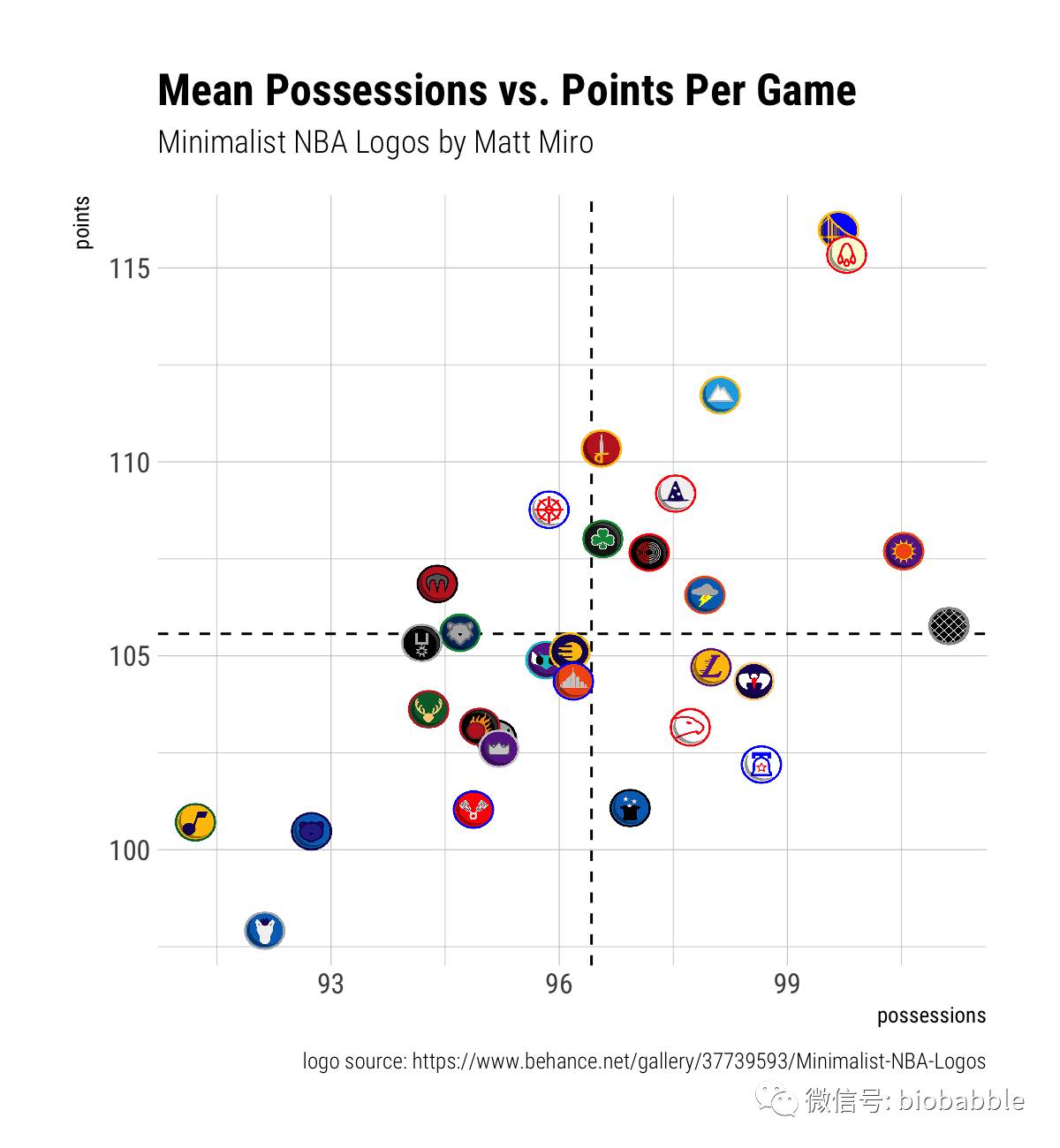
Geometries of our own?
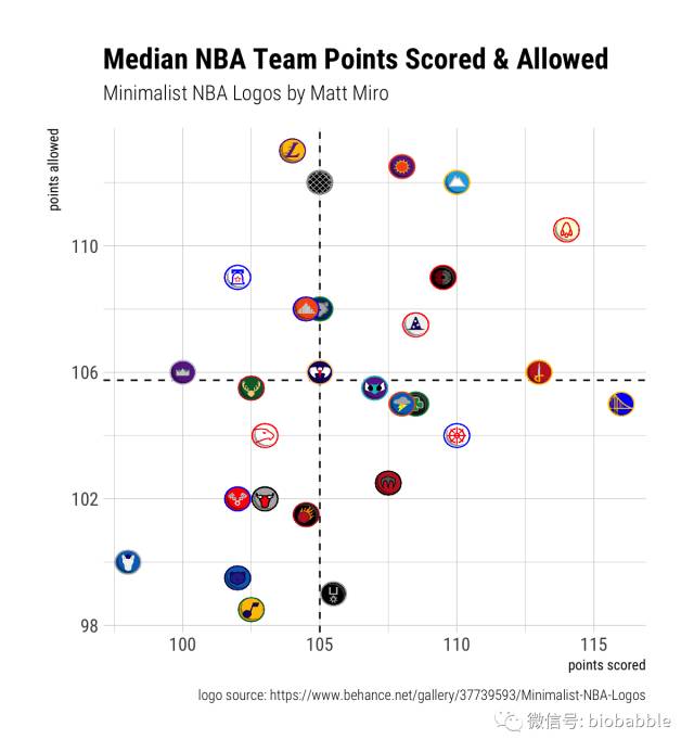
We could use any geometry we like, really. And, given the fact that the Pokémon matches are a little vague, we might try for something that actually makes some semantic sense. Let’s try using some super-cool-looking Minimalist NBA Logos made by Matt Miro.
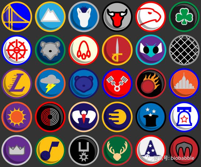
Minimalized logo/icon work for every NBA team by Matt Miro
Possession-Adjusted Averages
Let’s try another geom
Artist Robb Harskamp did a series of illustrations for Hooped Up NBA team jerseys that:
combin[ed] all 30 team jerseys with advertising from some of the largest corporate entities in the same city or state as the team.
Since we’re using ggimage, we can just use a path to the images (which I shrunk down from their original size) to use the jerseys as “shapes” for our plot by defining a function for the new geometry.
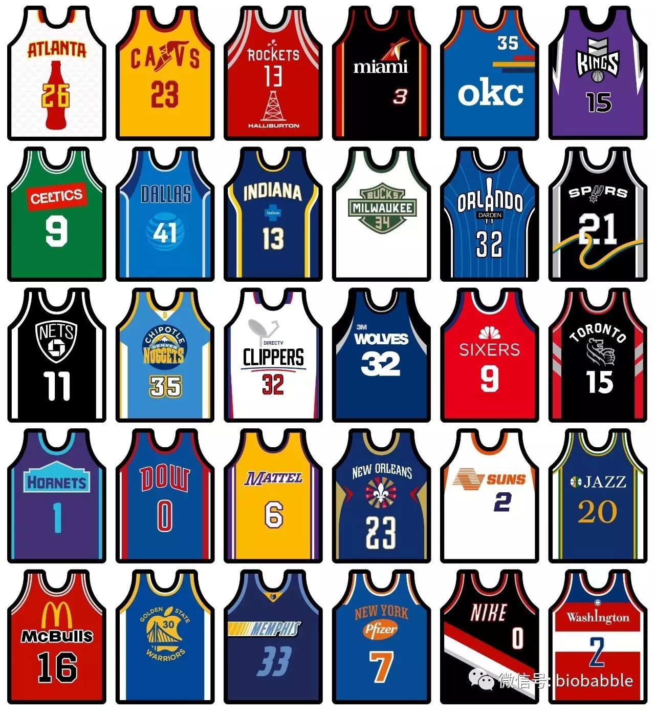
Minimalist NBA Jerseys x Forbes List by Robb Harskamp
Regular NBA logos?
Why not? In reality, there are many reasons not to use anything of the sort as far as visualization best practices go. However, we might as well go for it, since we’ve gone this far down the rabbit hole…
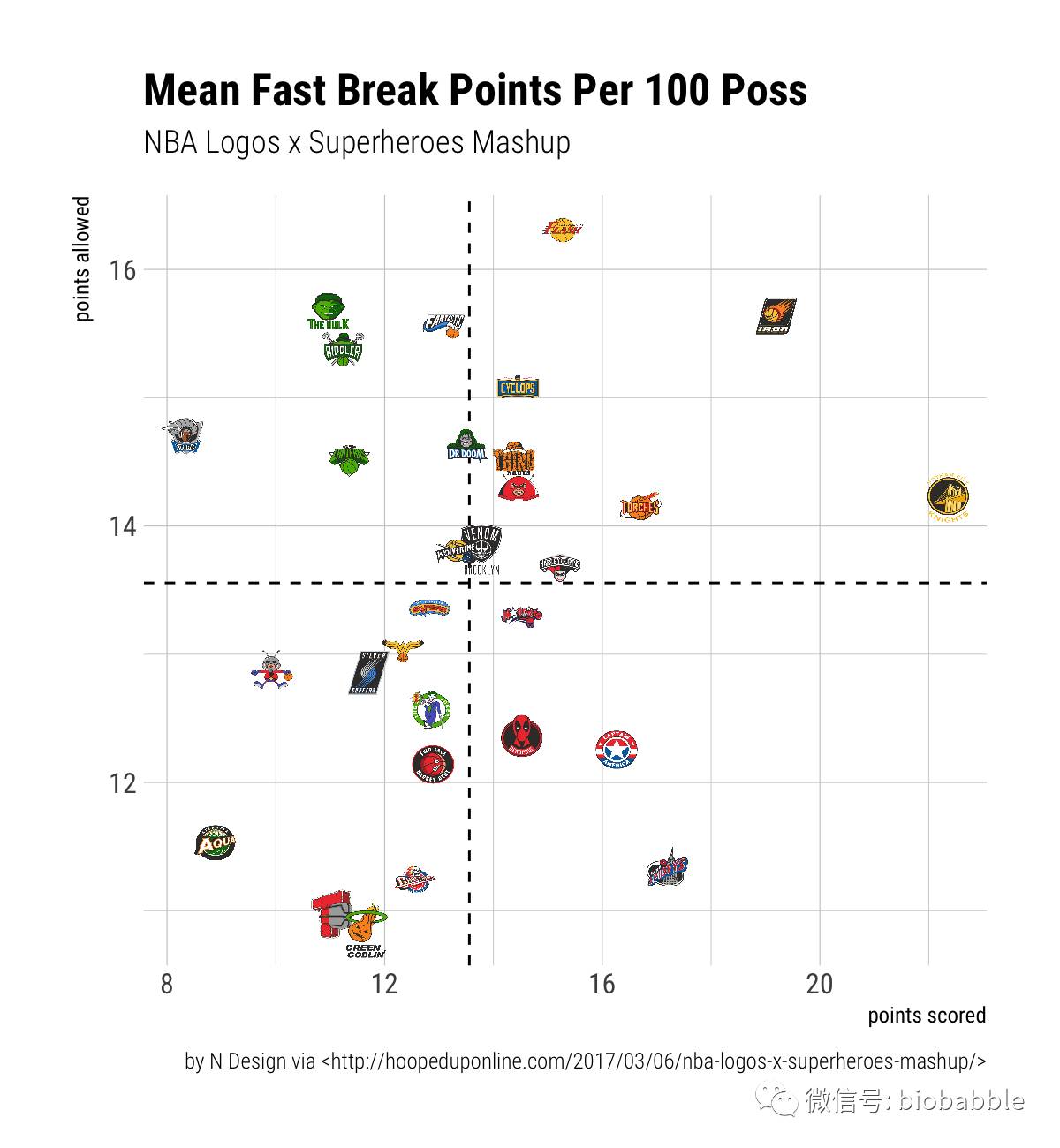
Superhero mashups?
These were tricky for me to figure out! I might actually be wrong about some of them, but they’re just so cool-looking…
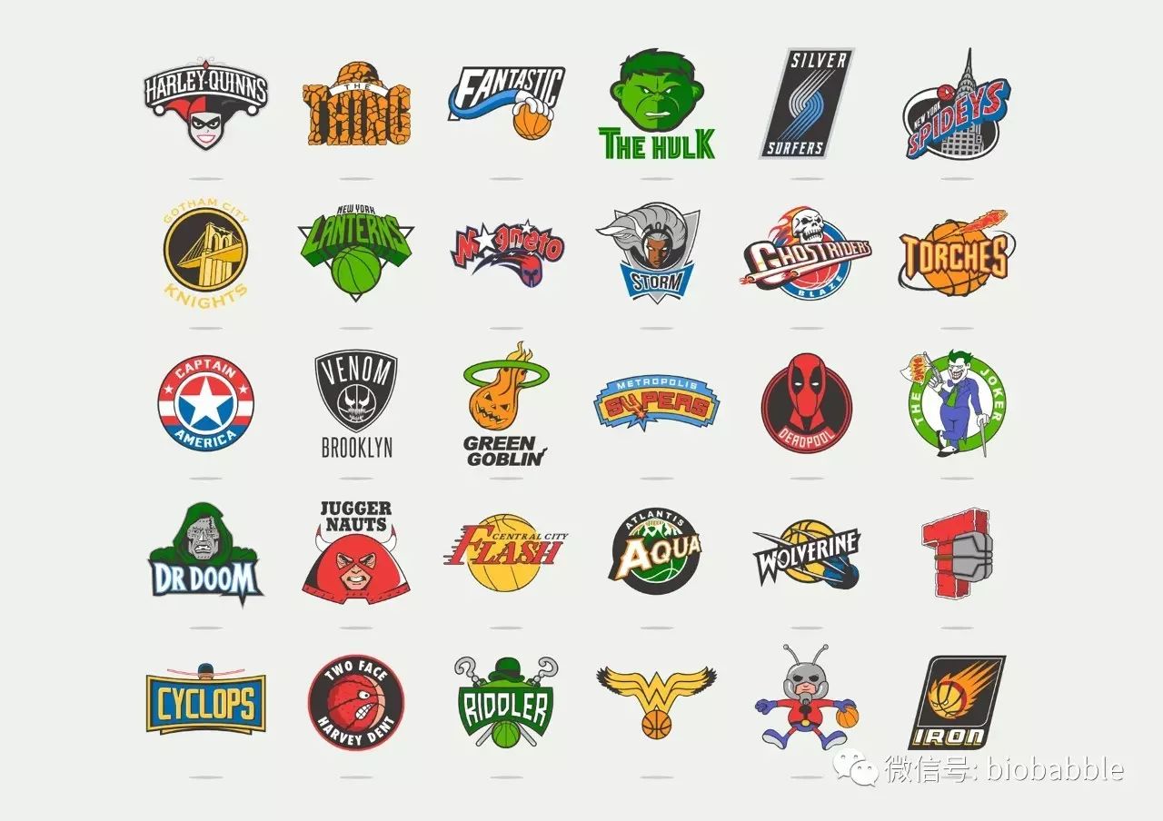
NBA x Superhero Mashup
The illustrations are from another Hooped Up piece, NBA Logos x Superheroes Mashup, done by artist(s) at N Design.