今天这篇博文为大家分享如何用ggplot2绘制漂亮的直方图(如封面所示)
数据准备
set.seed(070511)
d
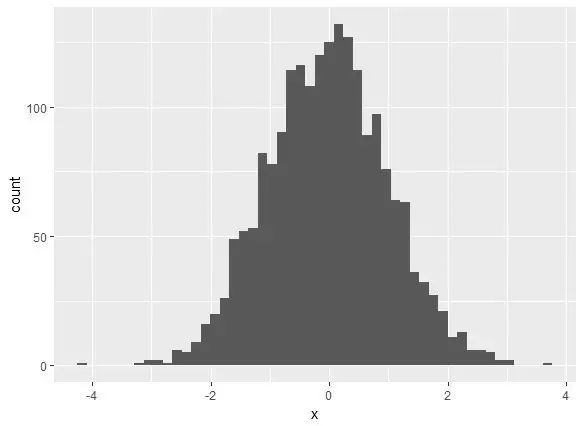
基本直方图
library(ggplot2)
ggplot(d, aes(x)) +
geom_histogram(bins = 50)
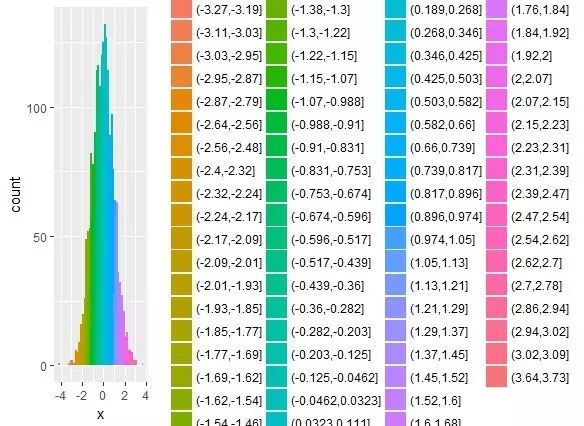
通过分组添加颜色
ggplot(d, aes(x, fill = cut(x, 100))) +
geom_histogram(bins = 50)
去掉图列
ggplot(d, aes(x, fill = cut(x, 100))) +
geom_histogram(bins = 50,show.legend = FALSE)
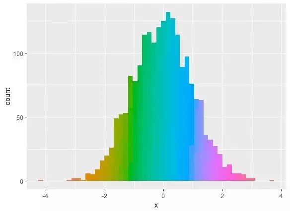
调整色调
ggplot(d, aes(x, fill = cut(x, 100))) +
geom_histogram(show.legend = FALSE) +
scale_fill_discrete(h = c(250, 10))
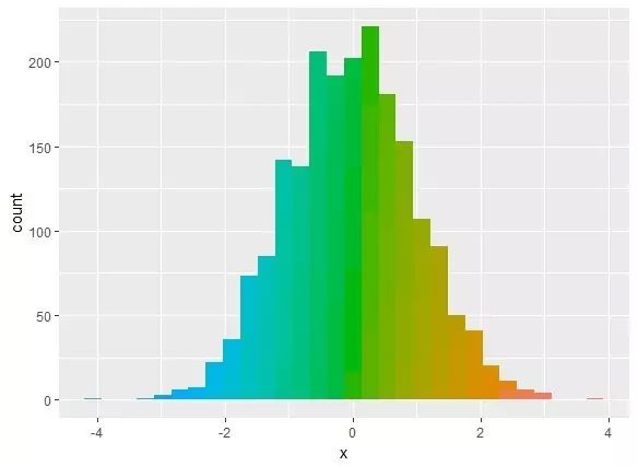
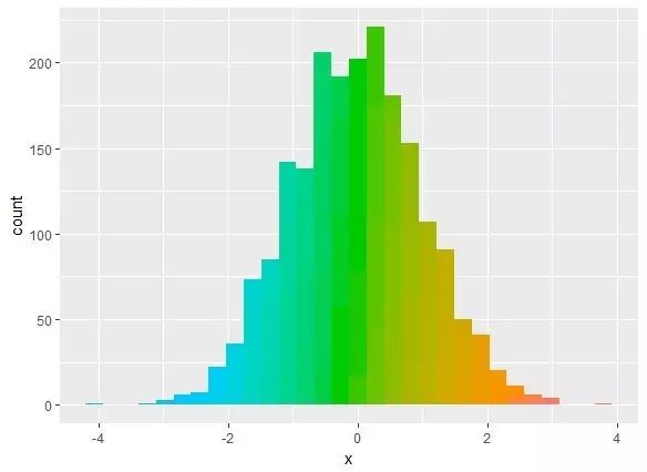
调整饱和度和亮度
ggplot(d, aes(x, fill = cut(x, 100))) +
geom_histogram(show.legend = FALSE) +
scale_fill_discrete(h = c(240, 10), c = 120, l = 70)
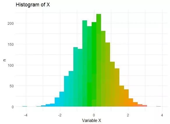
设置主题
ggplot(d, aes(x, fill = cut(x, 100))) +
geom_histogram(show.legend = FALSE) +
scale_fill_discrete(h = c(240, 10), c = 120, l = 70) +
theme_minimal() +
labs(x = "Variable X", y = "n") +
ggtitle("Histogram of X")
为封面绘图
p geom_histogram(show.legend = FALSE,bins = 50) +
theme_minimal() +
labs(x = "Variable X", y = "n") +
ggtitle("Histogram of X",subtitle = R.version.string)+
labs(caption = "zsrnog")
p + scale_fill_discrete(h = c(180, 360), c = 150, l = 80)+
theme(panel.background = element_rect(fill='black'),
#panel.border = element_rect(fill='black'),
plot.background = element_rect(fill='black'),
plot.title =element_text(colour = "blue"),
plot.subtitle=element_text(colour = "blue"),
plot.caption=element_text(colour = "blue"),
axis.line = element_line(colour = "grey80"),
axis.text = element_text(colour = "blue"),
axis.title = element_text(colour = "grey80"))


