
1.折线图
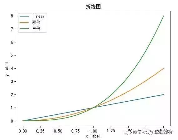
在绘制折线图时,如果你的数据很小,图表的线条有点折,当你数据集比较大时候,比如超过100个点,则会呈现相对平滑的曲线。
在这里,我们使用三个plt.plot绘制了,不同斜率(1,2和3)的三条线。
import numpy as np
import matplotlib.pyplot as plt
cc= np.linspace(0,2,100)
plt.rcParams['font.sans-serif'] = ['SimHei']
plt.plot(cc,cc,label='linear')
plt.plot(cc,cc**2,label='两倍')
plt.plot(cc,cc**3,label='三倍')
plt.xlabel('x label')
plt.ylabel('y label')
plt.title("折线图")
plt.legend()
plt.show()
cc = np.linspace(0,2,100)
plt.plot(cc,cc,label ='linear')
plt.plot(cc,cc ** 2,label ='quadratic')
plt.plot(cc,cc ** 3,label ='cubic')
plt.xlabel('x label')
plt.ylabel('y label')
结果显示,如下:
注意为了显示中文,我们
plt.rcParams
属性设置了中文字体,不然不能正确显示中文title的。
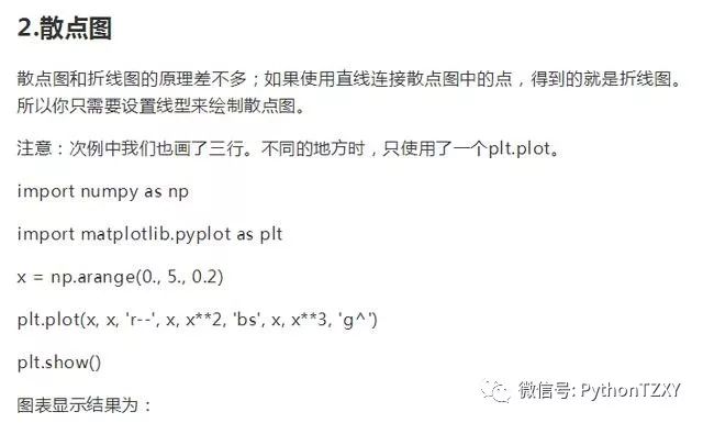
3.直方图
直方图也是一种常用的简单图表,本例中我们在同一张图片中绘制两个概率直方图。
import numpy as np
import matplotlib.pyplot as plt
np.random.seed(19680801)
mu1, sigma1 = 100, 15
mu2, sigma2 = 80, 15
x1 = mu1 + sigma1 * np.random.randn(10000)
x2 = mu2 + sigma2 * np.random.randn(10000)
n1, bins1, patches1 = plt.hist(x1, 50, density=True, facecolor='g', alpha=1)
n2, bins2, patches2 = plt.hist(x2, 50, density=True, facecolor='r', alpha=0.2)
plt.rcParams['font.sans-serif'] = ['SimHei']
plt.xlabel('智商')
plt.ylabel('置信度')
plt.title('IQ直方图')
plt.text(110, .025, r'$mu=100, sigma=15$')
plt.text(50, .025, r'$mu=80, sigma=15$')
# 设置坐标范围
plt.axis([40, 160, 0, 0.03])
plt.grid(True)
plt.show()
显示效果为:

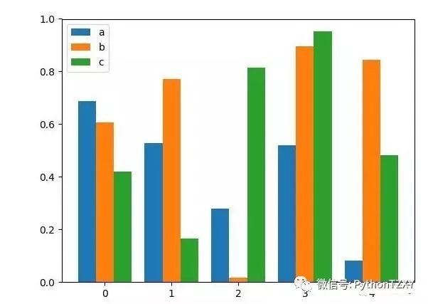
4.条形图
我们要介绍的第四种,图表类型是条形图,我们这儿引入稍微比较复杂的条形图。
4.1平行条形图
此例中,我们引入三组(a,b,c)5个随机数(0~1),并用条形图打印出来,做比较
import numpy as np
import matplotlib.pyplot as plt
size = 5
a = np.random.random(size)
b = np.random.random(size)
c = np.random.random(size)
x = np.arange(size)
total_width, n = 0.8, 3
width = total_width / n
# redraw the coordinates of x
x = x - (total_width - width) / 2
# here is the offset
plt.bar(x, a, width=width, label='a')
plt.bar(x + width, b, width=width, label='b')
plt.bar(x + 2 * width, c, width=width, label='c')
plt.legend()
plt.show()
显示效果为:
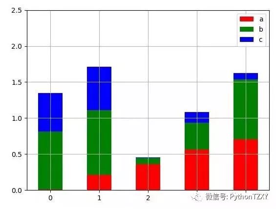
4.2堆积条形图
数据同上,不过条形plot的时候,用的相互的值大小差异(水平方向),而不是条柱平行对比。
import numpy as np
import matplotlib.pyplot as plt
size = 5
a = np.random.random(size)
b = np.random.random(size)
c = np.random.random(size)
x = np.arange(size)
plt.bar(x, a, width=0.5, label='a',fc='r')
plt.bar(x, b, bottom=a, width=0.5, label='b', fc='g')
plt.bar(x, c, bottom=a+b, width=0.5, label='c', fc='b')
plt.ylim(0, 2.5)
plt.legend()
plt.grid(True)
plt.show()
显示效果为:
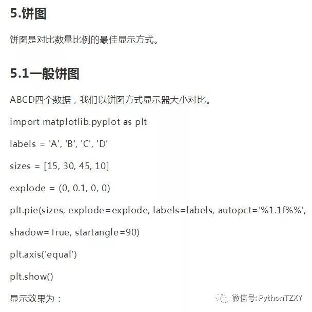
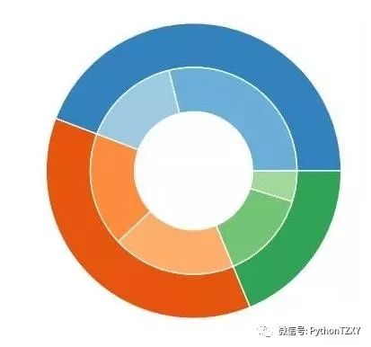
5.2嵌套饼图
import numpy as np
import matplotlib.pyplot as plt
size = 0.3
vals = np.array([[60., 32.], [37., 40.], [29., 10.]])
cmap = plt.get_cmap("tab20c")
outer_colors = cmap(np.arange(3)*4)
inner_colors = cmap(np.array([1, 2, 5, 6, 9, 10]))
print(vals.sum(axis=1))
# [92. 77. 39.]
plt.pie(vals.sum(axis=1), radius=1, colors=outer_colors,
wedgeprops=dict(width=size, edgecolor='w'))
print(vals.flatten())
# [60. 32. 37. 40. 29. 10.]
plt.pie(vals.flatten(), radius=1-size, colors=inner_colors,
wedgeprops=dict(width=size, edgecolor='w'))
# equal makes it a perfect circle
plt.axis('equal')
plt.show()
显示效果为:
5.3极轴饼图


