
上周的小项目作业是“爬取 Expatistan 网站上的各国生活成本数据并绘制一幅世界地图进行展示”。
1.
数据源:
Expatistan
[1]
。
2.
世界地图的底图数据:
tmap
[2]
包内有一个 World 数据,调用方法:
data("World", package = "tmap")
1.
爬取数据的 R 包,可以用
rvest
[3]
;
Tips: 可能需要到的函数:read_html,html_nodes,html_table;
1.
绘制地图的 R 包,ggplot + sf (本周有教程),用 tmap 也行。
2.
拓展作业:可以再绘制一些其他的图来展示各国生活成本的排名。
参考结果
爬取数据
这种表格数据用 rvest 包爬取非常容易:
library(tidyverse)library(hrbrthemes)library(rvest)# 把网址保存成一个名为 url 的变量:url # 使用 read_html() 函数读取解析网页文件,保存为名为 html 的变量:html
解析得到的 html 是个
xml_document
,这是一种结构性的数据,我们可以使用
html_nodes()
函数从中找寻某个节点,通常找寻的办法有两个:CSS 和 XPath,都可以用,首先我们用 xpath:
html %>% html_nodes(xpath = '//*[@id="content"]/div/div[1]/div[1]/table')
## {xml_nodeset (1)}## [1] \n\n\n ...table 标签对应的就是我们想要爬取数据的这个表格。那么这个 xpath 从哪来的呢?
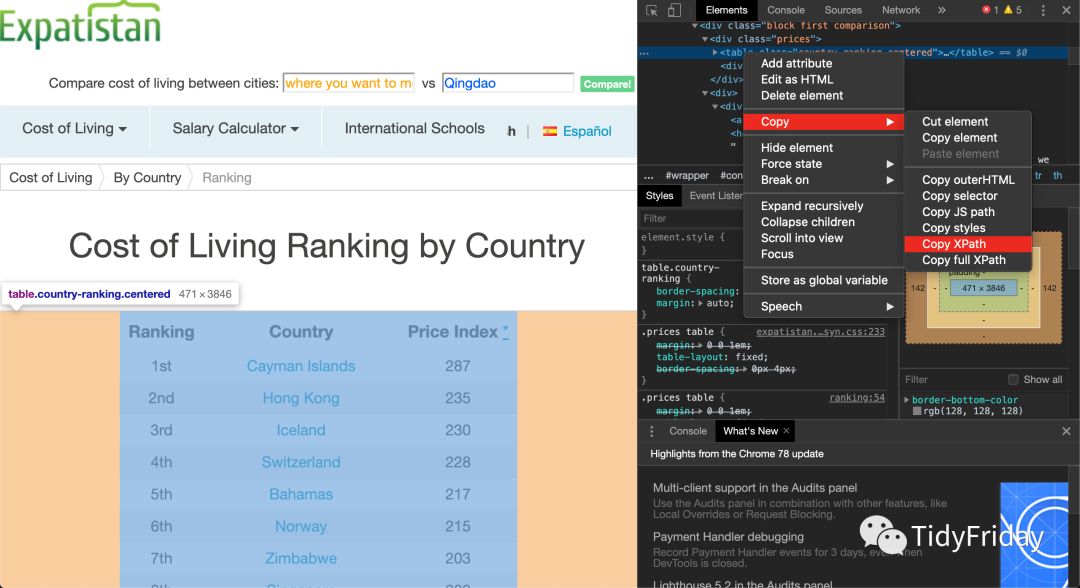
或者我们可以用 CSS 选择:
html %>% html_nodes(css = '#content > div > div.block.first.comparison > div.prices > table')
## {xml_nodeset (1)}## [1]
\n\n\n ...CSS 选择器是这么来的
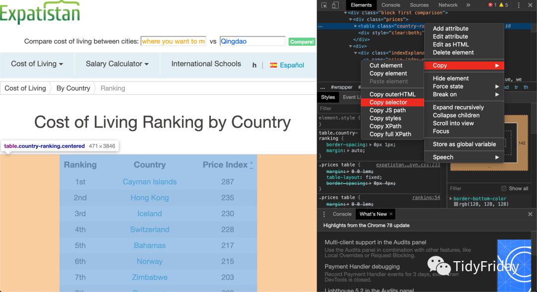
两种方式的效果是一样的,至于选择哪种就看你的偏好了。
得到了 table 所在的节点之后呢,我们可以使用 html_table() 函数解析表格,解析之后再转化为 tibble 数据框并赋值给 df 变量:
html %>% html_nodes(xpath = '//*[@id="content"]/div/div[1]/div[1]/table') %>% html_table() %>% .[[1]] %>% as_tibble() -> df
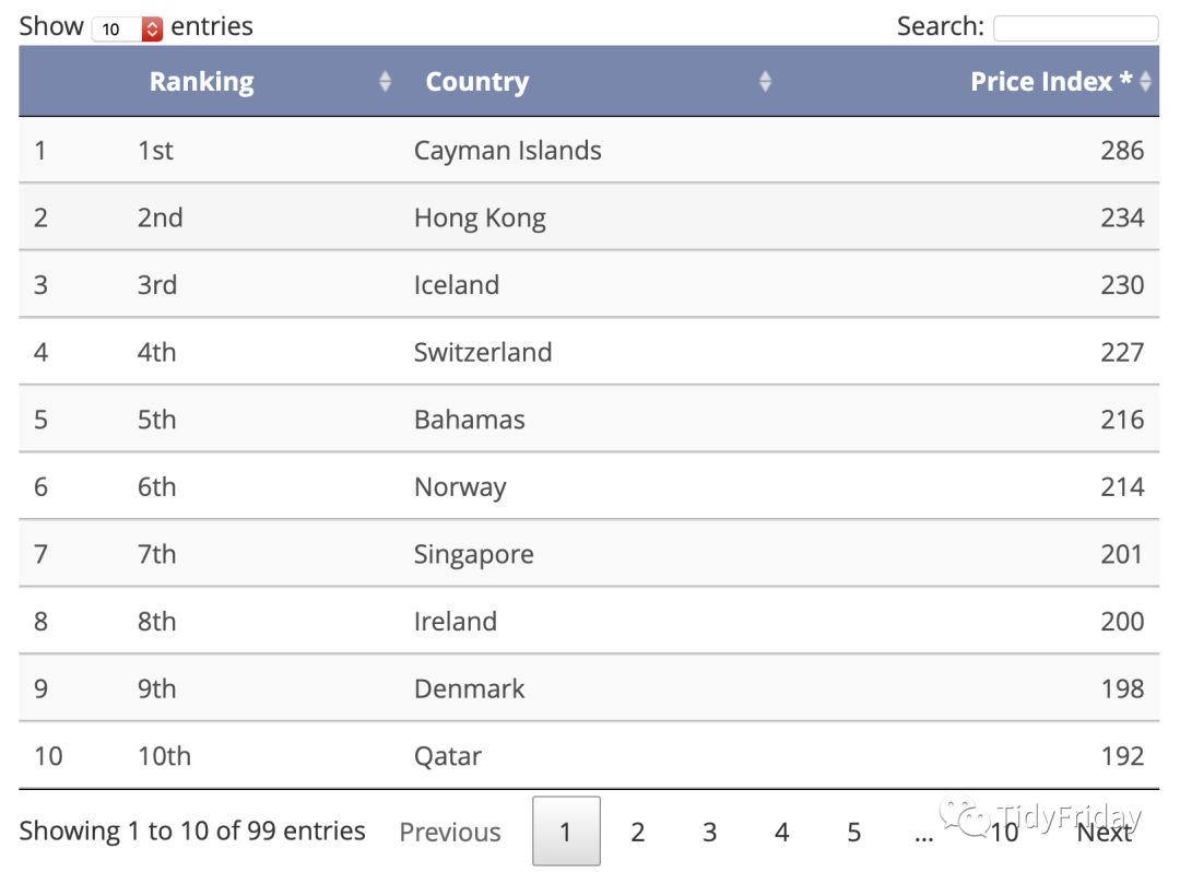
完整的表格是这样的:
我们再把这个数据整理一下,例如 Ranking 变量可以转换成数值型变量, Price Index * 的名字也改改:
library(stringr)df % `colnames% mutate(ranking = str_remove_all(ranking, "[st nd rd th]")) %>% type_convert()
df
## # A tibble: 99 x 3## ranking country price_index## ## 1 1 Cayman Islands 286## 2 2 Hong Kong 234## 3 3 Iceland 230## 4 4 Switzerland 227## 5 5 Bahamas 216## 6 6 Norway 214## 7 7 Singapore 201## 8 8 Ireland 200## 9 9 Denmark 198## 10 10 Qatar 192## # … with 89 more rows
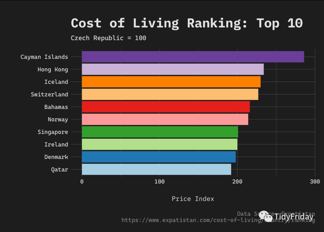
先画个简单的柱状图吧!
# 关于字体和主题的设置,请参考:https://czxa.top/tf/get-started-with-r-and-rstudio.htmlenfont = "CascadiaCode-Regular"library(forcats)df %>% slice(1:10) %>% mutate( country = fct_reorder(country, price_index) ) %>% ggplot() + geom_col(aes(x = country, y = price_index, fill = country)) + awtools::a_dark_theme(enfont) + theme(legend.position = "none") + scale_fill_brewer(palette = "Paired") + coord_flip() + labs(y = "Price Index", x = "", title = "Cost of Living Ranking: Top 10", subtitle = "Czech Republic = 100", caption = "Data Source: Expatistan\nhttps://www.expatistan.com/cost-of-living/country/ranking") + theme(plot.margin = grid::unit(c(1, 0.5, 0.5, 0.2), "cm"))
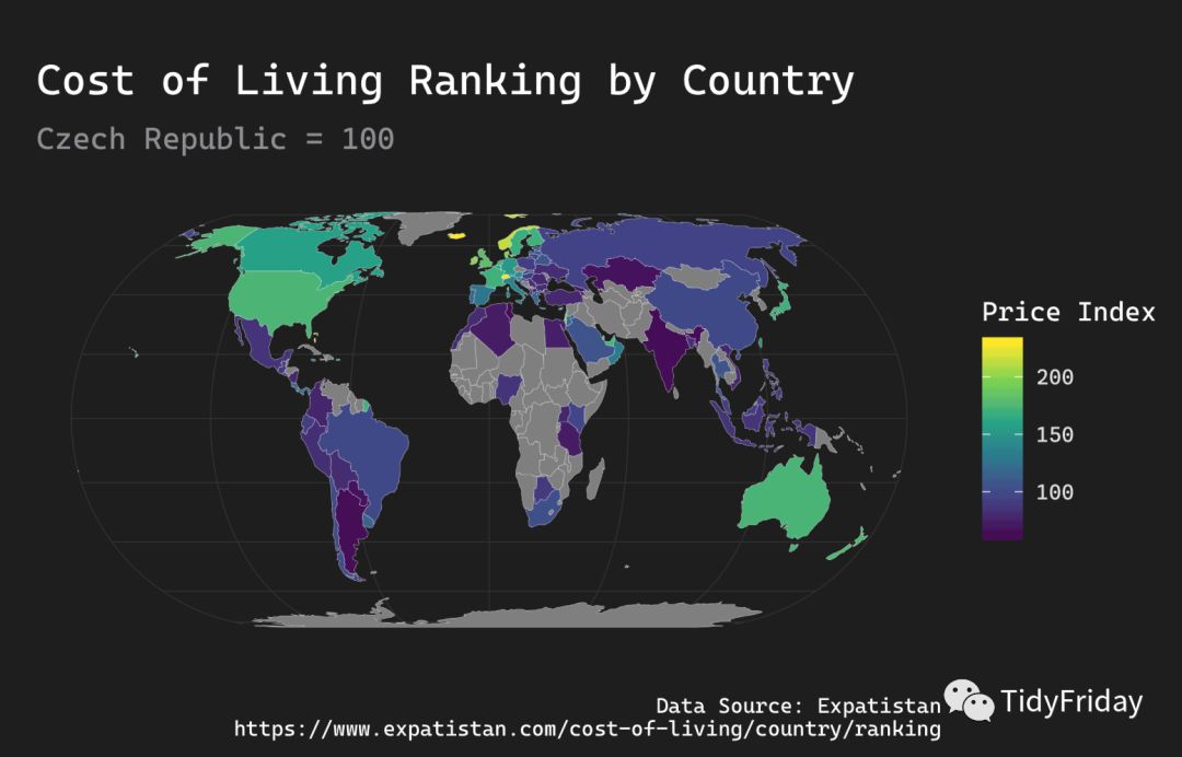
这是个世界地图的数据,最好的可视化当然是画世界地图了!
我们使用 ggplot2 + sf 绘制世界地图,底图使用 tmap 包中的 World,安装 tmap 包出错的小伙伴,可以从 TidyFriday 的 知识星球下载 “World.rds” 数据:
library(ggplot2)library(sf)data("World", package = "tmap")wdf % mutate(name = as.character(name)) %>% left_join(df, by = c("name" = "country")) %>% rename(`Price Index` = `price_index`)ggplot(wdf) + geom_sf(aes(geometry = geometry, fill = `Price Index`), color = "white", size = 0.05) + theme_modern_rc(base_family = enfont, plot_title_family = enfont, subtitle_family = enfont, caption_family = enfont) + scale_fill_viridis_c() + theme(plot.margin = grid::unit(c(1, 0.2, 0.3, 0.2), "cm")) +
labs(y = "", x = "", title = "Cost of Living Ranking by Country", subtitle = "Czech Republic = 100", caption = "Data Source: Expatistan\nhttps://www.expatistan.com/cost-of-living/country/ranking")
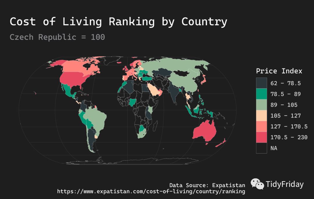
离散变量
价格指数是个连续变量,但是我们可以把它切割成分组的离散变量:
# 使用分位数进行切割,例如我们想分成 6 组nclass = 6
# 计算分位数quantiles % pull(`Price Index`) %>% quantile(probs = seq(0, 1, length.out = nclass + 1), na.rm = TRUE) %>% as.vector()
labels return(paste0(quantiles[idx], " – ", quantiles[idx + 1]))})# 删除最后一个标签,要不然我们就会看到像 "62 - NA" 这样的标签:labels labels
## [1] "62 – 78.5" "78.5 – 89" "89 – 105" "105 – 127" "127 – 170.5"## [6] "170.5 – 230"
wdf wdf %>% mutate( `Price Index` = cut(`Price Index`, breaks = quantiles, labels = labels, include.lowest = TRUE) )
unique(wdf$`Price Index`)
## [1] 78.5 – 89 170.5 – 230 62 – 78.5 127 – 170.5 105 – 127 ## [7] 89 – 105 ## Levels: 62 – 78.5 78.5 – 89 89 – 105 105 – 127 127 – 170.5 170.5 – 230
绘制地图:
ggplot(wdf) + geom_sf(aes(geometry = geometry, fill = `Price Index`), color = "white", size = 0.05) + theme_modern_rc(base_family = enfont, plot_title_family = enfont, subtitle_family = enfont, caption_family = enfont) + scale_fill_manual(values = ggrapid::select_palette()) + theme(plot.margin = grid::unit(c(1, 0.2, 0.3, 0.2), "cm")) + labs(y = "", x = "", title = "Cost of Living Ranking by Country", subtitle = "Czech Republic = 100", caption = "Data Source: Expatistan\nhttps://www.expatistan.com/cost-of-living/country/ranking")
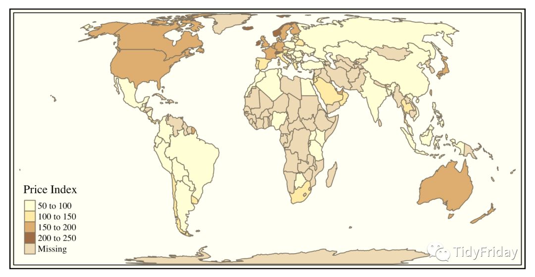
使用 tmap 包绘制地图
wdf2 % mutate(name = as.character(name)) %>% left_join(df, by = c("name" = "country")) %>%
rename(`Price Index` = `price_index`)tmap::tmap_style("classic")tmap::tm_shape(wdf2) + tmap::tm_polygons("Price Index")
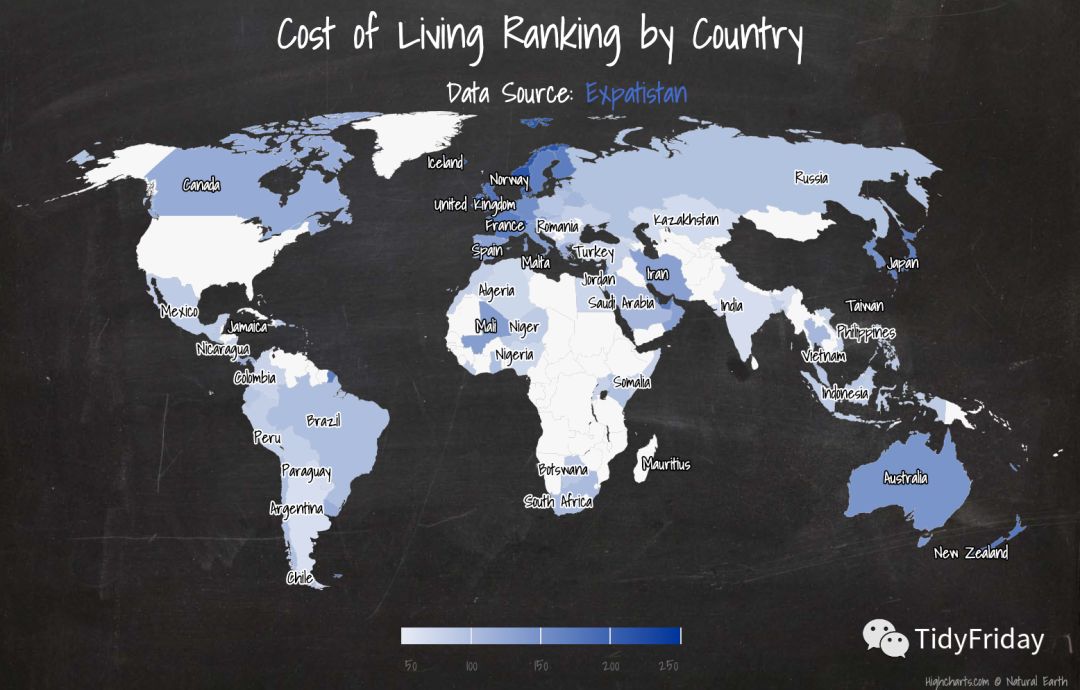
使用 highcharter 包绘制世界地图
似乎由于国家和地区的名字差异的问题,合并的有些问题,尽管我使用了 fuzzyjoin 包进行模糊连接:
library(highcharter)world worlddf worlddf % fuzzyjoin::stringdist_left_join(df, by = c("name" = "country")) %>% select(code = `hc-a2`, price_index)
hcmap("custom/world-robinson-highres", data = worlddf, value = "price_index", joinBy = c("hc-a2", "code"), name = "Price Index", dataLabels = list( enabled = T, format = '{point.name}' ), borderColor = "#FAFAFA", borderWidth = 0.1, tooltip = list( valueDecimal = 2 )) %>% hc_title(text = "Cost of Living Ranking by Country") %>% hc_subtitle(text = 'Data Source: Expatistan', useHTML = TRUE) %>% hc_add_theme(hc_theme_chalk())
我再试试用 Stata 完成这些图表的绘制。。。
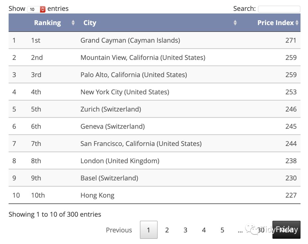
爬取城市生活成本指数的排名
这个表在这里:https://www.expatistan.com/cost-of-living/index
爬取方法类似:
"https://www.expatistan.com/cost-of-living/index" %>% read_html() %>% html_nodes(xpath = '//*[@id="ranking"]/div[1]/table') %>% html_table() %>% .[[1]] %>% `colnames% as_tibble() %>% DT::datatable()
编写 Shiny 文档
Shiny 文档和 R Markdown 文档不同的地方在于,它是实时运行的,我做了个 Shiny 文档:https://czxa.top/shiny/cost/ ,实时运行意味着每次你打开它的时候里面的代码就会自动运行一遍,所以这个文档上的表格和图表和原始网站上的始终是一致的。
References
[1] Expatistan: https://www.expatistan.com/cost-of-living/country/ranking
[2] tmap: https://cran.r-project.org/web/packages/tmap/
[3] rvest: https://cran.r-project.org/web/packages/rvest/
如需联系EasyCharts团队
请加微信:EasyCharts
增强版配套源代码下载地址
Github
https://github.com/EasyChart/Beautiful-Visualization-with-R
![]()
微信扫一扫
关注该公众号
![]()
微信扫一扫
使用小程序
';
mydiv.className = "img_loading";
mydiv.src="data:image/gif;base64,iVBORw0KGgoAAAANSUhEUgAAAAEAAAABCAYAAAAfFcSJAAAADUlEQVQImWNgYGBgAAAABQABh6FO1AAAAABJRU5ErkJggg==";
videoPlaceHolderSpan.style.cssText = "width: " + obj.w + "px !important;";
mydiv.style.cssText += ";width: " + obj.w + "px";
videoPlaceHolderSpan.appendChild(videoPlayerIconSpan);
videoPlaceHolderSpan.appendChild(mydiv);
insertAfter(videoPlaceHolderSpan, a);
a.style.cssText += ";width: " + obj.w + "px !important;";
a.setAttribute("width",obj.w);
if(window.__zoom!=1){
a.style.display = "block";
videoPlaceHolderSpan.style.display = "none";
a.setAttribute("_ratio",obj.ratio);
a.setAttribute("_vid",vid);
}else{
videoPlaceHolderSpan.style.cssText += "height: " + obj.h + "px !important;";
mydiv.style.cssText += "height: " + obj.h + "px !important;";
a.style.cssText += "height: " + obj.h + "px !important;";
a.setAttribute("height",obj.h);
}
a.setAttribute("data-vh",obj.vh);
a.setAttribute("data-vw",obj.vw);
if(a.getAttribute("data-mpvid")){
a.setAttribute("data-src",location.protocol+"//mp.weixin.qq.com/mp/readtemplate?t=pages/video_player_tmpl&auto=0&vid="+vid);
}else{
a.setAttribute("data-src",location.protocol+"//v.qq.com/iframe/player.html?vid="+ vid + "&width="+obj.vw+"&height="+obj.vh+"&auto=0");
}
}
})();
(function(){
if(window.__zoom!=1){
if (!window.__second_open__) {
document.getElementById('page-content').style.zoom = window.__zoom;
var a = document.getElementById('activity-name');
var b = document.getElementById('meta_content');
if(!!a){
a.style.zoom = 1/window.__zoom;
}
if(!!b){
b.style.zoom = 1/window.__zoom;
}
}
var images = document.getElementsByTagName('img');
for (var i = 0,il=images.length;i=0 && child.getAttribute("data-vid")==vid){
child.style.cssText += "height: " + h + "px !important;";
child.style.display = "";
}
}
}
}
})();
})();


前往“发现”-“看一看”浏览“朋友在看”