
1
简介
本文是螺旋线的可视化,及在螺旋线上添加圆、正方形、星型等填充图形。
螺旋线有很多种,这里只介绍阿基米德螺旋线,因为这种与我们的目标更加契合:
Archimedean Spiral,阿基米德螺线。
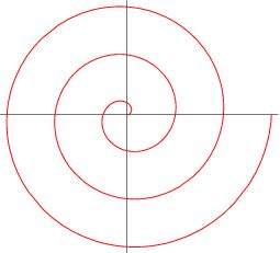
在极坐标系中,阿基米德螺旋线的极径与极角成正比
r
=
a
θ
r
=
a
θ
,
为了增加兼容性,方便与其它图形画在一起,我们还需要几个参数,比如:
-
中心点/起始点的坐标,
-
螺旋线的旋转方向(顺时针/逆时针)。
-
图形的尺寸范围。
这样才能大致确定螺旋线的占地范围。
2
绘制阿基米德螺旋线
首先我们需要进行坐标系转换,
极坐标系下函数:
r
=
a
θ
, 转换公式:
x
=
r
cos
θ
;
y
=
r
sin
θ
。所有
θ
均表示弧度。
2.1
需要的包
library(ggplot2)
library(dplyr)
library(magrittr)
library(tibble)
library(readr)
library(ggforce) # geom_circle
3
产生坐标数据
相邻图形之间的夹角相等,而图形尺寸不等,逐渐增加, 为了排列紧凑,
周期为
2
×
360
o
,即
(
n
+
1
2
)
x
=720
,解得
x
=
48
" role="presentation" style="word-spacing: normal; overflow-wrap: normal; float: none; direction: ltr; max-width: none; max-height: none; min-width: 0px; min-height: 0px;">
x
=48
n
=
7
" role="presentation" style="word-spacing: normal; overflow-wrap: normal; float: none; direction: ltr; max-width: none; max-height: none; min-width: 0px; min-height: 0px;">
,n
=7
。
随着图形数量增加,圈数逐渐增加。
通过自定义函数产生坐标数据。
# x0,y0表示中心点坐标,a为阿基米德螺旋线的参数,旋转角度angle
## 如果是顺时针,则angle顺时针增加,如果是逆时针,则angle逆时针增加。
gener_ArchSpiral function(data, x0=0, y0=0, a=1, clockwise = TRUE, angle=0){
  if (clockwise) {
    theta seq(from = 0, by = -4/45*pi, length.out = 3*nrow(data)-2) -pi
  } else {
    theta seq(from = 0, by = 4/45*pi, length.out = 3*nrow(data)-2) +pi
  }
  r *theta
  # 增加旋转角度
  theta +angle/180 *pi

  # 转化为直角坐标系并平移
  x *cos(theta) +x0
  y *sin(theta) +y0
  return(tibble(x = x, y = y))
}
4
业务数据
这里我们用2018年中国各省GDP作为业务数据,
需要按照GDP大小排序。
# 读取各省简称
province read_csv(file = "E:/R_input_output/data_input/prov_centroids.csv",
                   col_names = TRUE) %>%select(name, shortname)

# 读取各省GDP
GDP_df read_csv(file = "E:/R_input_output/data_input/GDP_China_2018_trillion.csv",
                   col_names = TRUE) %>%rename(name = province) %>%
left_join(province, by = "name") %>%arrange(GDP)


# 结果如下
head(GDP_df)
|
name
|
GDP
|
shortname
|
|
西藏自治区
|
1477.63
|
西藏
|
|
青海省
|
2865.23
|
青海
|
|
宁夏回族自治区
|
3705.18
|
宁夏
|
|
海南省
|
4832.05
|
海南
|
|
甘肃省
|
8246.07
|
甘肃
|
|
新疆维吾尔自治区
|
12199.08
|
新疆
|
1-6 of 6 rows
5
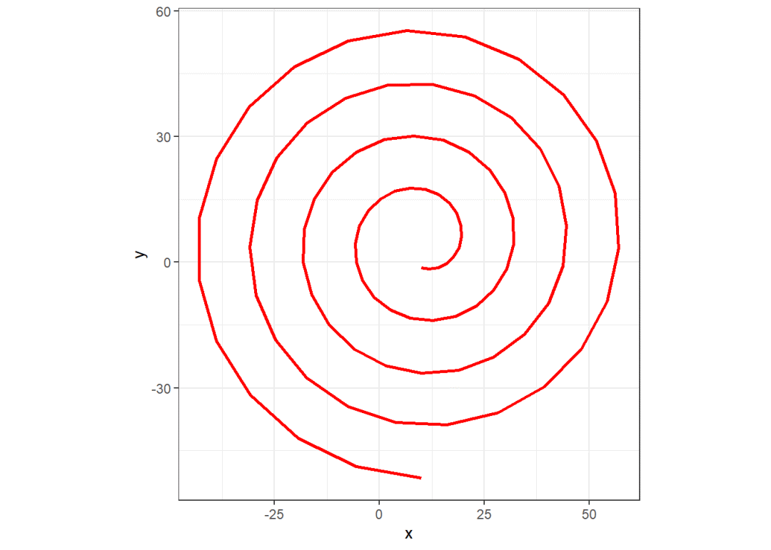
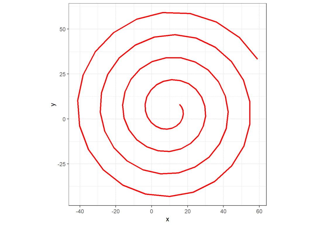
绘制螺旋线
df_Arch1 gener_ArchSpiral(data = GDP_df, x0 = 10, y0 = 5, a = 2,
                             clockwise = FALSE, angle = 90)
df_Arch2 gener_ArchSpiral(data = GDP_df, x0 = 10, y0 = 5, a = 2,
                             clockwise = FALSE, angle = 45)
df_Arch3 gener_ArchSpiral(data = GDP_df, x0 = 10, y0 = 5, a = 2,
                             clockwise = TRUE, angle = 30)

ggplot(df_Arch1) +
geom_path(aes(x = x, y = y), size = 1, color = "red") +
coord_fixed() +
theme_bw()

ggplot(df_Arch2) +
geom_path(aes(x = x, y = y), size = 1, color = "red") +
coord_fixed() +
theme_bw()

ggplot(df_Arch3) +
geom_path(aes(x = x, y = y), size = 1, color = "red") +
coord_fixed() +
theme_bw()

6
合并业务数据与坐标数据
df_Arch gener_ArchSpiral(data = GDP_df, x0 = 10, y0 = 5, a = 0.5,
                            clockwise = FALSE, angle = 90)

# 设置尺寸范围,这里画圆,就是半径
size_min 0.5; size_max 3

df_points %>%add_column(., order = 1:nrow(.)) %>%
filter(order %%3 ==1) %>%# 3个坐标取1个。
arrange(order) %>%cbind(GDP_df) %>%
# 数据归一化,将GDP大小归一到设置的尺寸范围内
mutate(.,size = round(GDP/max(GDP)*(size_max-size_min)+size_min, digits = 1)) %>%
mutate(label = paste0(shortname, "\n", GDP))
7
最终图形
ggplot(df_Arch) +
geom_path(aes(x = x, y = y), size = 1, color = "grey") +
geom_circle(data = df_points, aes(x0 = x, y0 = y, r = size),
              fill = "lightskyblue", colour = NA) +
geom_text(data = df_points, aes(x = x, y = y, label = label),
            size = 2, colour = "black") +
coord_fixed() +
labs(title = "2018年中国各省GDP(亿元)") +
theme_bw()

8
顺时针
刚刚画了逆时针图,下面来个顺时针图。
df_Arch gener_ArchSpiral(data = GDP_df, x0 = 10, y0 = 5, a = 0.5,
                            clockwise = TRUE)

# 设置尺寸范围,这里画圆,就是半径