正文
前端布局非常重要的一环就是页面框架的搭建,也是最基础的一环。在页面框架的搭建之中,又有居中布局、多列布局以及全局布局,今天我们就来总结总结前端干货中的CSS布局。
居中布局
水平居中
1)使用inline-block+text-align
(1)原理、用法
(2)代码实例
class="parent">
class="child>DEMO
.child{
display:inline-block;
}
.parent{
text-align:center;
}
(3)优缺点
2)使用table+margin
(1)原理、用法
class="parent">
class="child>DEMO
.child {
display:table;
margin:0 auto;
}
(3)优缺点:
3)使用absolute+transform
(1)原理、用法
(2)代码实例
class="parent">
class="child>DEMO
.parent {
position:relative;
}
.child {
position:absolute;
left:50%;
transform:translateX(-50%);
}
(3)优缺点
4)使用flex+margin
(1)原理、用法
(2)代码实例
class="parent">
class="child>DEMO
.parent {
display:flex;
}
.child {
margin:0 auto;
}
(3)优缺点
5)使用flex+justify-content
(1)原理、用法
(2)代码实例
class="parent">
class="child>DEMO
.parent {
display:flex;
justify-content:center;
}
(3)优缺点
垂直居中
1)使用table-cell+vertical-align
(1)原理、用法
class="parent"
>
class="child>DEMO
.parent {
display:table-cell;
vertical-align:middle;
}
(3)优缺点
2)使用absolute+transform
(1)原理、用法
-
原理:类似于水平居中时的absolute+transform原理。将子框设置为绝对定位,移动子框,使子框上边距离相对框上边边框的距离为相对框高度的一半,再通过向上移动子框的一半高度以达到垂直居中。当然,在此之前,我们需要设置父框为相对定位,使父框成为子框的相对框。
-
用法:先将父框设置为position:relative,再设置子框position:absolute,top:50%,transform:translateY(-50%)。
(2)代码实例
class="parent">
class="child>DEMO
.parent {
position:relative;
}
.child {
position:absolute;
top:50%;
transform:translateY(-50%);
}
(3)优缺点
3)使用flex+align-items
(1)原理、用法
(2)代码实例
class="parent">
class="child>DEMO
.parent {
position:flex;
align-items:center;
}
(3)优缺点
-
优点:只设置parent
-
缺点:兼容性存在一定问题
水平垂直居中
1)使用absolute+transform
(1)原理、用法
(2)代码实例
class="parent">
class="child>DEMO
.parent {
position:relative;
}
.child {
position:absolute;
left:50%;
top:50%;
transform:tranplate(-50%,-50%);
}
(3)优缺点
-
优点:child元素不会对其他元素产生影响
-
缺点:兼容性存在一定问题
2)使用inline-block+text-align+table-cell+vertical-align
(1)原理、用法
(2)代码实例
class="parent">
class="child>DEMO
.parent {
text-align:center;
display:table-cell;
vertical-align:middle;
}
.child {
display:inline-block;
}
(3)优缺点
3)使用flex+justify-content+align-items
(1)原理、用法
(2)代码实例
class="parent">
class="child>DEMO
.parent {
display:flex;
justify-content:center;
align-items:center;
}
(3)优缺点
-
优点:只设置了parent
-
缺点:兼容性存在一定问题
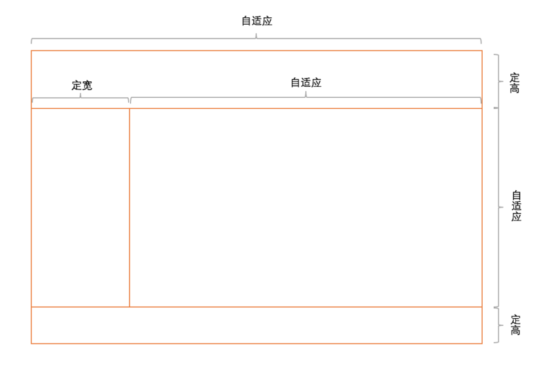
多列布局
定宽+自适应
1)使用float+overflow
(1)原理、用法
(2)代码实例
class="parent">
class="left">
left
class="right">
right
right
.left {
float:left;
width:100px;
margin-right:20px;
}
.right {
overflow:hidden;
}
(3)优缺点
2)使用float+margin
(1)原理、用法
(2)代码实例
class="parent">
class="left">
left
class="right">
right
right
.left {
float:left;
width:100px;
}
.right {
margin-left:120px;
}
(3)优缺点
3)使用float+margin(改良版)
(1)原理、用法
(2)代码实例
class="parent">
class="left">
left
class="rigth-fix">
class="right">
right
right
.left {
float:left;
width:100px;
position:relative;
}
.right-fix {
float:right;
width:100%;
margin-left:-100px;
}
.right {
margin-left:120px;
}
(3)优缺点
4)使用table
(1)原理、用法
(2)代码实例
class="parent">
class="left">
left
class="right">
right
right
.parent {
display:table;
width:100%;
table-layout:fixed;
}
.left {
width:100px;
padding-right:20px;
}
.right,.left {
display:table-cell;
}
5)使用flex
(1)原理、用法
(2)代码实例
class="parent">
class="left">
left
class="right">
right
right
.parent {
display:flex;
}
.left {
width:100px;
margin-right:20px;
}
.right {
flex:1;
}
(3)优缺点
-
优点:flex很强大
-
缺点:兼容性存在一定问题,性能存在一定问题
两列定宽+一列自适应
(1)原理、用法
(2)代码实例
class="parent">
class="left">
left
class="center">
center
class="right">
right
right
.left,.center {
float:left;
width:100px;
margin-right:20px;
}
.right {
overflow:hidden;
}
不定宽+自适应
1)使用float+overflow
(1)原理、用法
(2)代码实例
class="parent">
class="left">
left
class="right">
right
right
.left{
float: left;
margin-right: 20px;
}
.right{
overflow: hidden;
}
.left p{
width: 200px;
}
(3)优缺点
2)使用table
(1)原理、用法
(2)代码实例
class="parent">
class="left">
left
class="right">
right
right
.parent{
display: table; width: 100%;
}
.left,.right{
display: table-cell;
}
.left{
width: 0.1%;
padding-right: 20px;
}
.left p{
width:
200px;
}
(3)优缺点
3)使用flex
(1)原理、用法
(2)代码实例
class="parent">
class="left">
left
class="right">
right
right
.parent {
display:flex;
}
.left {
margin-right:20px;
}
.right {
flex:1;
}
.left p{
width: 200px;
}
(3)优缺点
-
优点:flex很强大
-
缺点:兼容性存在一定问题,性能存在一定问题
两列不定宽+一列自适应
(1)原理、用法
(2)代码实例
class="parent">
class="left">
left
class="center">
center
class
="right">
right
right
.left,.center{
float: left;
margin-right: 20px;
}
.right{
overflow: hidden;
}
.left p,.center p{
width: 100px;
}
等分布局
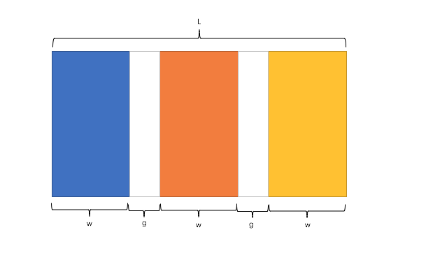
公式转化:
        l


        =


        w


        *


        n


        +


        g


        *


        (


        n


        -


        1


        )


        ->


        l


        =


        w


        *


        n


        +


        g


        *


        n


        -


        g


        ->


        l


        +


        g


        =


        (


        w


        +


        g


        )


        *


        n
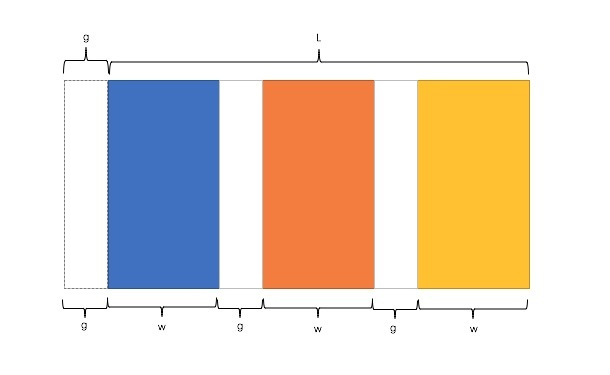
因此,我们需要解决两个问题:
-
如何让总宽度增加g(即:L+g)
-
如何让每个宽包含g(即:w+g)
1)使用float
(1)原理、用法
(2)代码实例
class="parent">
.parent{
margin-left: -
20px;//l增加g
}
.column{
float: left;
width: 25%;
padding-left: 20px;
box-sizing: border-box;//包含padding区域 w+g
}
(3)优缺点
-
优点:兼容性较好
-
缺点:ie6 ie7百分比兼容存在一定问题
2)使用table
(1)原理、用法
(2)代码实例
class="parent-fix">
class="parent">
.parent-fix{
margin-left: -20px;//l+g
}
.parent{
display: table;
width:
100%;
table-layout: fixed;
}
.column{
display: table-cell;
padding-left: 20px;//w+g
}
(3)优缺点
       3)使用flex

      (1)原理、用法
(2)代码实例
class="parent">
.parent{
display: flex;
}
.column{
flex: 1;
}
.column+.column{
margin-left:20px;
}
(3)优缺点
-
优点:代码量少,与块数无关
-
缺点:兼容性存在一定问题
定宽+自适应+两块高度一样高
1)使用float
(1)原理、用法
(2)代码实例
class="parent">
class="left">
left
class="right">
right
right
p{
background: none!important;
}
.left,.right{
background: #444;
}
.parent{
overflow: hidden;
}
.left,.right{
padding-bottom: 9999px;
margin-bottom: -9999px;
}
.left{
float: left;
width: 100px;
margin-right: 20px;
}
.right{
overflow: hidden;
}
(3)优缺点
-
优点:兼容性好
-
缺点:伪等高,不是真正意义上的等高
2)使用table
(1)原理、用法
(2)代码实例
class="parent">
class="left">
left
class="right">
right
right
.parent {
display:table;
width:100%;
table-layout:fixed;
}
.left {
width:100px;
padding-right:20px;
}
.right,.left {
display:table-cell;
}
3)使用flex
(1)原理、用法
(2)代码实例
class="parent">
class="left">
left
class="right">
right
right
.parent {
display:flex;
}
.left {
width:100px;
margin-right:20px;
}
.right {
flex:1;
}
(3)优缺点
-
优点:代码少,flex很强大
-
缺点:兼容性存在一定问题
4)使用display
(1)原理、用法
(2)代码实例
class="parent">
class="left">left
class="right">right
.parent {
width: 100%;
display: -webkit-box;
}
.left {
width:100px;
margin-right: 20px;
}
.right {
-webkit-box-flex: 1;
}
(3)优缺点
全屏布局
全屏布局的特点
全屏布局的方法
1)使用position
(1)原理、用法


