冲击图(alluvial diagram)是流程图(flow diagram)的一种,最初开发用于代表网络结构的时间变化。
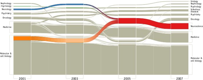
实例1. neuroscience coalesced from other related disciplines to form its own field. From PLoS ONE 5(1): e8694 (2010)

实例2. Sciences封面哈扎人肠道菌群 图1中的C/D就使用了3个冲击图。详见
3分和30分文章差距在哪里?
ggalluvial是一个基于ggplot2的扩展包,专门用于快速绘制冲击图(alluvial diagram),有些人也叫它桑基图(Sankey diagram),但两者略有区别,将来我们会介绍
riverplot
包绘制桑基图。
软件源代码位于Github: https://github.com/corybrunson/ggalluvial
CRNA官方演示教程: https://cran.r-project.org/web/packages/ggalluvial/vignettes/ggalluvial.html
安装
以下三种方装方式,三选1:
# 国内用户推荐清华镜像站
site="https://mirrors.tuna.tsinghua.edu.cn/CRAN"
# 安装稳定版(推荐)
install.packages("ggalluvial", repo=site)

# 安装开发版(连github不稳定有时间下载失败,多试几次可以成功)
devtools::install_github("corybrunson/ggalluvial", build_vignettes = TRUE)

# 安装新功能最优版
devtools::install_github("corybrunson/ggalluvial", ref = "optimization")
显示帮助文档
使用vignette查看演示教程
# 查看教程
vignette(topic = "ggalluvial", package = "ggalluvial")
接下来我们的演示均基于此官方演示教程,我的主要贡献是翻译与代码注释。
基于ggplot2的冲击图
原作者:Jason Cory Brunson, 更新日期:2018-02-11
1. 最简单的示例
基于泰坦尼克事件人员统计绘制性别与舱位和年龄的关系。
# 加载包
library(ggalluvial)

# 转换内部数据为数据框,宽表格模式
titanic_wide
# 显示数据格式
head(titanic_wide)
#>   Class    Sex   Age Survived Freq
#> 1   1st   Male Child       No    0
#> 2   2nd   Male Child       No    0
#> 3   3rd   Male Child       No   35
#> 4  Crew   Male Child       No    0
#> 5   1st Female Child       No    0
#> 6   2nd Female Child       No    0

# 绘制性别与舱位和年龄的关系
ggplot(data = titanic_wide,
       aes(axis1 = Class, axis2 = Sex, axis3 = Age,
           weight = Freq)) +
  scale_x_discrete(limits = c("Class", "Sex", "Age"), expand = c(.1, .05)) +
  geom_alluvium(aes(fill = Survived)) +
  geom_stratum() + geom_text(stat = "stratum", label.strata = TRUE) +
  theme_minimal() +
  ggtitle("passengers on the maiden voyage of the Titanic",
          "stratified by demographics and survival")
具体参考说明:data设置数据源,axis设置显示的柱,weight为数值,geom_alluvium为冲击图组间面积连接并按生存率比填充分组,geom_stratum()每种有柱状图,geom_text()显示柱状图中标签,theme_minimal()主题样式的一种,ggtitle()设置图标题
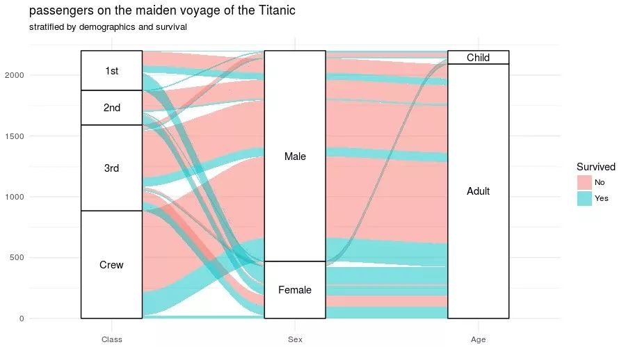
图1. 展示性别与舱位和年龄的关系及存活率比例
我们发现上图居然画的是宽表格模式下的数据,而通常ggplot2处理都是长表格模式,如何转换呢?
to_loades转换为长表格
# 长表格模式,to_loades多组组合,会生成alluvium和stratum列。主分组位于命名的key列中
titanic_long                          key = "Demographic",
                         axes = 1:3)
head(titanic_long)
ggplot(data = titanic_long,
       aes(x = Demographic, stratum = stratum, alluvium = alluvium,
           weight = Freq, label = stratum)) +
  geom_alluvium(aes(fill = Survived)) +
  geom_stratum() + geom_text(stat = "stratum") +
  theme_minimal() +
  ggtitle("passengers on the maiden voyage of the Titanic",
          "stratified by demographics and survival")
产生和上图一样的图,只是数据源格式不同。
2. 输入数据格式
定义一种Alluvial宽表格
# 显示数据格式
head(as.data.frame(UCBAdmissions), n = 12)
##       Admit Gender Dept Freq
## 1  Admitted   Male    A  512
## 2  Rejected   Male    A  313
## 3  Admitted Female    A   89
## 4  Rejected Female    A   19
## 5  Admitted   Male    B  353
## 6  Rejected   Male    B  207
## 7  Admitted Female    B   17
## 8  Rejected Female    B    8
## 9  Admitted   Male    C  120
## 10 Rejected   Male    C  205
## 11 Admitted Female    C  202
## 12 Rejected Female    C  391

# 判断数据格式
is_alluvial(as.data.frame(UCBAdmissions), logical = FALSE, silent = TRUE)
## [1] "alluvia"
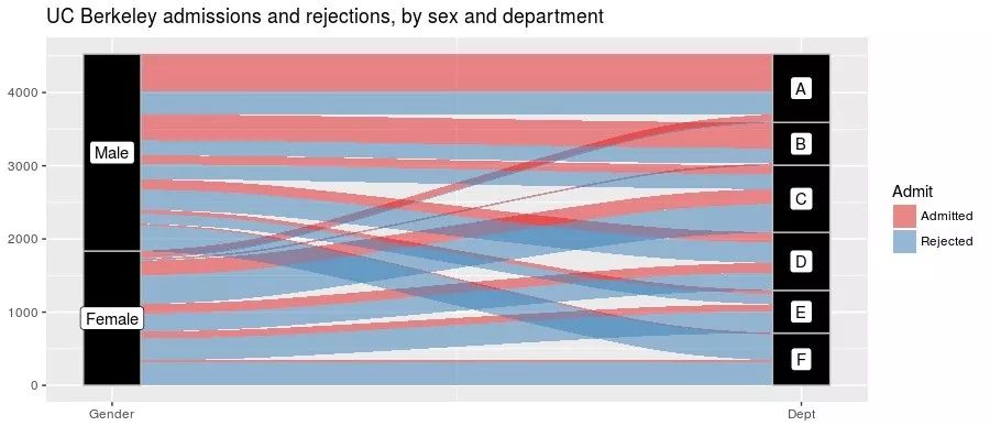
查看性别与专业间关系,并按录取情况分组
ggplot(as.data.frame(UCBAdmissions),
       aes(weight = Freq, axis1 = Gender, axis2 = Dept)) +
  geom_alluvium(aes(fill = Admit), width = 1/12) +
  geom_stratum(width = 1/12, fill = "black", color = "grey") +
  geom_label(stat = "stratum", label.strata = TRUE) +
  scale_x_continuous(breaks = 1:2, labels = c("Gender", "Dept")) +
  scale_fill_brewer(type = "qual", palette = "Set1") +
  ggtitle("UC Berkeley admissions and rejections, by sex and department")
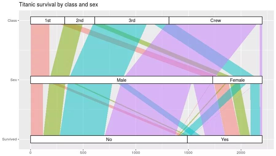
3. 三类型间关系,按重点着色
Titanic按生存,性别,舱位分类查看关系,并按舱位填充色
ggplot(as.data.frame(Titanic),
       aes(weight = Freq,
           axis1 = Survived, axis2 = Sex, axis3 = Class)) +
  geom_alluvium(aes(fill = Class),
                width = 0, knot.pos = 0, reverse = FALSE) +
  guides(fill = FALSE) +
  geom_stratum(width = 1/8, reverse = FALSE) +
  geom_text(stat = "stratum", label.strata = TRUE, reverse = FALSE) +
  scale_x_continuous(breaks = 1:3, labels = c("Survived", "Sex", "Class")) +
  coord_flip() +
  ggtitle("Titanic survival by class and sex")
4. 长表格数据
# to_lodes转换为长表格
UCB_lodes head(UCB_lodes, n = 12)
##    Freq alluvium     x  stratum
## 1   512        1 Admit Admitted
## 2   313        2 Admit Rejected
## 3    89        3 Admit Admitted
## 4    19        4 Admit Rejected
## 5   353        5 Admit Admitted
## 6   207        6 Admit Rejected
## 7    17        7 Admit Admitted
## 8     8        8 Admit Rejected
## 9   120        9 Admit Admitted
## 10  205       10 Admit Rejected
## 11  202       11 Admit Admitted
## 12  391       12 Admit Rejected

# 判断是否符合格式要求
is_alluvial(UCB_lodes, logical = FALSE, silent = TRUE)
## [1] "alluvia"
主要列说明:
-
x, 主要的分类,即X轴上每个柱
-
stratum, 主要分类中的分组
-
alluvium, 连接图的索引
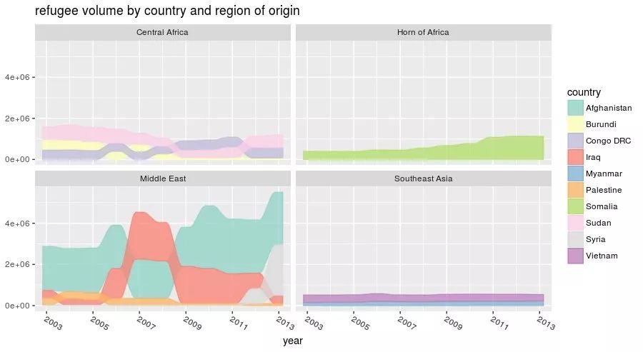
5. 绘制非等高冲击图
以各国难民数据为例,观察多国难民数量随时间变化
data(Refugees, package = "alluvial")
country_regions   Afghanistan = "Middle East",
  Burundi = "Central Africa",
  `Congo DRC` = "Central Africa",
  Iraq = "Middle East",
  Myanmar = "Southeast Asia",
  Palestine = "Middle East",
  Somalia = "Horn of Africa",
  Sudan = "Central Africa",
  Syria = "Middle East",
  Vietnam = "Southeast Asia"
)
Refugees$region ggplot(data = Refugees,
       aes(x = year, weight = refugees, alluvium = country)) +
  geom_alluvium(aes(fill = country, colour = country),
                alpha = .75, decreasing = FALSE) +
  scale_x_continuous(breaks = seq(2003, 2013, 2)) +
  theme(axis.text.x = element_text(angle = -30, hjust = 0)) +
  scale_fill_brewer(type = "qual", palette = "Set3") +
  scale_color_brewer(type = "qual", palette = "Set3") +
  facet_wrap(~ region, scales = "fixed") +
  ggtitle("refugee volume by country and region of origin")
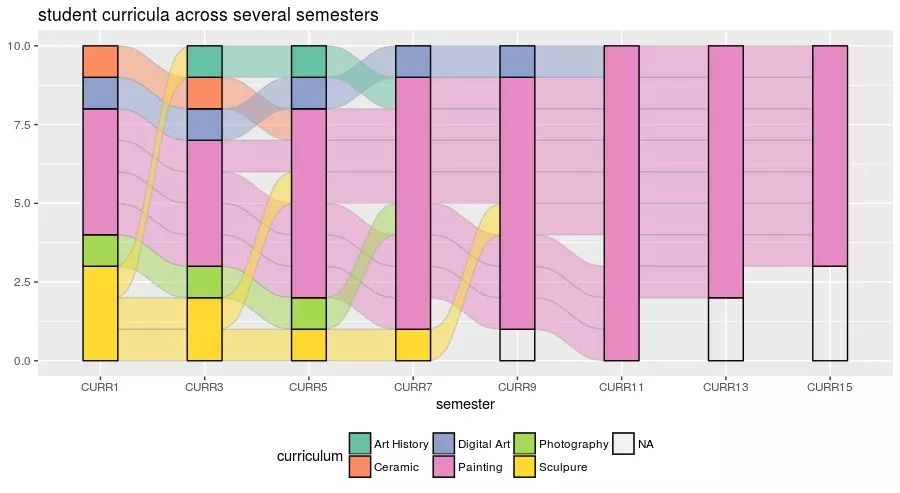
6. 等高非等量关系
不同学期学生学习科目的变化
data(majors)
majors$curriculum ggplot(majors,
       aes(x = semester, stratum = curriculum, alluvium = student,
           fill = curriculum, label = curriculum)) +
  scale_fill_brewer(type = "qual", palette = "Set2") +
  geom_flow(stat = "alluvium", lode.guidance = "rightleft",
            color = "darkgray") +
  geom_stratum() +
  theme(legend.position = "bottom") +
  ggtitle("student curricula across several semesters")
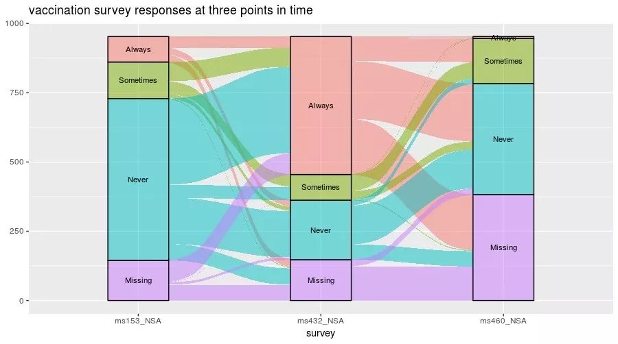
7. 工作状态时间变化图
data(vaccinations)
levels(vaccinations$response) ggplot(vaccinations,
       aes(x = survey, stratum = response, alluvium = subject,
           weight = freq,
           fill = response, label = response)) +
  geom_flow() +
  geom_stratum(alpha = .5) +
  geom_text(stat = "stratum", size = 3) +
  theme(legend.position = "none") +
  ggtitle("vaccination survey responses at three points in time")
8. 分类学门水平相对丰度实战
# 实战1. 组间丰度变化

# 编写测试数据
df=data.frame(
  Phylum=c("Ruminococcaceae","Bacteroidaceae","Eubacteriaceae","Lachnospiraceae","Porphyromonadaceae"),
  GroupA=c(37.7397,31.34317,222.08827,5.08956,3.7393),
  GroupB=c(113.2191,94.02951,66.26481,15.26868,11.2179),
  GroupC=c(123.2191,94.02951,46.26481,35.26868,1.2179),
  GroupD=c(37.7397,31.34317,222.08827,5.08956,3.7393)
)

# 数据转换长表格

library(reshape2)

melt_df = melt(df)

# 绘制分组对应的分类学,有点像circos
ggplot(data = melt_df,
       aes(axis1 = Phylum, axis2 = variable,
           weight = value)) +
  scale_x_discrete(limits = c("Phylum", "variable"), expand = c(.1, .05)) +
  geom_alluvium(aes(fill = Phylum)) +
  geom_stratum() + geom_text(stat = "stratum", label.strata = TRUE) +
  theme_minimal() +
  ggtitle("Phlyum abundance in each group")
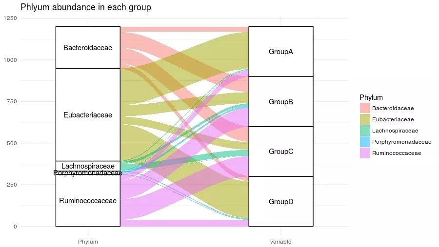
绘制分组对应的分类学,有点像circos
# 组间各丰度变化
ggplot(data = melt_df,
       aes(x = variable, weight = value, alluvium = Phylum)) +
  geom_alluvium(aes(fill = Phylum, colour = Phylum, colour = Phylum),
                alpha = .75, decreasing = FALSE) +
  theme_minimal() +
  theme(axis.text.x = element_text(angle = -30, hjust = 0)) +
  ggtitle("Phylum change among groups")
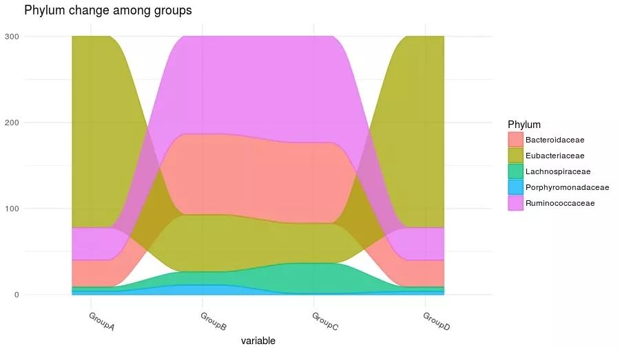
组间各丰度变化,如果组为时间效果更好
Reference
# 如何引用
citation("ggalluvial")
Jason Cory Brunson (2017). ggalluvial: Alluvial Diagrams in ‘ggplot2’. R package version 0.5.0.
https://CRAN.R-project.org/package=ggalluvial