
该
贴同样源于一个小伙伴实际遇到的问题,我现把数据更换掉,呈现给各位!
这位小伙伴的数据是类似这样的:
 1set.seed(1111)
 2data "Cluster",1:20), 60, replace = TRUE),
 3                    gene = sample(paste0("Gene",1:30), 60, replace = TRUE),
 4                    stringsAsFactors = FALSE)
 5
 6data[1:20,]
 7       class   gene
 81   Cluster4 Gene10
 92  Cluster12 Gene24
103  Cluster14 Gene11
114   Cluster7 Gene16
125  Cluster11 Gene27
136   Cluster7  Gene4
147  Cluster18 Gene25
158   Cluster6 Gene18
169  Cluster12 Gene29
1710 Cluster20 Gene30
1811  Cluster2 Gene23
1912  Cluster2 Gene22
2013  Cluster4 Gene15
2114  Cluster8 Gene18
2215 Cluster11 Gene11
2316 Cluster16 Gene13
2417 Cluster15 Gene20
2518 Cluster10  Gene7
2619 Cluster19 Gene16
2720  Cluster3 Gene23
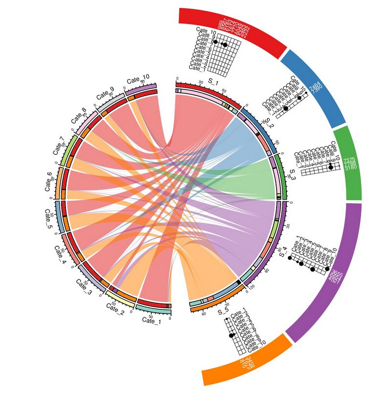
他想得到一个类似这样的图:

这个图可以用circlize包来画,对,就是之前提到的那个
顾博士的包
。
看到这个图后,我先把顾大佬给的例子看了一遍。想着如果有现成的相似的案例可以套用,就可以直接借鉴了(说实话,大佬的包参数太多,我目前还不能熟练使用)。于是我发现顾博士的这个图(该图代码见图下链接):
https://jokergoo.github.io/circlize_examples/example/otu.html
去掉外圈的半圆,只保留圆形部分,就可以很好地解答上述小伙伴的问题了
说干就干!利用上面我自己造的数据,搞起来:
1library(circlize)
2library(RColorBrewer)
3library(tidyverse)
4
5iterm1 = unique(data$class)
6iterm2 = unique(data$gene)
7
8circos.par(canvas.xlim = c(-1.5,1.5), canvas.ylim = c(-1.5,1.5),
9 cell.padding = c(0, 0, 0, 0), start.degree = 270, gap.degree = c(rep(1, length(iterm2)-1), 10, rep(1, length(iterm1)-1), 10))
10
11data$number = rep(1, nrow(data))
12
13sum_gene %
14 group_by(gene) %>%
15 summarise(Sum = sum(number))
16
17sum_class %
18 group_by(class) %>%
19 summarise(Sum = sum(number))
20
21sector_lim = c(rep(0,nrow(sum_class) + nrow(sum_gene)),
22 sum_gene$Sum, sum_class$Sum) %>% matrix(ncol = 2)
23
24rownames(sector_lim) = c(sum_gene$gene, sum_class$class)
25
26sector = rownames(sector_lim)
27
28class = sum_class$class
29gene = sum_gene$gene
30
31col1 = colorRampPalette(brewer.pal(11,"PiYG"))(nrow(sum_gene))
32names(col1) = gene
33
34col2 = colorRampPalette(brewer.pal(8,"Set1"))(nrow(sum_gene))
35names(col2) = class
36
37
38nrow(sum_gene)
39nrow(sum_class)
40
41circos.initialize(factors = factor(sector, levels = c(str_sort(sum_gene$gene, numeric = TRUE),
42 str_sort(sum_class$class, numeric = TRUE))),
43 xlim = sector_lim,
44 sector.width = c(sector_lim[1:28,2]/sum(sector_lim[1:28,2]),
45 1*sector_lim[29:46,2]/sum(sector_lim[29:46,2])))
46
47circos.trackPlotRegion(ylim = c(0, 1), panel.fun = function(x, y) {
48 sector.index = get.cell.meta.data("sector.index")
49 xlim = get.cell.meta.data("xlim")
50 ylim = get.cell.meta.data("ylim")
51 circos.text(mean(xlim), mean(ylim), sector.index, cex = 1, facing = "clockwise", adj = c(0, 0.5), niceFacing = TRUE)
52}, track.height = 0.05, bg.border = NA)
53
54circos.trackPlotRegion(ylim = c(0, 1), panel.fun = function(x, y) {
55}, track.height = 0.05, bg.col = c(col1, col2))
56
57circos.trackPlotRegion(ylim = c(0, 1), panel.fun = function(x, y) {
58}, track.height = 0.02,track.margin = c(0, 0.02))
59
60
61accum_class = sapply(class, function(x) get.cell.meta.data("xrange", sector.index = x))
62names(accum_class) = class
63
64accum_gene = sapply(gene, function(x) get.cell.meta.data("xrange", sector.index = x))
65names(accum_gene) = gene
66
67
68for(i in seq_len(nrow(data))) {
69 circos.link(data[i,2], c(accum_gene[data[i,2]], accum_gene[data[i,2]] - data[i, 3]),
70 data[i,1], c(accum_class[data[i,1]], accum_class[data[i,1]] - data[i, 3]),
71 col = paste0(col2[data[i,1]], "80"), border = NA)
72
73 circos.rect(accum_class[data[i,1]], 0, accum_class[data[i,1]] - data[i, 3], 1, sector.index = data[i,1], col = col1[data[i,2]])
74 circos.rect(accum_gene[data[i,2]], 0, accum_gene[data[i,2


