
1
简介
丁香园·丁香医生
数据介绍:
该数据是从丁香园·丁香医生通过爬虫获取的全国
2019-ncov
病毒的感染病例。
-
时间的分辨率:1小时
-
空间分辨率:城市和省份
-
起止时间:从2020/1/25/17时到疫情结束
2
需要的包
library(readr)
library(lubridate)
library(magrittr)
library(tibble)
library(dplyr)
library(ggplot2)
library(tidyr)
library(purrr)
library(gganimate)
library(gifski)
3
时间序列
实时更新
# set start day
startDay  paste("2020", 1, 25, sep = "/") %>%
      as.Date()
# update data at 10:00 everyday
nowTime  Sys.time() %>% with_tz(tz = "Asia/Shanghai") # only support Shanghai timezone
endDay  if(hour(nowTime) > 17) {
  date(nowTime)
} else {
  date(nowTime) - ddays(1) # the date 1 day before a date
}

# compute time length, unit day
timeLength  interval(startDay, endDay) %>% time_length("day")
# time sequence
mydate  startDay + ddays(0:timeLength)
4
读取疫情数据
通过API接口读取
# define a function to read epidemic data of a day
read_epidemic  function(mydate) {
  mytime  paste(mydate, "17", sep = "T")
  url_API  paste0("http://69.171.70.18:5000/download/city_level_", mytime, ".csv")
  epidemic_df  read_csv(file = url_API)
  colnames(epidemic_df)  c("order", "city", "confirmed_c", "suspected_c", "cured_c",
                         "dead_c", "province", "short_p", "confirmed_p", "suspected_p",
                         "cured_p", "dead_p", "comment")
  epidemic_df %<>% select(city, confirmed_c) %>%
    arrange(desc(confirmed_c)) %>%
    slice(1:15)
  return(epidemic_df)
}


epidemic_nest  tibble(mydate = mydate,
                        mytime = paste(mydate, "17:00:00", sep = " ")) %>%
  mutate(., data = map(.$mydate, ~read_epidemic(.x)))
5
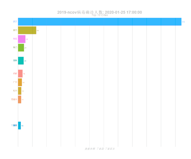
动态可视化
epidemic_formatted  epidemic_nest %>% unnest() %>% select(-mydate) %>%
  group_by(mytime) %>%
  # The * 1 makes it possible to have non-integer ranks while sliding
  mutate(rank = rank(-confirmed_c),
         confirmed_c_rel = confirmed_c/confirmed_c[rank==1],
         confirmed_c_lbl = paste0(" ",confirmed_c)) %>%
  ungroup()
# Animation
anim ggplot(epidemic_formatted, aes(rank, group = city,
fill = as.factor(city), color = as.factor(city))) +
geom_tile
(aes(y = confirmed_c/2,
height = confirmed_c,
width = 0.9), alpha = 0.8, color = NA) +
geom_text(aes(y = 0, label = paste(city, " ")), vjust = 0.2, hjust = 1) +
geom_text(aes(y=confirmed_c,label = confirmed_c_lbl, hjust=0)) +
coord_flip(clip = "off", expand = FALSE) +
scale_y_continuous(labels = scales::comma) +
scale_x_reverse() +
guides(color = FALSE, fill = FALSE) +
theme(axis.line=element_blank(),
axis.text.x=element_blank(),
axis.text.y=element_blank(),
axis.ticks=element_blank(),
axis.title.x=element_blank(),
axis.title.y=element_blank(),
legend.position="none",
panel.background=element_blank(),
panel.border=element_blank(),
panel.grid.major=element_blank(),
panel.grid.minor=element_blank(),
panel.grid.major.x = element_line( size=.1, color="grey" ),
panel.grid.minor.x = element_line( size=.1, color="grey" ),
plot.title=element_text(size=25, hjust=0.5, face="bold", colour="grey", vjust=-1),
plot.subtitle=element_text(size=18, hjust=0.5, face="italic", color="grey"),
plot.caption =element_text(size=15, hjust=0.5, face="italic", color="grey"),
plot.background=element_blank(),
plot.margin = margin(2,2, 2, 4, "cm")) +
transition_states(mytime, transition_length = 4, state_length = 1) +
view_follow(fixed_x = TRUE) +
labs(title = '2019-ncov病毒确诊人数: {closest_state}',
subtitle = "Top 10 Cites",
caption = "数据来源: 丁香园·丁香医生")
# For GIF
animate(anim, nframes = length(mydate)*5, fps = 20,
width = 1200, height = 1000,
renderer = gifski_renderer("gganim.gif"))
参考来源:
如需联系EasyCharts团队
请加微信:
EasyCharts

增强版配套源代码下载地址


