

出品 | AI科技大本营(ID:rgznai100)
新冠肺炎已在全球范围内爆发。为了解全球疫情分布情况,有技术人员使用Jupyter Notebook
绘制了
两种疫情的
等值线地图(
choropleth chart
)
和
散点图
。
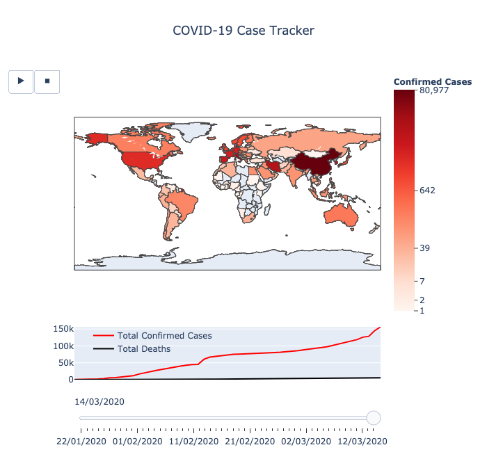
前者显示了
一个国家/地区的疫情扩散情况:该国家/地区的在地图上的颜色越深,其确诊案例越多。其中的播放键可以为图表制作动画,同时还可以使用滑块手动更改日期。
第二个散点图中的红点则表明
其大小与某一特定地点的确诊病例数量成对数比例。
这个图表的分辨率更高,数据呈现的是州/省一级的疫情情况。
最终的疫情地图显示效果清晰明了,以下为作者分享的全部代码:
from datetime import datetimeimport re
from IPython.display import displayimport numpy as npimport pandas as pdimport plotly.graph_objects as gofrom plotly.subplots import make_subplots
pd.options.display.max_columns = 12
date_pattern = re.compile(r"\d{1,2}/\d{1,2}/\d{2}")def reformat_dates(col_name: str) -> str: try: return date_pattern.sub(datetime.strptime(col_name, "%m/%d/%y").strftime("%d/%m/%Y"), col_name, count=1) except ValueError: return col_name
confirmed_cases_url = "https://raw.githubusercontent.com/CSSEGISandData/COVID-19/master/csse_covid_19_data/" \ "csse_covid_19_time_series/time_series_19-covid-Confirmed.csv"deaths_url = "https://raw.githubusercontent.com/CSSEGISandData/COVID-19/master/csse_covid_19_data/" \ "csse_covid_19_time_series/time_series_19-covid-Deaths.csv"
 等值线地图
等值线地图
renamed_columns_map = { "Country/Region": "country", "Province/State": "location", "Lat": "latitude", "Long": "longitude"}
cols_to_drop = ["location", "latitude", "longitude"]
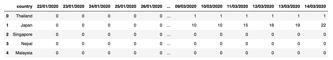
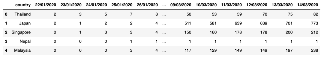
confirmed_cases_df = ( pd.read_csv(confirmed_cases_url) .rename(columns=renamed_columns_map) .rename(columns=reformat_dates) .drop(columns=cols_to_drop))deaths_df = ( pd.read_csv(deaths_url) .rename(columns=renamed_columns_map) .rename(columns=reformat_dates) .drop(columns=cols_to_drop))
display(confirmed_cases_df.head())display(deaths_df.head())
geo_data_df = confirmed_cases_df[["country"]].drop_duplicates()country_codes_df = ( pd.read_csv( "country_code_mapping.csv", usecols=["country", "alpha-3_code"], index_col="country"))geo_data_df = geo_data_df.join(country_codes_df, how="left", on="country").set_index("country")
geo_data_df[(pd.isnull(geo_data_df["alpha-3_code"])) & (geo_data_df.index != "Cruise Ship")
输出:

dates_list = ( deaths_df.filter(regex=r"(\d{2}/\d{2}/\d{4})", axis=1) .columns .to_list()
)
cases_by_date = {}for date in dates_list: confirmed_cases_day_df = ( confirmed_cases_df .filter(like=date, axis=1) .rename(columns=lambda col: "confirmed_cases") ) deaths_day_df = deaths_df.filter(like=date, axis=1).rename(columns=lambda col: "deaths") cases_df = confirmed_cases_day_df.join(deaths_day_df).set_index(confirmed_cases_df["country"])
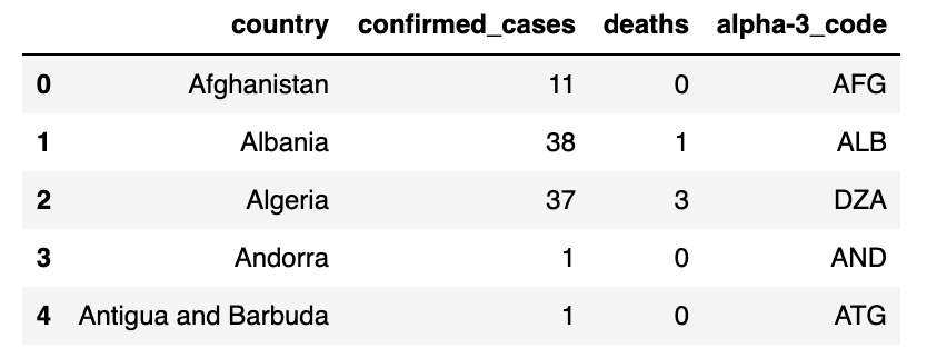
date_df = ( geo_data_df.join(cases_df) .groupby("country") .agg({"confirmed_cases": "sum", "deaths": "sum", "alpha-3_code": "first"}) ) date_df = date_df[date_df["confirmed_cases"] > 0].reset_index() cases_by_date[date] = date_df cases_by_date[dates_list[-1]].head()
输出:
def frame_args(duration): return { "frame": {"duration": duration}, "mode": "immediate", "fromcurrent": True, "transition": {"duration": duration, "easing": "linear"}, }
fig = make_subplots(rows=2, cols=1, specs=[[{"type": "scattergeo"}], [{"type": "xy"}]], row_heights=[0.8, 0.2])
fig.layout.geo = {"showcountries": True}fig.layout.sliders = [{"active": 0, "steps": []}]fig.layout.updatemenus = [ { "type": "buttons", "buttons": [ { "label": "▶", "method": "animate", "args": [None, frame_args(250)], }, { "label": "◼", "method": "animate", "args": [[None], frame_args(0)], }, ], "showactive": False, "direction": "left", }]fig.layout.title = {"text": "COVID-19 Case Tracker", "x": 0.5}
frames = []steps = []max_country_confirmed_cases = cases_by_date[dates_list[-1]]["confirmed_cases"].max()
high_tick = np.log1p(max_country_confirmed_cases)low_tick = np.log1p(1)log_tick_values = np.geomspace(low_tick, high_tick, num=6)
visual_tick_values = np.expm1(log_tick_values).astype(int)visual_tick_values[-1] = max_country_confirmed_cases visual_tick_values = [f"{val:,}" for val in visual_tick_values]
cases_deaths_totals = [(df.filter(like="confirmed_cases").astype("uint32").agg("sum")[0], df.filter(like="deaths").astype("uint32").agg("sum")[0]) for df in cases_by_date.values()]
confirmed_cases_totals = [daily_total[0] for daily_total in cases_deaths_totals]deaths_totals =[daily_total[1] for daily_total in cases_deaths_totals]
for i, (date, data) in enumerate(cases_by_date.items(), start=1): df = data
df["confirmed_cases_log"] = np.log1p(df["confirmed_cases"])
df["text"] = ( date + "
" + df["country"] + "
Confirmed cases: " + df["confirmed_cases"].apply(lambda x: "{:,}".format(x)) + "
Deaths: " + df["deaths"].apply(lambda x: "{:,}".format(x)) )
choro_trace = go.Choropleth( **{ "locations": df["alpha-3_code"], "z": df["confirmed_cases_log"], "zmax": high_tick, "zmin": low_tick, "colorscale": "reds", "colorbar"
: { "ticks": "outside", "ticktext": visual_tick_values, "tickmode": "array", "tickvals": log_tick_values, "title": {"text": "Confirmed Cases"}, "len": 0.8, "y": 1, "yanchor": "top" }, "hovertemplate": df["text"], "name": "", "showlegend": False } ) confirmed_cases_trace = go.Scatter( x=dates_list, y=confirmed_cases_totals[:i], mode="markers" if i == 1 else "lines", name="Total Confirmed Cases", line={"color": "Red"}, hovertemplate="%{x}
Total confirmed cases: %{y:,}" ) deaths_trace = go.Scatter( x=dates_list, y=deaths_totals[:i], mode="markers" if i == 1 else "lines", name="Total Deaths", line={"color": "Black"}, hovertemplate="%{x}
Total deaths: %{y:,}" )
if i == 1: fig.add_trace(choro_trace, row=1, col=1) fig.add_traces([confirmed_cases_trace, deaths_trace], rows=[2, 2], cols=[1, 1]) frames.append(dict(data=[choro_trace, confirmed_cases_trace, deaths_trace], name=date))
steps.append( {"args": [[date], frame_args(0)], "label": date, "method": "animate",} )
fig.update_xaxes(range=[0, len(dates_list)-1], visible=False)fig.update_yaxes(range=[0, max(confirmed_cases_totals)])fig.frames = framesfig.layout.sliders[0].steps = stepsfig.layout.geo.domain = {"x": [0,1], "y": [0.2, 1]}fig.update_layout(height=650, legend={"x": 0.05, "y": 0.175, "yanchor": "top", "bgcolor": "rgba(0, 0, 0, 0)"})fig

疫情散点图
renamed_columns_map = {    "Country/Region": "country",    "Province/State": "location",    "Lat": "latitude",    "Long": "longitude"}
confirmed_cases_df = (    pd.read_csv(confirmed_cases_url)    .rename(columns=renamed_columns_map)    .rename(columns=reformat_dates)    .fillna(method="bfill", axis=1))deaths_df = (    pd.read_csv(deaths_url)    .rename(columns=renamed_columns_map)    .rename(columns=reformat_dates)    .fillna(method="bfill", axis=1))
display(confirmed_cases_df.head())display(deaths_df.head())
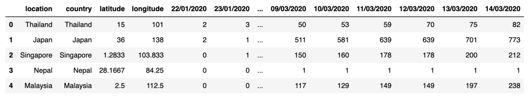
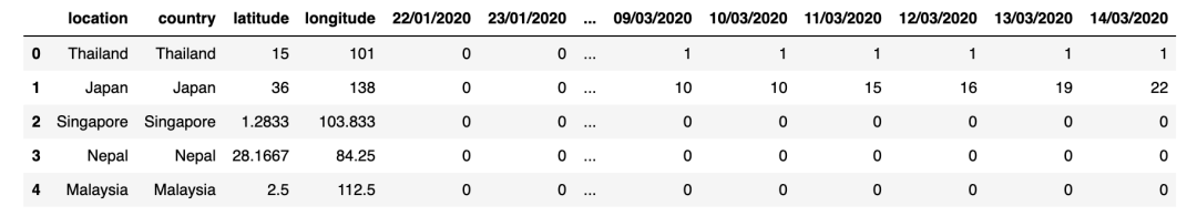
fig = go.Figure()
geo_data_cols = ["country", "location", "latitude", "longitude"]geo_data_df = confirmed_cases_df[geo_data_cols]dates_list = ( confirmed_cases_df.filter(regex=r"(\d{2}/\d{2}/\d{4})", axis=1) .columns .to_list())
cases_by_date = {}for date in dates_list: confirmed_cases_day_df = ( confirmed_cases_df.filter(like=date, axis=1) .rename(columns=lambda col: "confirmed_cases") .astype("uint32") ) deaths_day_df = ( deaths_df.filter(like=date, axis=1) .rename(columns=lambda col: "deaths") .astype("uint32") ) cases_df = confirmed_cases_day_df.join(deaths_day_df) cases_df = geo_data_df.join(cases_df) cases_df = cases_df[cases_df["confirmed_cases"] > 0] cases_by_date[date] = cases_df cases_by_date[dates_list[-1]].head()
输出:
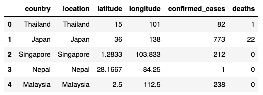
fig.data = []for date, df in cases_by_date.items(): df["confirmed_cases_norm"] = np.log1p(df["confirmed_cases"]) df["text"] = ( date + "
" + df["country"] + "
" + df["location"] + "
Confirmed cases: " + df["confirmed_cases"].astype(str) + "
Deaths: " + df["deaths"].astype(str) ) fig.add_trace( go.Scattergeo( name="", lat=df["latitude"], lon=df["longitude"], visible=False, hovertemplate=df["text"], showlegend=False, marker={ "size": df["confirmed_cases_norm"] * 100, "color": "red", "opacity": 0.75, "sizemode": "area", }, ) )
annotation_text_template = "Worldwide Totals" \ "
{date}
" \ "Confirmed cases: {confirmed_cases:,d}
" \ "Deaths: {deaths:,d}
" \ "Mortality rate: {mortality_rate:.1%}"annotation_dict = { "x": 0.03, "y": 0.35, "width": 150, "height": 110, "showarrow": False, "text": "", "valign": "middle", "visible": False, "bordercolor": "black"


