通过 css 关联起来:
.placeholder {
background-image: paint(placeholder-box);
/* 其他样式... */
}
嗯,就是这样。
恭喜!看来你已经知道怎么用 Paint API 了!
Input Property
现在我们写的叉中,线的粗细程度和颜色都是硬编码的,如果想要改成对齐容器边框的粗细和颜色要怎么写呢?
我们可以通过
input property(输入属性)
实现,这一特性由
Typed Object Model
(也可以称之为
Typed OM
)提供。Typed OM 同属于 Houdini,但和 Paint API 不同的是,需要手动开启
chrome://flags
中的
Experimental Web Platform features
。
可以通过下面的代码确认是否成功启用该特性:
if ('CSSUnitValue' in window) {
// 样式在此
}
启用之后,就可以修改原来的 paint worklet 让它可以接收 input property 了:
class PlaceholderBoxPropsPainter {
static get inputProperties() {
return
['border-top-width', 'border-top-color'];
}
paint(ctx, size, props) {
// 默认值
ctx.lineWidth = 2;
ctx.strokeStyle = '#666';
// 设置线的宽度为(如果存在的)顶边宽度
let borderTopWidthProp = props.get('border-top-width');
if (borderTopWidthProp) {
ctx.lineWidth = borderTopWidthProp.value;
}
// 设置线的样式为(如果存在的)定边样式
let borderTopColorProp = props.get('border-top-color');
if (borderTopColorProp) {
ctx.strokeStyle = borderTopColorProp.toString();
}
// 上面 demo 中的代码从这里开始...
}
}
registerPaint('placeholder-box-props'
, PlaceholderBoxPropsPainter);
通过添加
inputProperties
,paint worklet 就知道要去哪里找 CSS 属性。
paint()
函数也能够接收第三个传入参数
props
,通过它获取到 CSS 属性值。现在,我们的占位符看着自然多了(codepen 链接
[2]
):
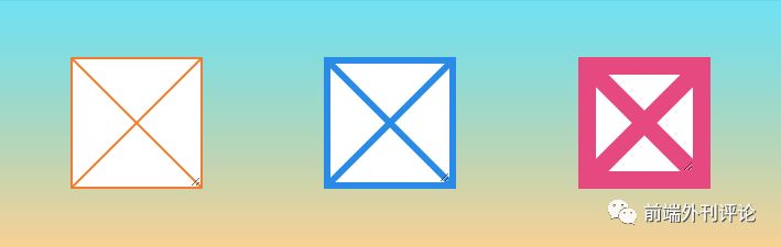
用
border
也可以,不过要记得这个属性其实是简写,背后其实有12个属性:
.shorthand {
border: 1px solid blue;
}
.expanded {
border-top-width: 1px;
border-right-width: 1px;
border-bottom-width: 1px;
border-left-width: 1px;
border-top-style: solid;
border-right-style: solid;
border-bottom-style: solid;
border-left-style: solid;
border-top-color: blue;
border-right-color: blue;
border-bottom-color: blue;
border-left-color: blue;
}
paint worklet 需要指明具体属性,到目前为止的例子里,我们用到的属性是
border-top-width
和
border-top-color
。
值得注意的是,paint worklet 在处理
border-top-width
时会转化为以像素为单位的数值。这个处理方式堪称完美,正是
ctx.lineWidth
所希望的处理方式。什么?怎么知道会转成像素的?看看 demo 中的第三个占位符,它的
border-top-width
是
1rem
,但 paint worklet 接收以后就变成了
16px
。
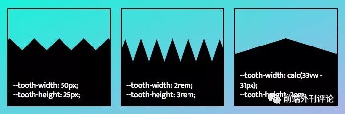
带锯齿的边界
让我们把目光投向新的舞台 — 用 paint worklet 画一个带锯齿的边界,代码在此
[3]
:
接下来,让我们详细看看具体实现:
class JaggedEdgePainter {
static get inputProperties() {
return ['--tooth-width', '--tooth-height'];
}
paint(ctx, size, props) {
let toothWidth = props.get('--tooth-width').value;
let toothHeight = props.get('--tooth-height').value;
// 为确保「牙齿」排列集中,需要进行一系列计算
let spaceBeforeCenterTooth = (size.width - toothWidth) / 2;
let teethBeforeCenterTooth = Math.ceil(spaceBeforeCenterTooth / toothWidth);
let totalTeeth = teethBeforeCenterTooth * 2 + 1;
let startX = spaceBeforeCenterTooth - teethBeforeCenterTooth * toothWidth;
// 从左开始画
ctx.beginPath();
ctx.moveTo(startX, toothHeight);
// 给所有「牙齿」画上锯齿
for (let i = 0; i < totalTeeth; i++) {
let x = startX + toothWidth * i;
ctx.lineTo(x + toothWidth / 2, 0);
ctx.lineTo(x + toothWidth, toothHeight);
}
// 闭合「牙齿」的曲线,并填色
ctx.lineTo(size.width, size.height);
ctx.lineTo(0, size.height);
ctx.closePath();
ctx.fill();
}
}
registerPaint('jagged-edge', JaggedEdgePainter);
这里我们又用上了
inputProperties
,需要控制每个「牙齿」的宽度和高度。还用到了
自定义属性
(也被称为
CSS 变量
)
--tooth-width
和
--tooth-height
。这确实比占用现有的 CSS 属性要好,但想在 paint worklet 中使用自定义属性还要多走一步。
你看,浏览器能够识别它已知的 CSS 属性值和对应的变量值,知道某一个属性需要「长度」作为它的属性值(比如上面的
border-top-width
)。但自定义属性是开发者控制的,会有各种各样的属性值,浏览器不知道哪个属性该对应什么样的值才合法。所以要用自定义属性就多了一步,需要告知浏览器识别属性值。
Properties and Values API
做的就是这件事情。这个 API 也是 Houdini 的一部分,同样需要手动开启(译者:方法同上,不再赘述)。
可以通过 JS 确认是否成功开启:
if ('registerProperty' in CSS) {
// 这里写代码
}
确认开启后,在 paint worklet 外面加上下面这一段:
CSS.registerProperty({
name: '--tooth-width',
syntax: '',
initialValue: '40px'
});
CSS.registerProperty({
name: '--tooth-height',
syntax: '',
initialValue: '20px'
});
在
--tooth-width
和
--tooth-height
上填长度相关的值后,浏览器就知道在 paint worklet 中使用这两个属性时,需要把对应值转成像素。甚至可以用
calc()
!如果不小心写成非长度值,则会传入
initialValue
不至于报错。
.jagged {
background: paint(jagged-edge);
/* 其他样式... */
}
.slot:nth-child(1) .jagged {
--tooth-width: 50px;
--tooth-height: 25px;
}
.slot:nth-child(2) .jagged {
--tooth-width: 2rem;
--tooth-height: 3rem;
}
.slot:nth-child(3) .jagged {
--tooth-width: calc(33vw - 31px);
--tooth-height: 2em;
}
并不是只允许使用
类型,更多可选类型请参考这里。
比如我们也能定义
--tooth-color
自定义属性,并规定属性值是
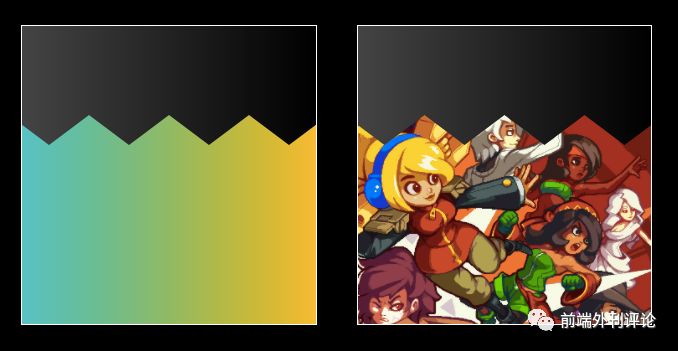
。不过在实现锯齿边距上,我还有个更好的方案:在 paint worklet 中用
-webkit-mask-image
。这个方案不用修改锯齿背景色就能实现各种各样背景的锯齿了:
.jagged {
--tooth-width: 80px;
--tooth-height: 30px;
-webkit-mask-image: paint(jagged-edge);
/* 其他样式... */
}
.slot:nth-child(1) .jagged {
background-image: linear-gradient(to right, #22c1c3, #fdbb2d);
}
.slot:nth-child(2) .jagged {
/* 图源来自游戏 Iconoclasts http://www.playiconoclasts.com/ */
background-image: url('iconoclasts.png');
background-size: cover;
background-position: 50% 0;
}
paint worklet 代码修改不大,具体效果如下
[4]
:
输入参数
可以通过
输入参数 (input arguments)
向 paint worklet 中传参,从 CSS 中传入参数:
.solid {
background-image: paint(solid-color, #c0eb75);
/* 其他的样式... */
}
paint worklet 中定义了
inputArguments
需要传入什么样的参数。
paint()
函数可以通过第四个传入参数获取到所有
inputArguments
,第四个参数是名为
args
的数组:
class SolidColorPainter {
static get
inputArguments() {
return [''];
}
paint(ctx, size, props, args) {
ctx.fillStyle = args[0].toString();
ctx.fillRect(0, 0, size.width, size.height);
}
}
registerPaint('solid-color', SolidColorPainter);
说实话,我并非这种写法的拥趸。而且我认为相比之下,自定义属性更灵活,还可以通过变量名得到自文档化的 CSS。
动画革命
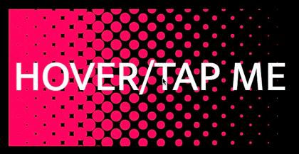
最后一个 demo 了。通过以上所学知识,我们能做出下面这漂亮的褪色圆点图案
[5]
:
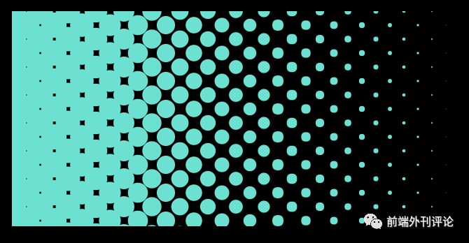
为了控制这些渐变点,第一步就是先注册几个自定义属性:
CSS.registerProperty({
name: '--dot-spacing',
syntax: '',
initialValue: '20px'
});
CSS.registerProperty({
name: '--dot-fade-offset',
syntax: '',
initialValue: '0%'
});
CSS.registerProperty({
name: '--dot-color',
syntax: '',
initialValue: '#fff'
});
注册之后 paint worklet 就能使用这些变量啦,接下来就是进行一系列计算,画出想要的褪色效果:
class PolkaDotFadePainter {
static get inputProperties() {
return ['--dot-spacing', '--dot-fade-offset', '--dot-color'];
}
paint(ctx, size, props) {
let spacing = props.get('--dot-spacing').value;
let fadeOffset = props.get('--dot-fade-offset').value;
let color = props.get('--dot-color').toString();
ctx.fillStyle = color;
for (let y = 0; y < size.height + spacing; y += spacing) {
for (let x = 0; x < size.width + spacing; x += spacing * 2) {
// 通过变换 x 在每一行中创建交错的点
let staggerX = x + ((y / spacing) % 2 === 1 ? spacing : 0);
// 通过 fade offset和每个点的横坐标,计算出该点的半径
let fadeRelativeX = staggerX - size.width * fadeOffset / 100;
let radius = spacing * Math.max(Math.min(1 - fadeRelativeX / size.width, 1), 0);
// 画出目标点
ctx.beginPath();
ctx.arc(staggerX, y, radius, 0, 2 * Math.PI);
ctx.fill();
}
}
}
}
registerPaint('polka-dot-fade', PolkaDotFadePainter);
最后,还要在 CSS 中用上这个 paint worklet 才能看到效果:
.polka-dot {
--dot-spacing: 20px;
--dot-fade-offset: 0%;
--dot-color:
#40e0d0;
background: paint(polka-dot-fade);
/* 其他样式... */
}
现在,故事的转折点来了!动画效果可以通过改变自定义属性的方式实现。当属性值发生变化时,paint worklet 会被调用,然后浏览器重绘元素,最终实现动画效果。
那么来试试通过 CSS 动画中的
keyframes
(
transition
也可以)改变
--dot-fade-offset
和
--dot-color
:
.polka-dot {
--dot-spacing: 20px;
--dot-fade-offset: 0%;
--dot-color: #fc466b;
background: paint(polka-dot-fade);
/* 其他样式... */
}
.polka-dot:hover, .polka-dot:focus {
animation: pulse 2s ease-out 6 alternate;
/* 其他样式... */
}
@keyframes pulse {
from {
--dot-fade-offset: 0%;
--dot-color: #fc466b;
}
to {
--dot-fade-offset: 100%;
--dot-color: #3f5efb;
}
}
最终效果如下,完整代码在此
[6]
:
看到 houdini 的潜力了吧!是不是酷毙了,paint worlets + 自定义属性的组合将会给动画带来革命!
优点和缺点
让我们再回顾一下 Houdini 的优点(着重回顾本篇大量用到的 CSS Paint API):
-
不受限制,开发者能创造各种各样的视觉效果。
-
不需要新增 DOM 节点。
-
在浏览器渲染管道中执行,效率高。
-
比起 polyfill,更加性能友好,也更健壮。
-
这是浏览器原生支持的接口,开发者能有不用 hack 的选择了。
-
用于实现视觉效果的 CSS 常常被诟病不像一门编程语言,几乎无法表达完整的逻辑。那现在可以用 paint worklet 编写视觉效果上的逻辑了。
-
动画革命。
-
快浏览器厂商一步实现特性,而且这些特性能实实在在地展现在用户的设备上。
-
五大浏览器厂商都表示支持 Houdini。
当然了,缺点也不能避而不谈:
-
Houdini 的实现之路漫漫。
-
虽然它可以缓解兼容问题,但首先,浏览器们得先兼容 Houdini…
-
浏览器加载 paint worklet 并执行它需要时间,这是异步的,可能导致样式上的闪动。
-
开发者工具尚不支持 paint worklet 的断点调试(也不支持
debugger
),不过
console.log()
还能用。
结论
Houdini 将会改变我们现在编写 CSS 的方式。虽然可能它将历时不短,但从目前可用的部分(比如,Paint API)来看,潜力惊人。所以,请继续关注 Houdini 啊~
本文中用到的 demo 都在 Github
[7]
上了。更多效果请移步 @iamvdo 的作品
[8]
。
完整信息请访问“阅读原文”,文中的主要链接如下:
[0] https://codersblock.com/blog/say-hello-to-houdini-and-the-css-paint-api/
[1] https://codepen.io/lonekorean/pen/wmwJQX
[2] https://codepen.io/lonekorean/pen/QmLpJJ
[3] https://codepen.io/lonekorean/pen/MVgpzd
[4] https://codepen.io/lonekorean/pen/zWOZyx
[5] https://codepen.io/lonekorean/pen/aYoJPv
[6] https://codepen.io/lonekorean/pen/xWKqmZ
[7] https://github.com/lonekorean/hello-houdini
[8] https://lab.iamvdo.me/houdini/


